
A modern mark rooted in national meaning
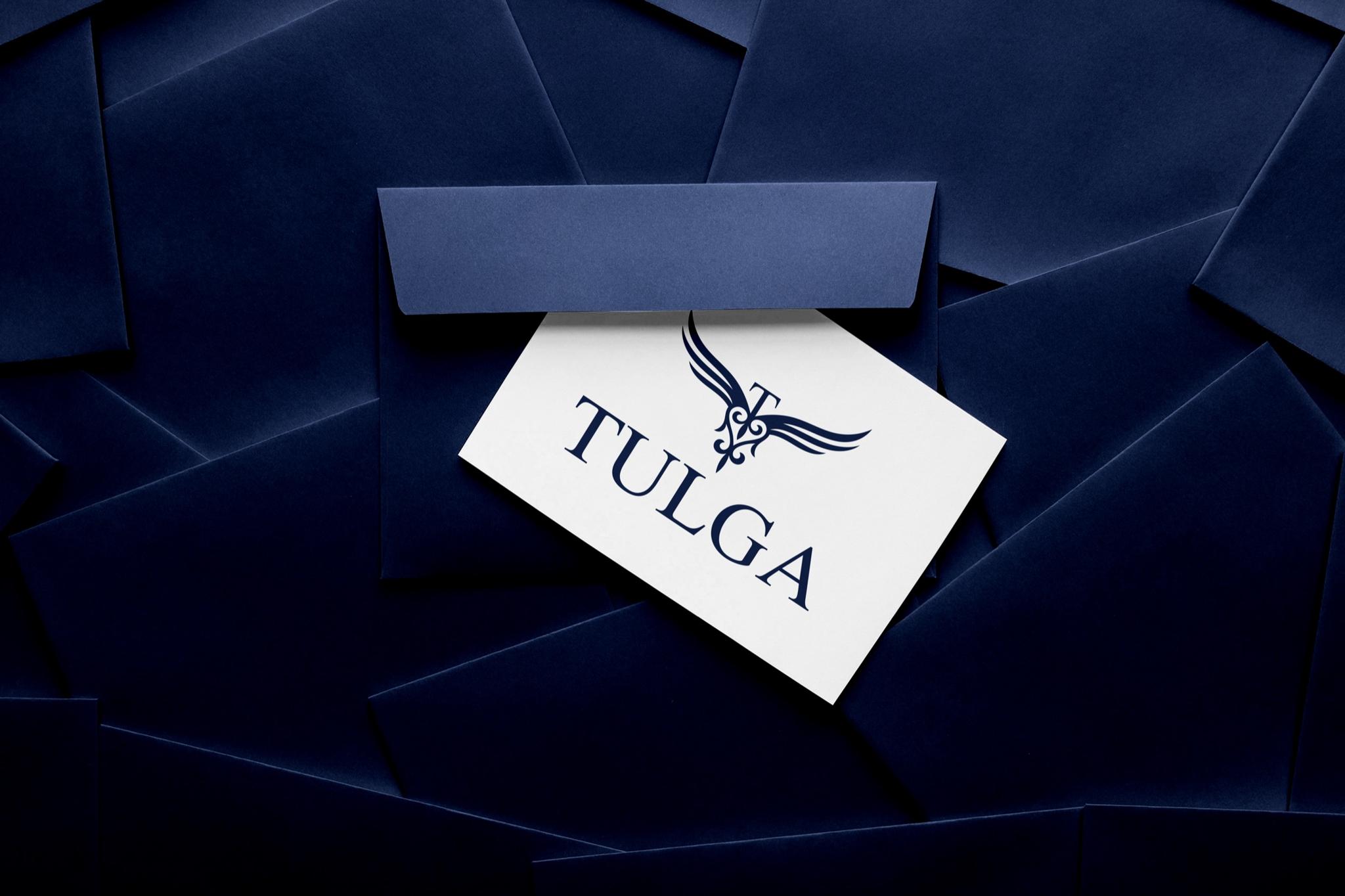
TULGA is a Kazakhstan watch brand. Here, the task was a mark that feels contemporary yet keeps the national element part of the structure—not a decorative afterthought.
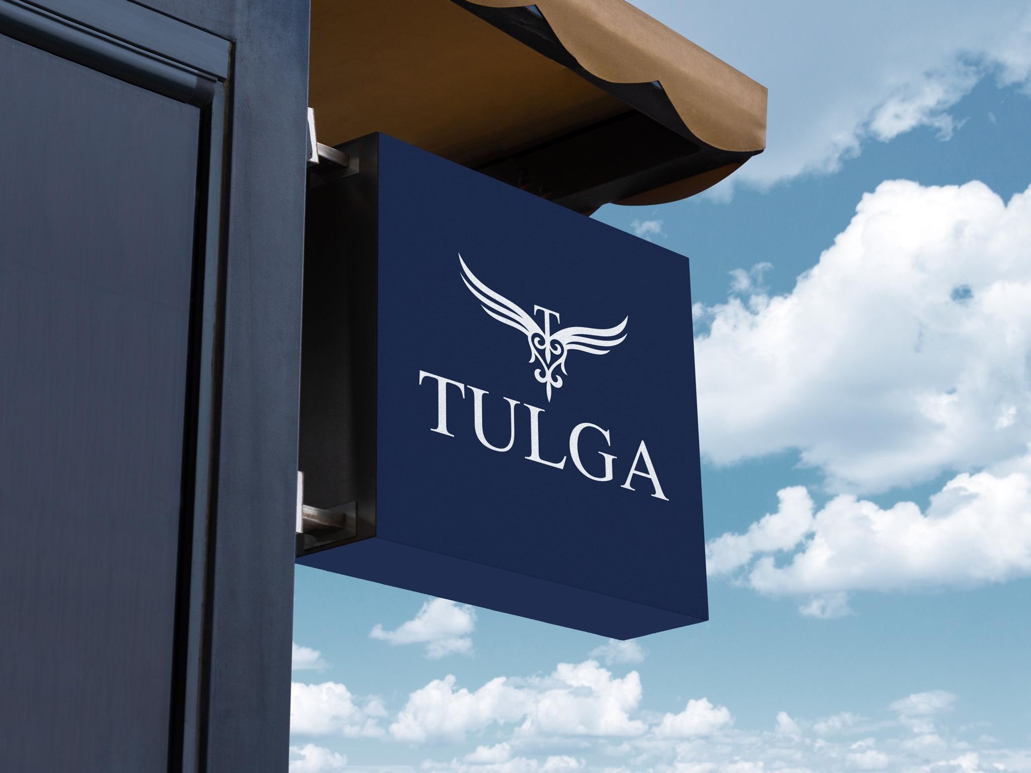
We started with the meaning of the name «Tulga»—individuality, freedom, and striving upward. That idea became the core symbol: the wing.
We placed a Kazakh ornament element at the center of the wing—not as decoration on top, but as part of the mark’s structure.
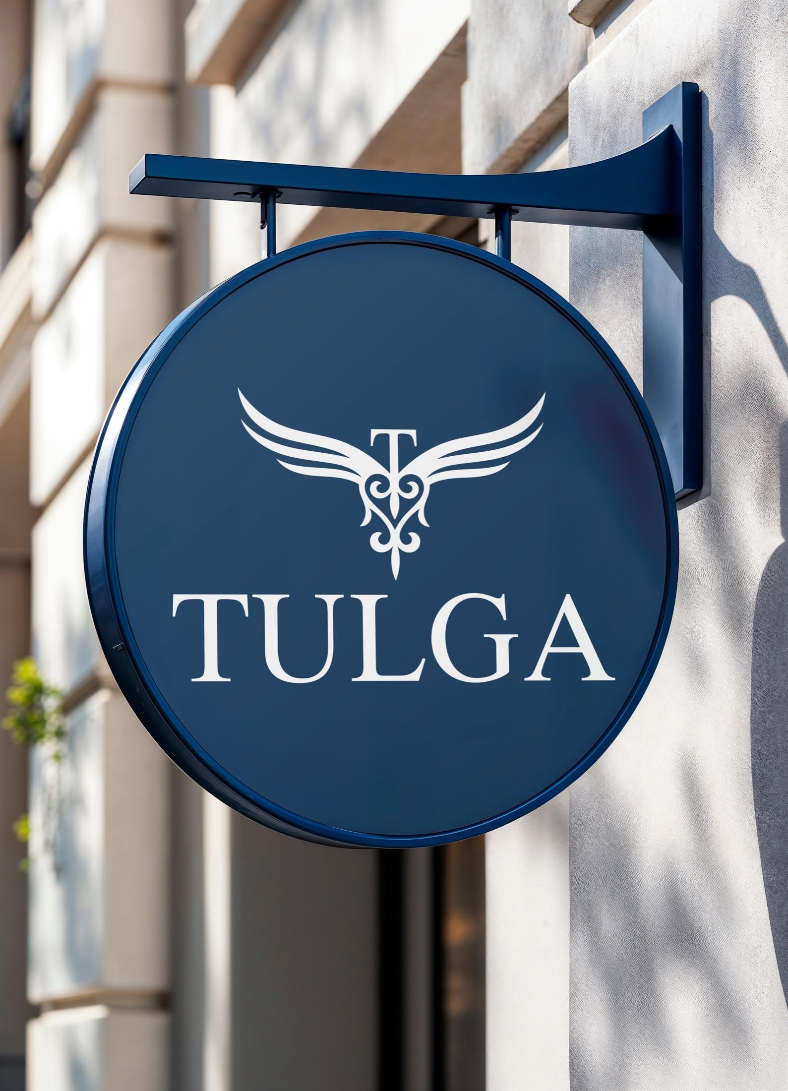

Deep blue and restrained typography reinforce TULGA’s gravitas—the precision and trust you expect from a watch brand.

The result brings together the meaning of TULGA, national spirit, and a contemporary tone. What we value here is that every line has a reason—and the mark carries a clear idea.