All projects
Soft color, bold character
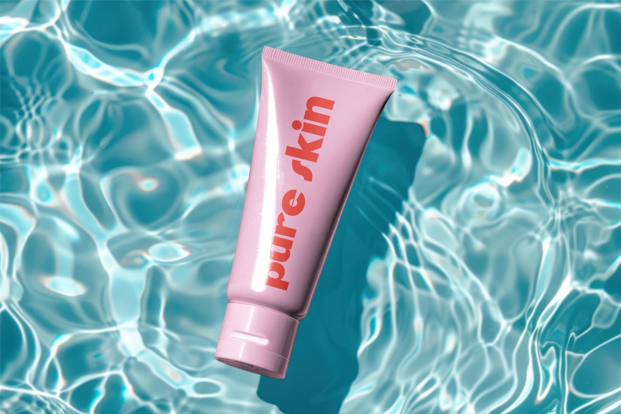
PURE SKIN is a contemporary cosmetics brand. Here, the goal was packaging without extra noise—still clear and noticeable at a glance.
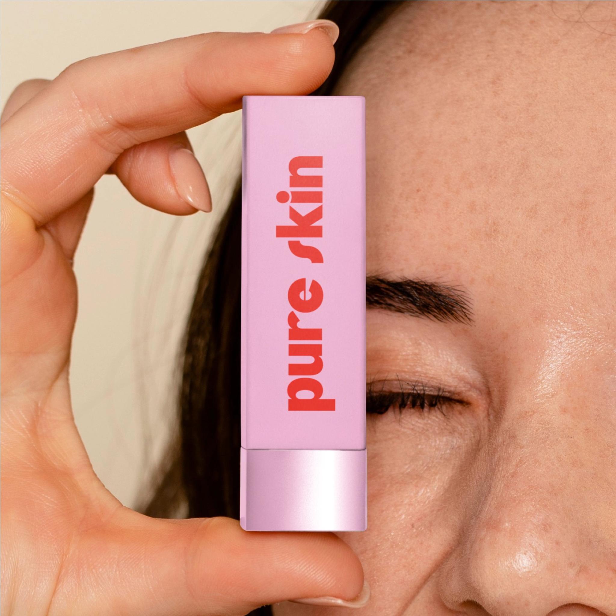
The direction is minimalism, delicate color, and bold type. Light pink brings softness; saturated red lettering adds a sharp accent.
Packaging had to work not only on its own, but together with product shades, colors, and textures—as one visual impression.
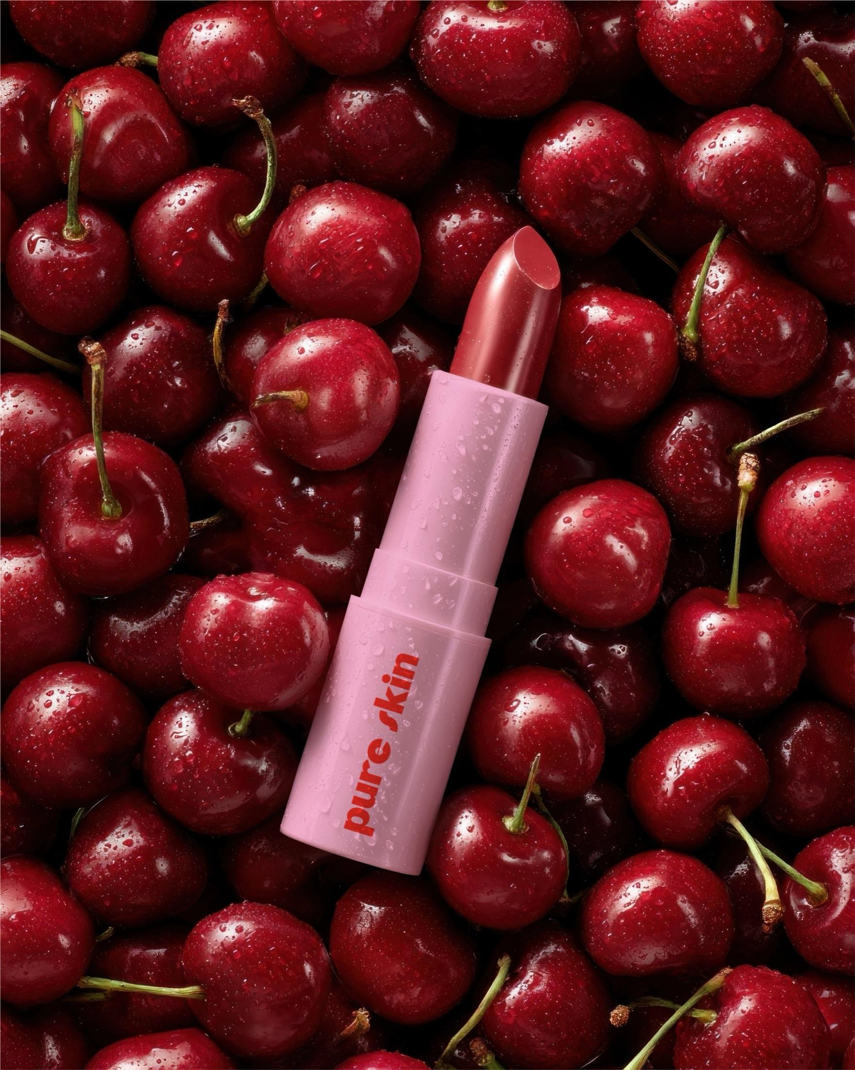
In the visuals we used cherry and deeper red tones so the product itself becomes the center of the composition.
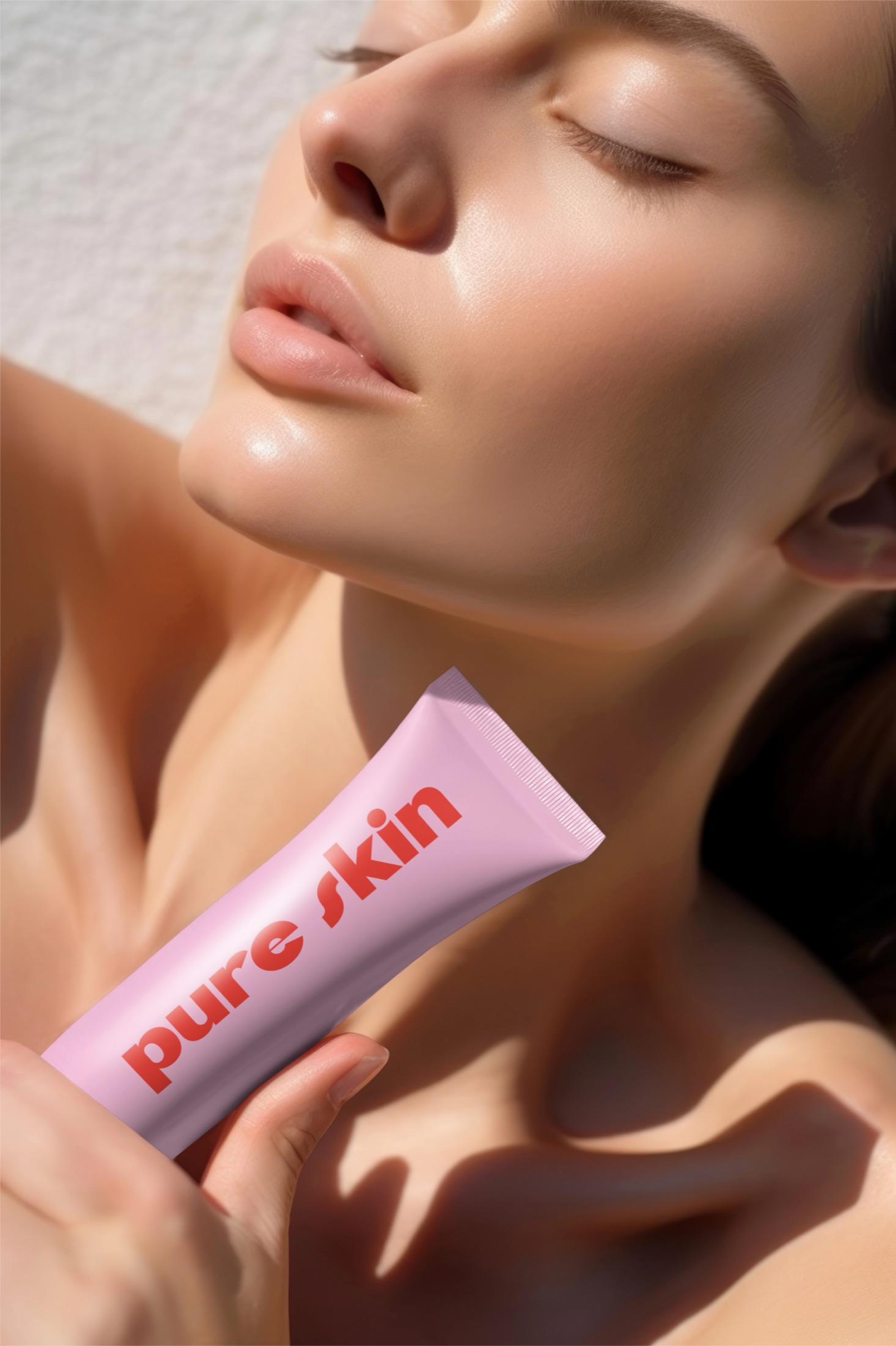
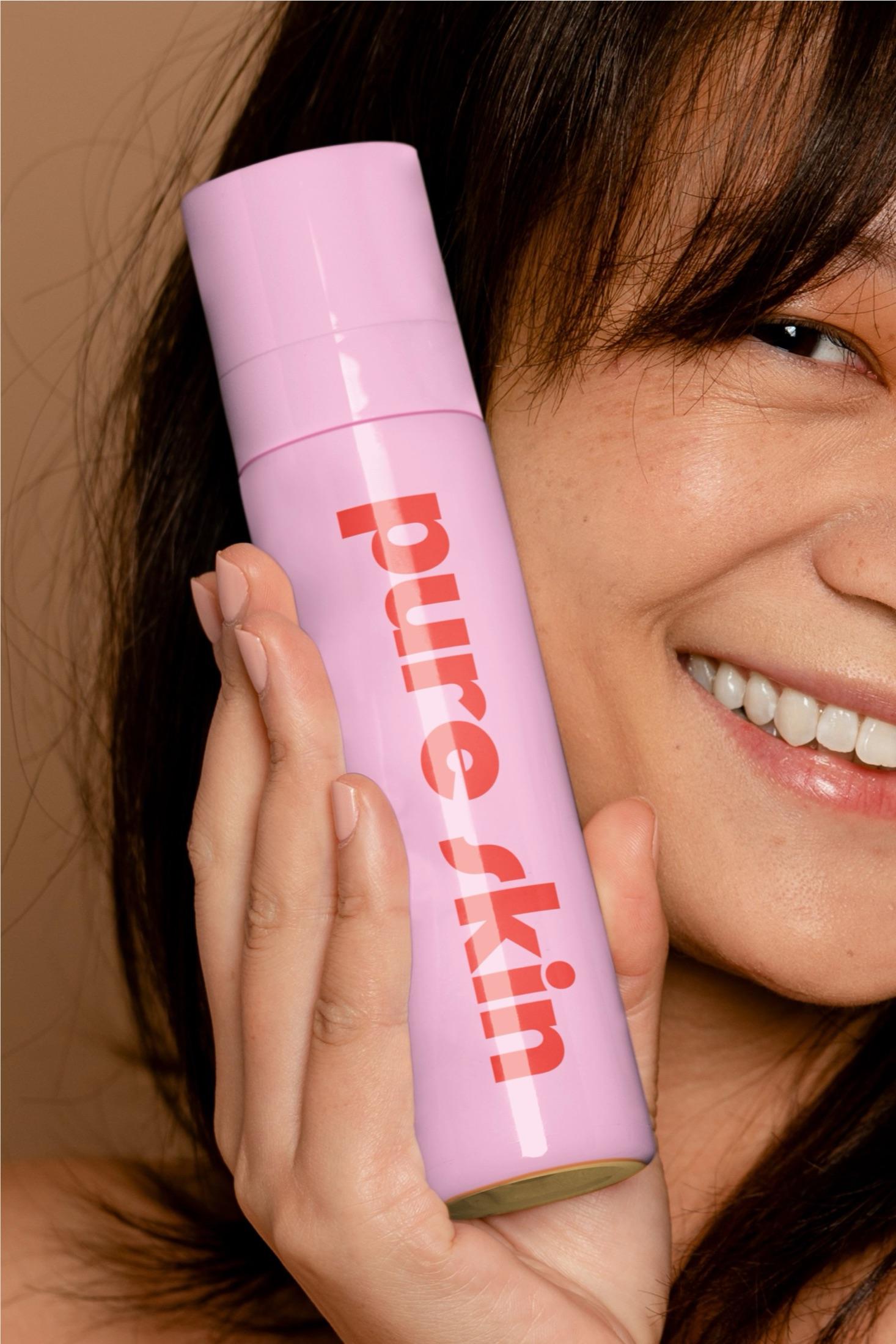
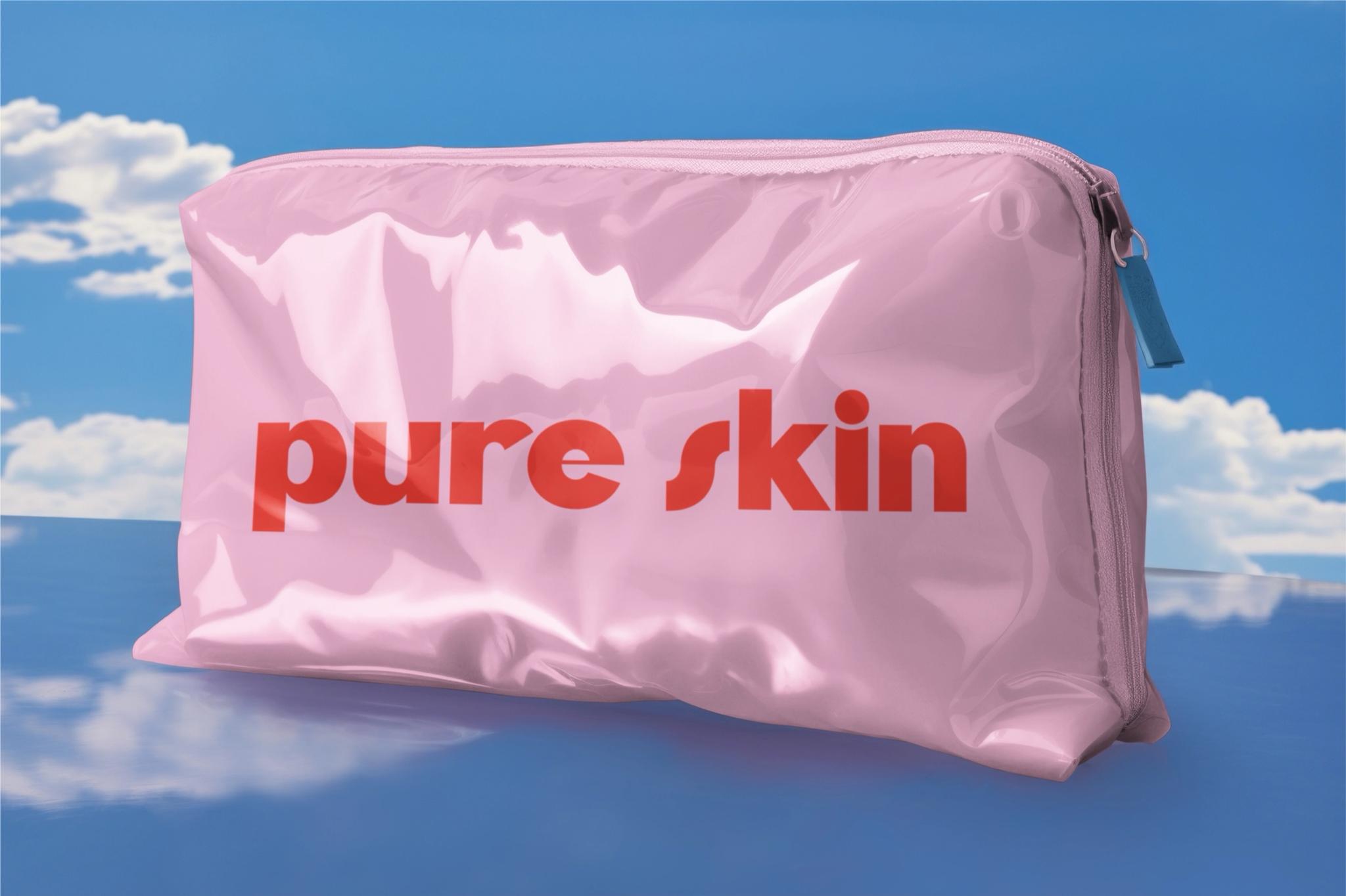
The result is simple form, balanced color, and contemporary typography—a packaging system for PURE SKIN that feels soft yet clearly defined.