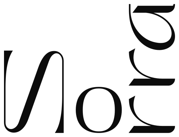

A balance of delicacy and refinement
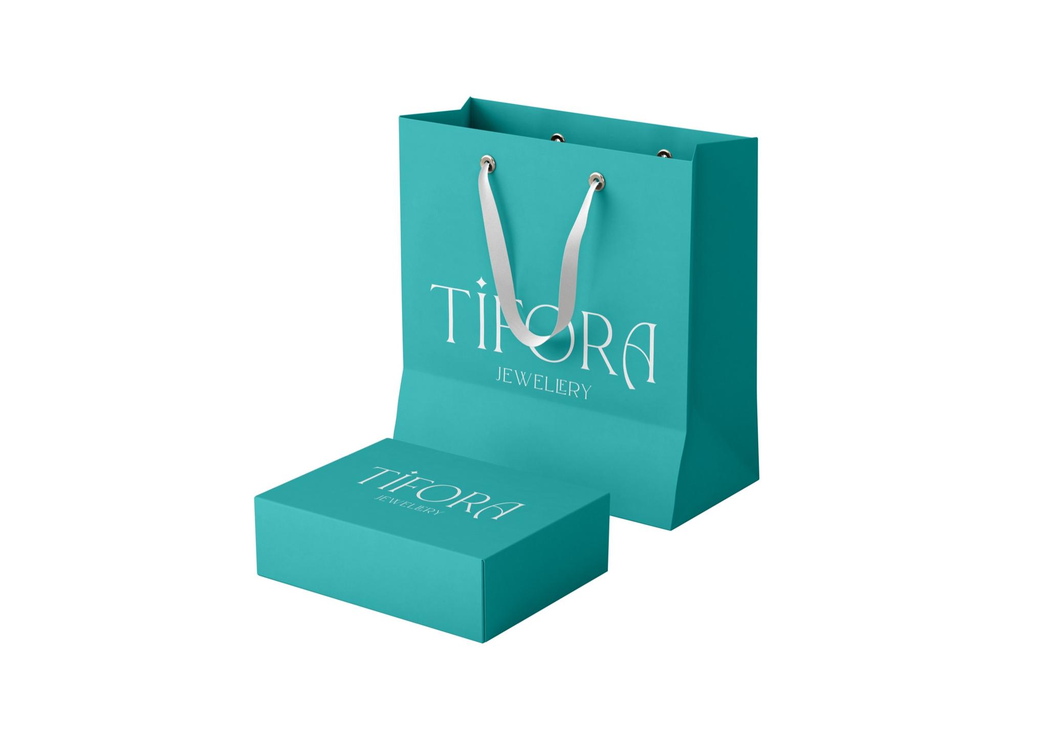
TIFORA is a jewelry brand. The goal was to keep the mark simple while combining delicacy with a premium aesthetic and a distinctive character.
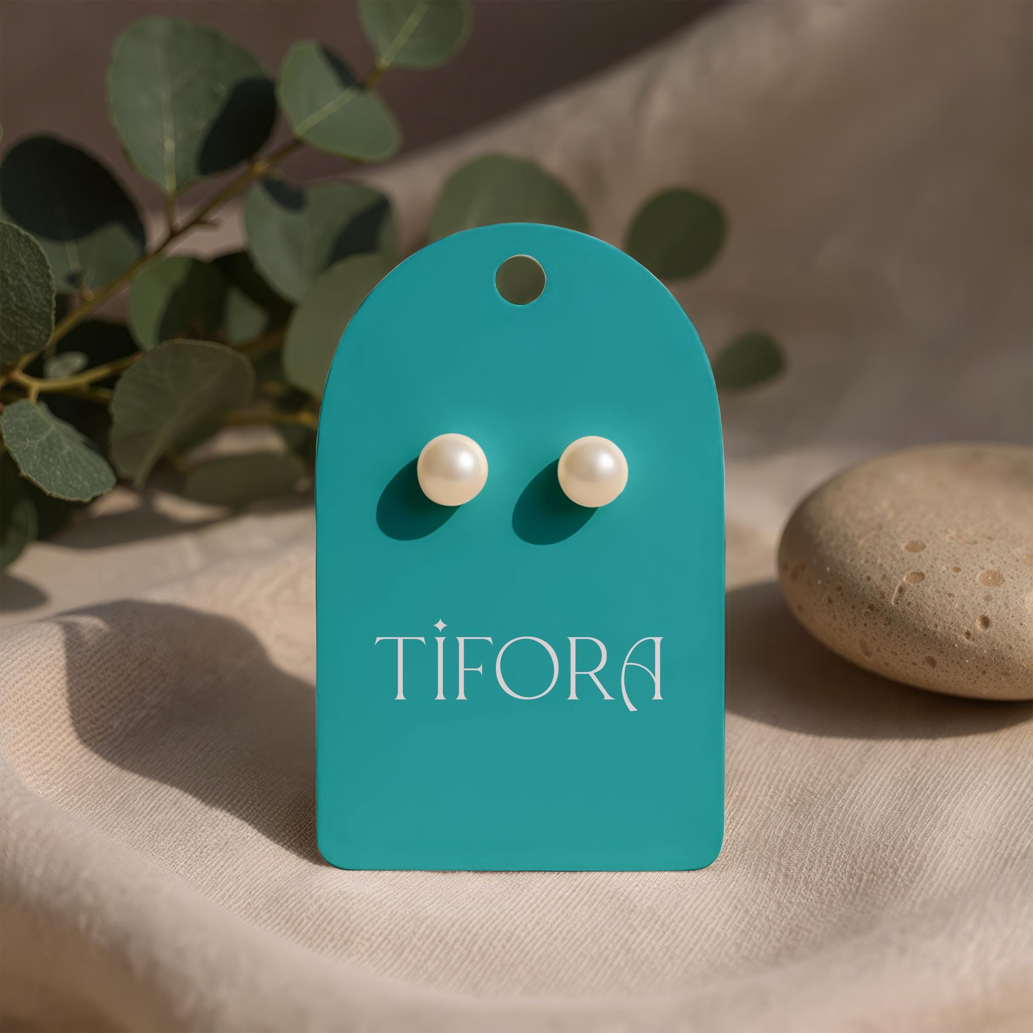
The main focus is typography. Thin, elongated letterforms bring lightness and a refined tone to the brand.
A small star above the “i” adds a delicate accent that recalls jewelry sparkle. The distinctive final “A” gives the wordmark its individuality.
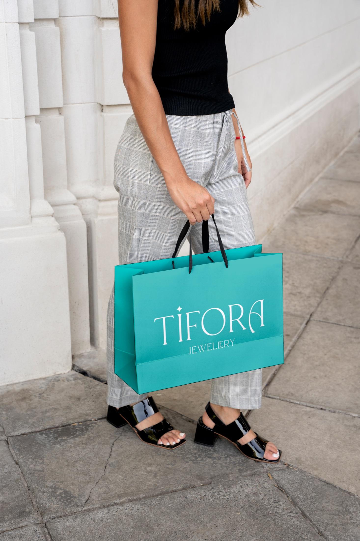
Instead of conventional black and gold, we chose saturated blue. Paired with light typography, it gives the brand a fresher, more contemporary character.
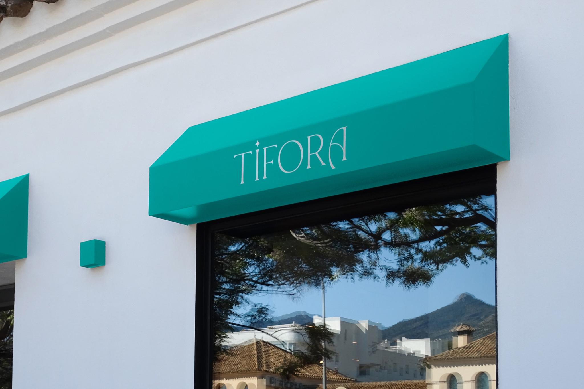
Without extra graphics, character comes through letterform and color. That restraint helps the mark stay clear on packaging and brand materials.
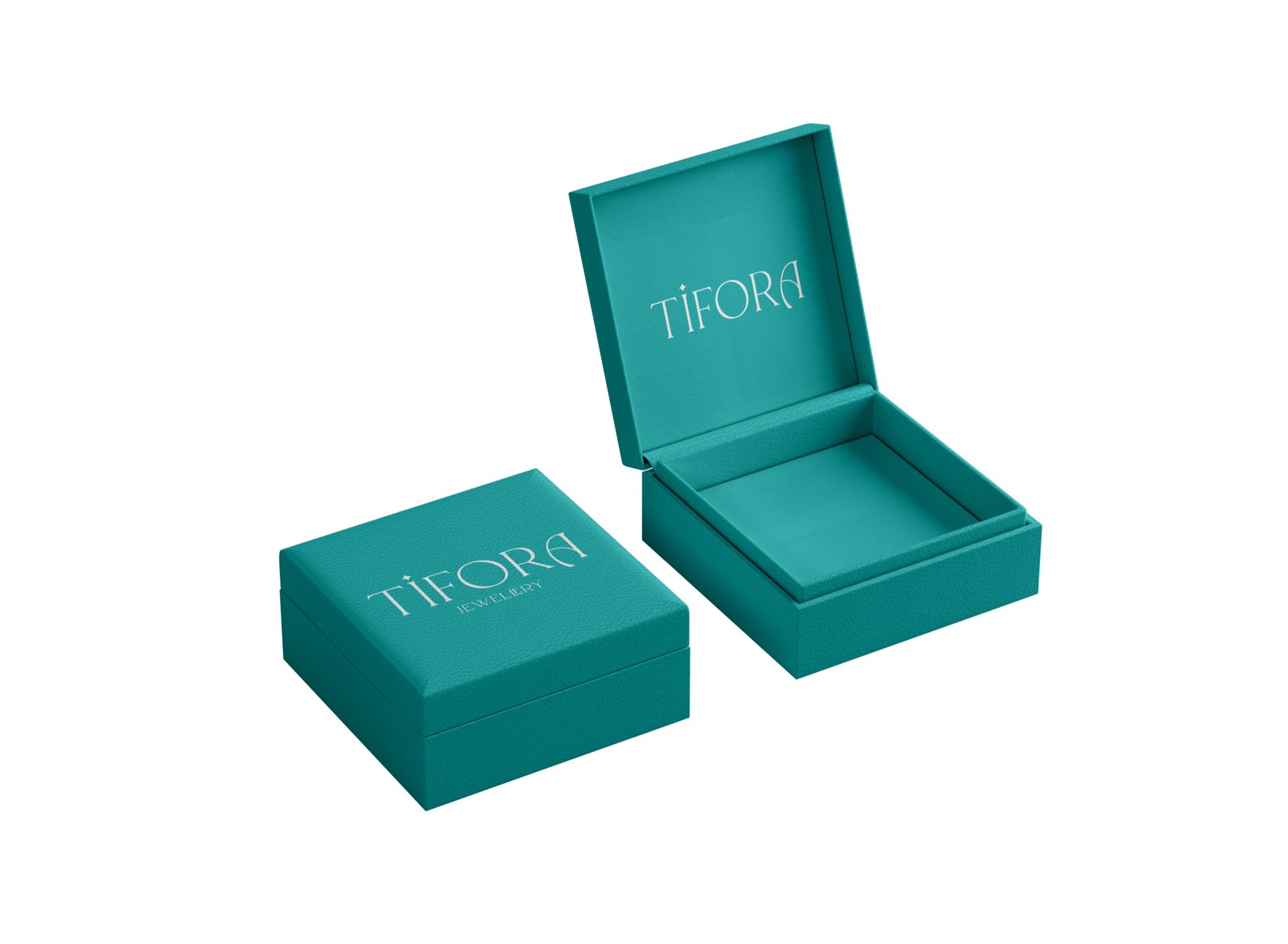
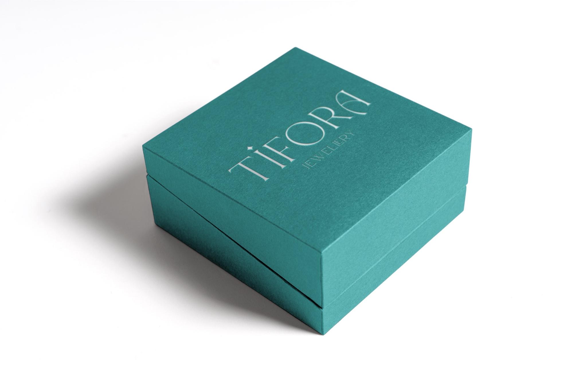
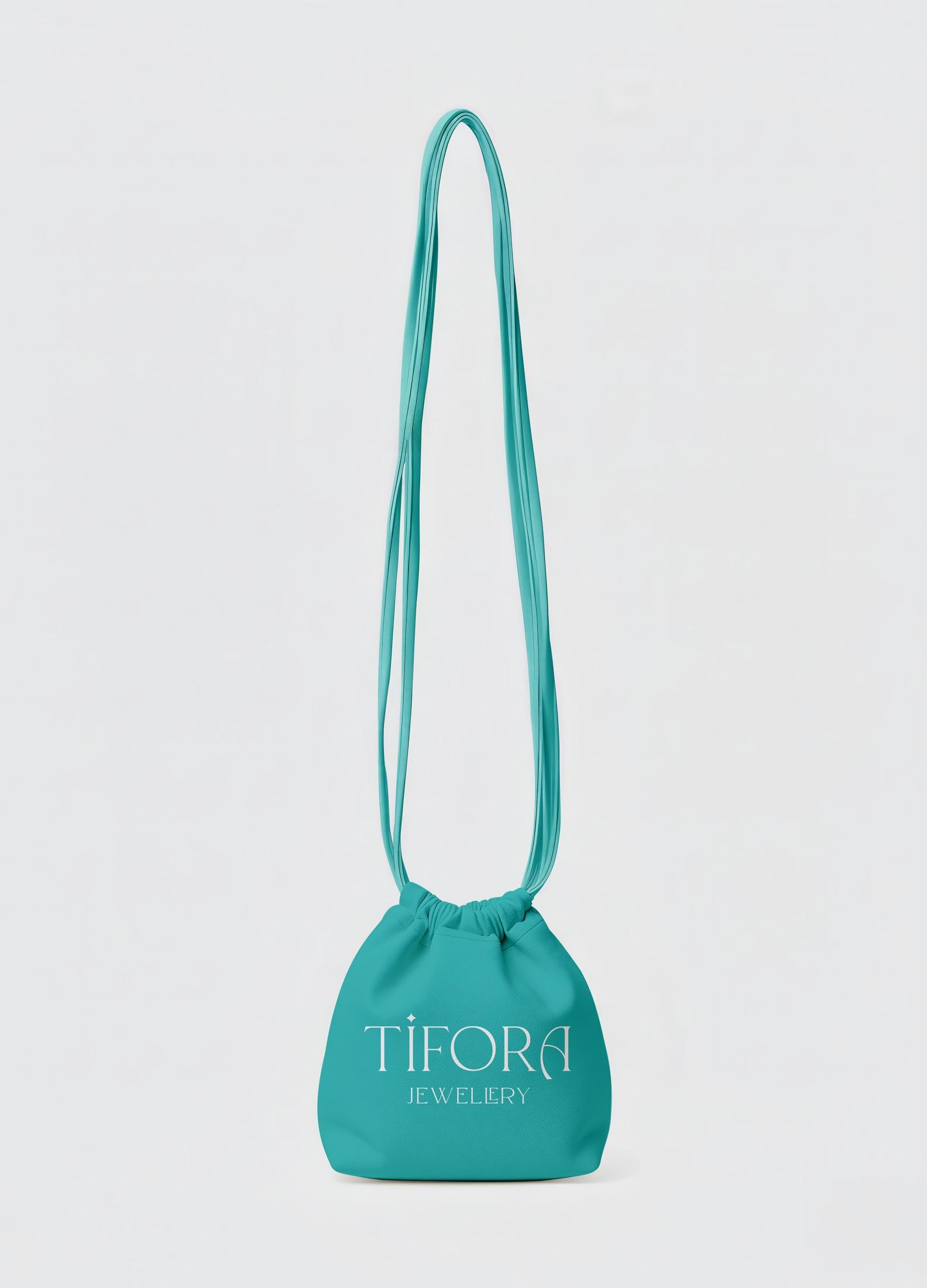
The result is a restrained mark with its own signature—aligned with the aesthetic of jewelry.