
A balance of simplicity and childlike warmth
ALA KIDS is a children’s clothing brand. The goal was to unite trust, simplicity, and childlike warmth in one identity.
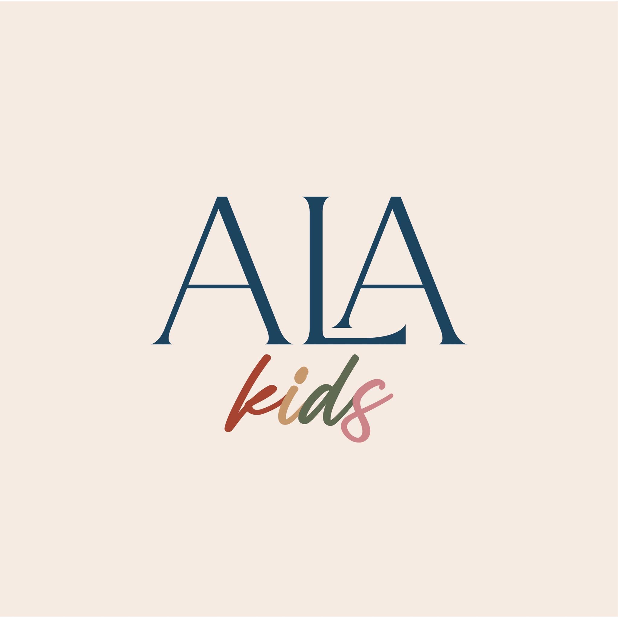
We stepped away from the idea that every children’s brand needs bright colors and toy-like symbols. The direction is restrained—trustworthy for parents, still close to children.
The main wordmark is a classic, clear ALA. Dark blue adds weight, stability, and reliability.
The word kids below uses freer, handwritten-style type. That softer voice balances the restraint of ALA and adds warmth.
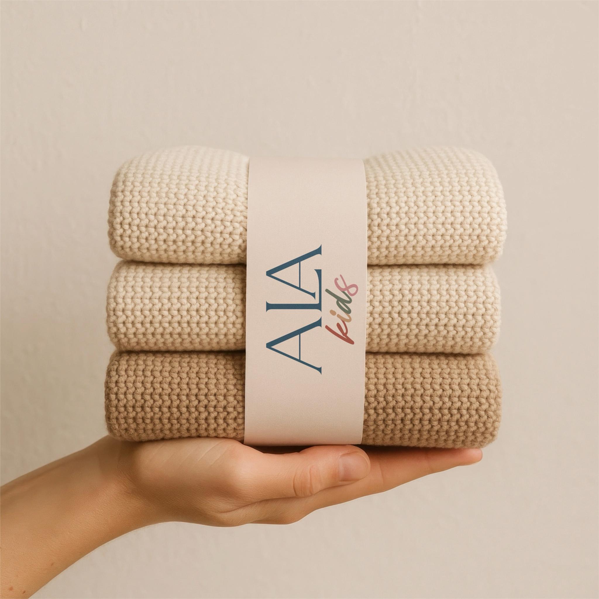
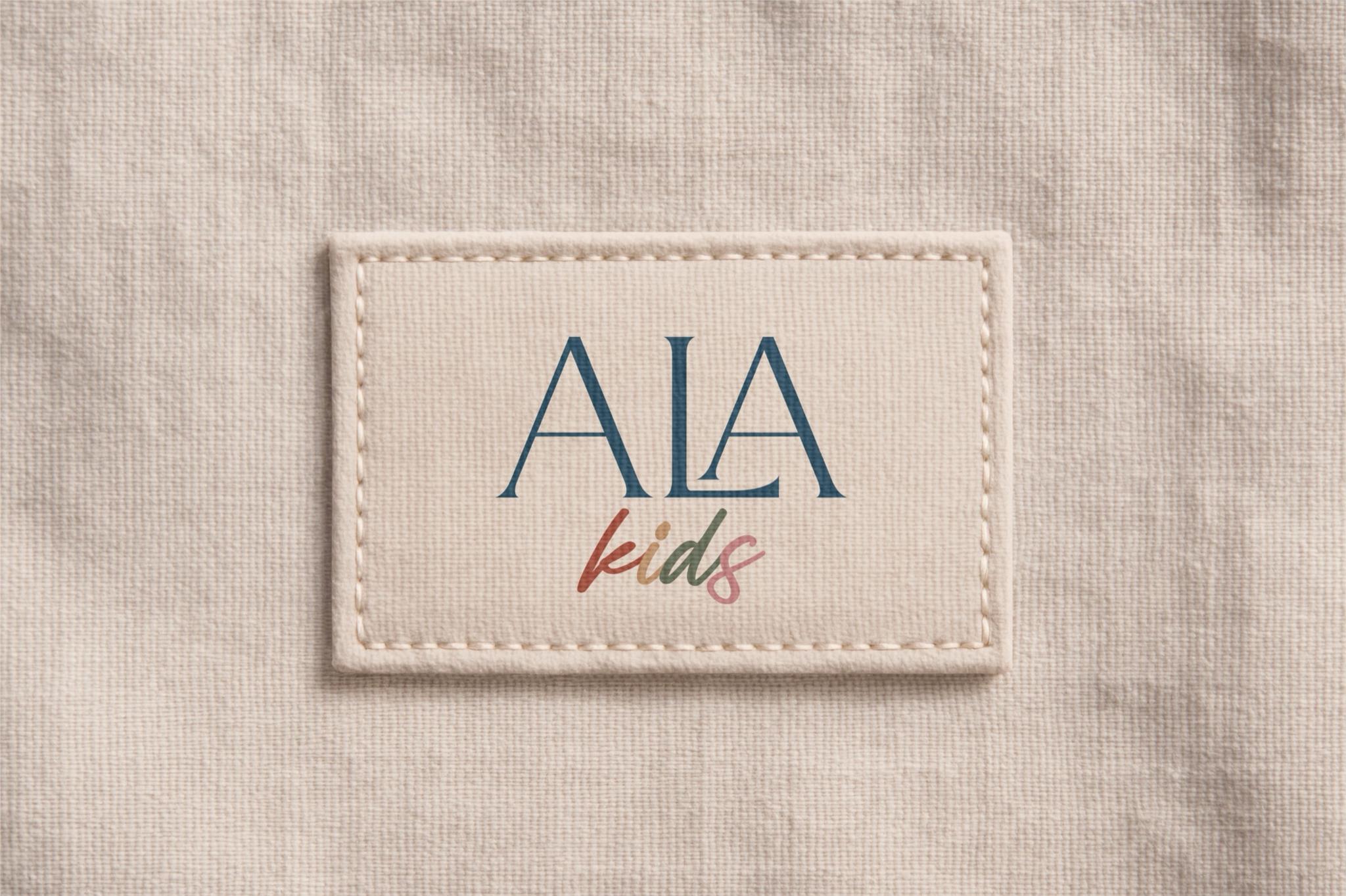
What matters here is two characters working side by side—order and trust for parents, freedom and softness for children.
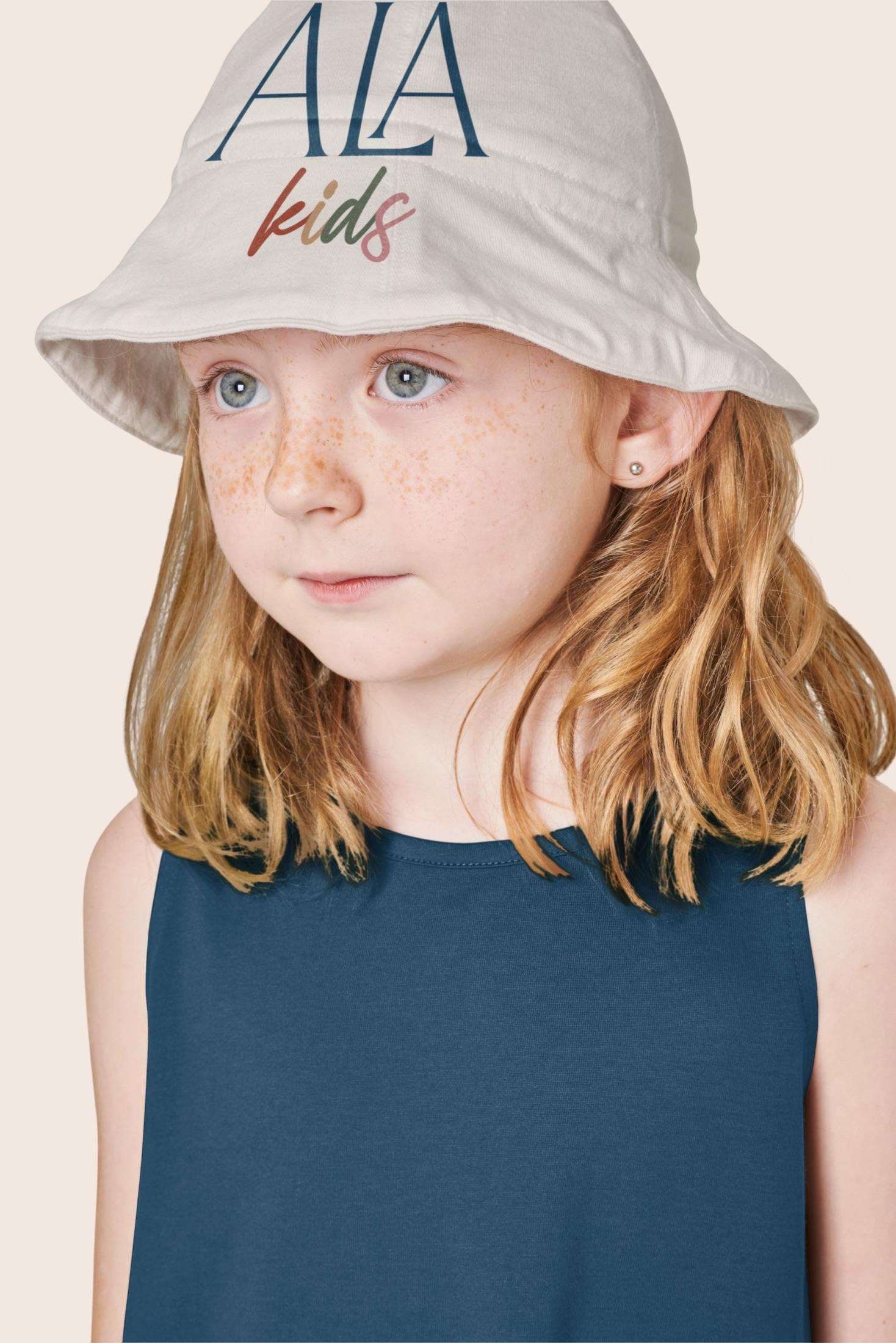
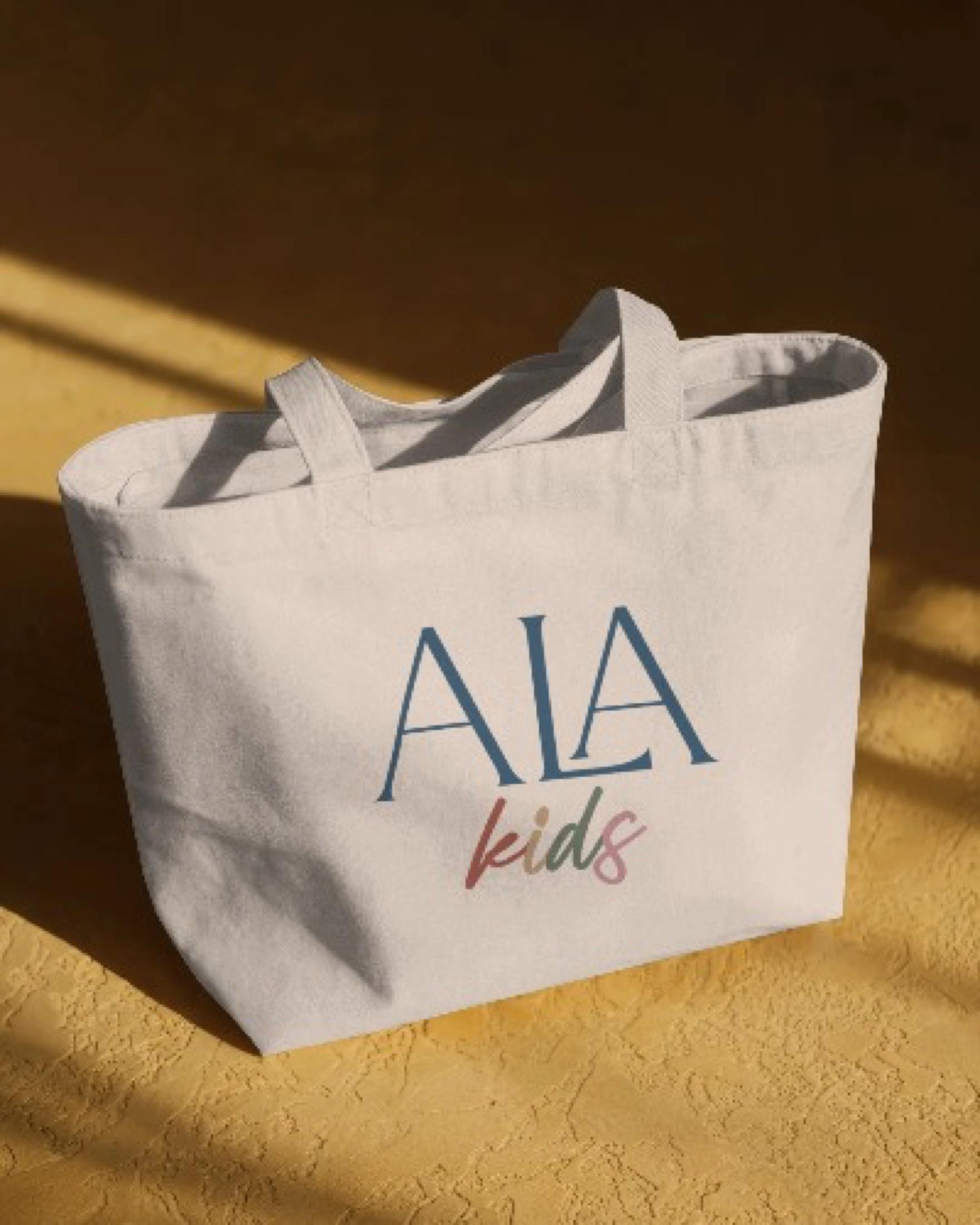
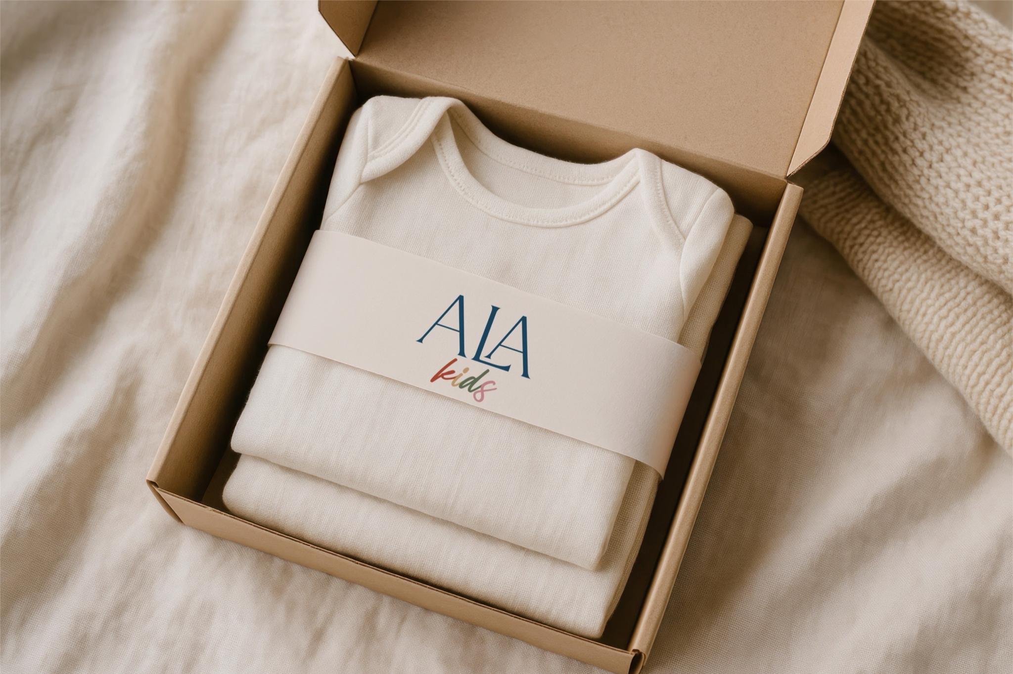
The result is a mark without unnecessary elements—distinctive, natural on clothing and packaging.