All projects
Feminine taste and a clear accent
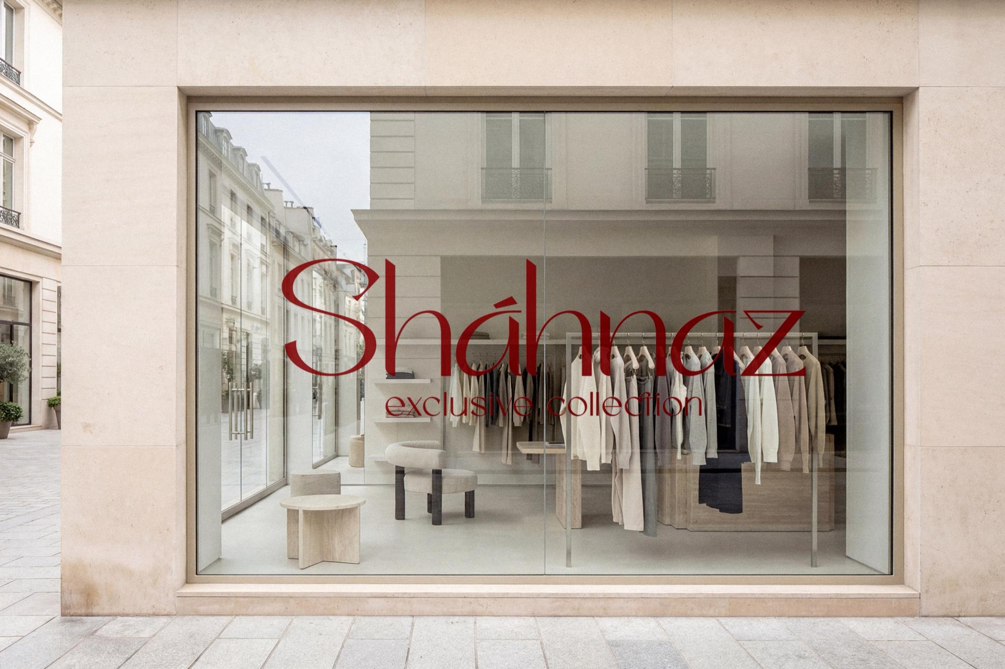
Sháhnaz is a personal brand for women. The goal was to build on the name—a mark that pairs delicacy with confidence and a clear accent.
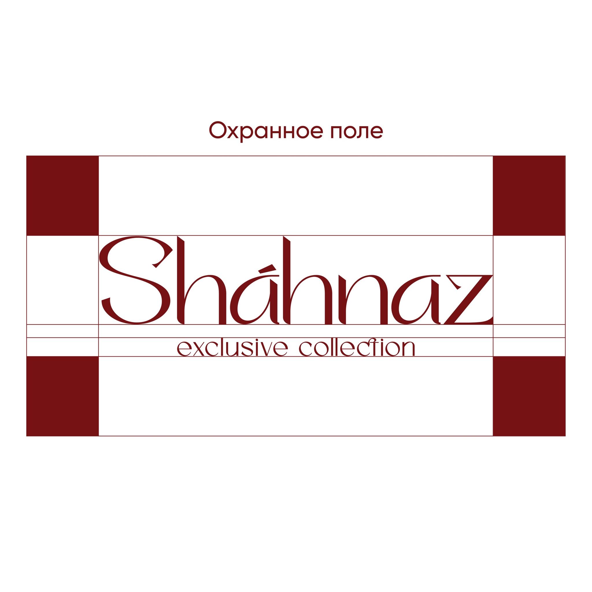
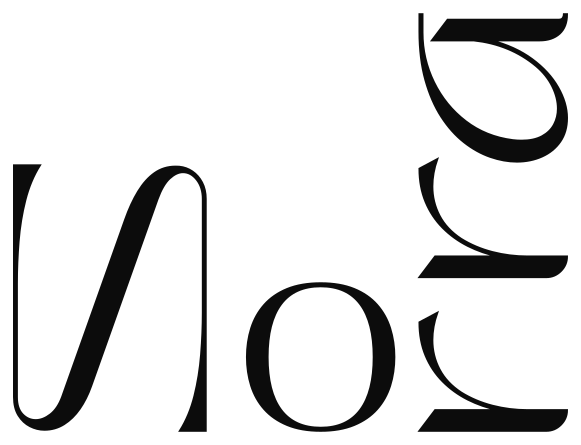
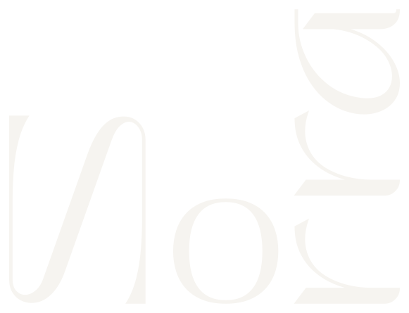
The primary solution is typography—light, elongated lettering that brings a feminine character and a restrained premium mood.
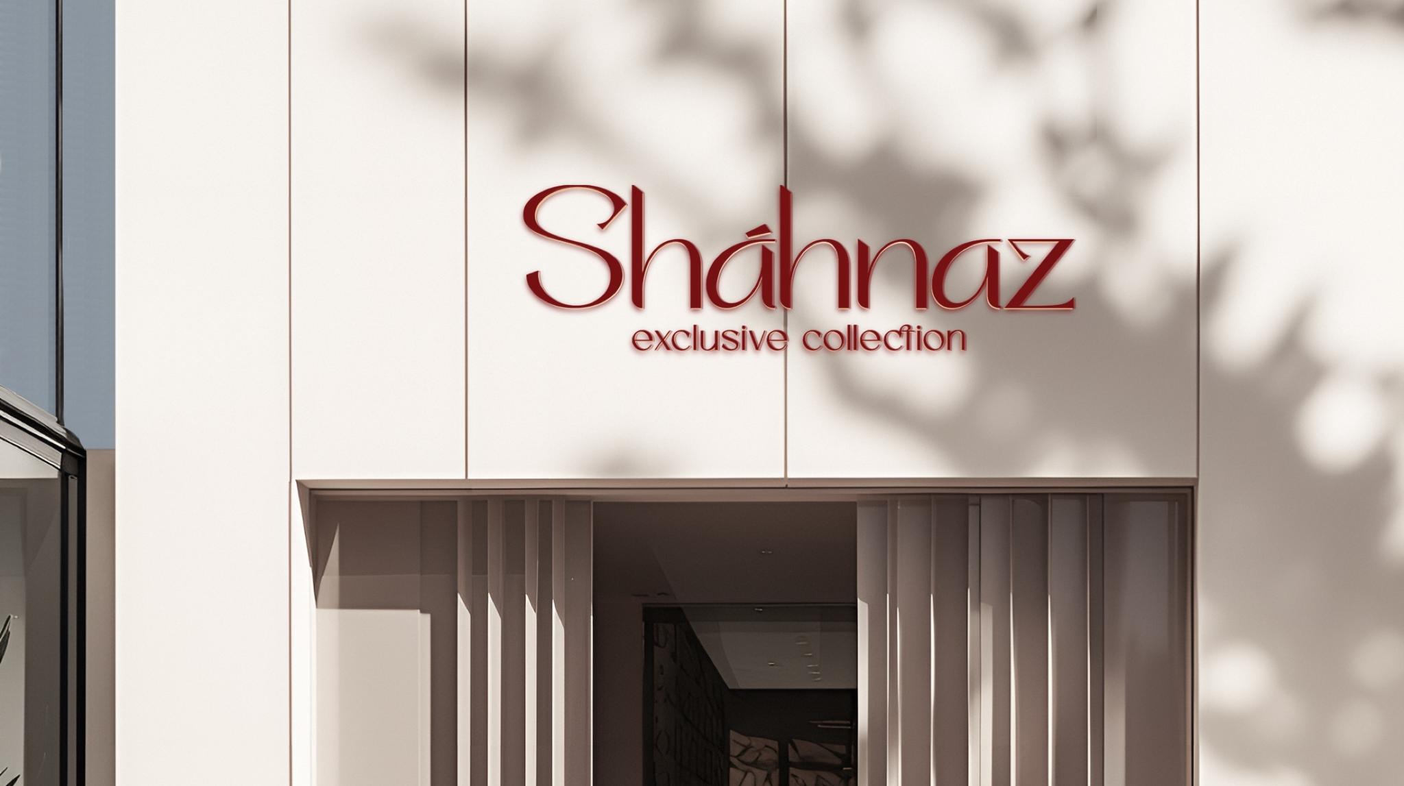
No extra symbols—the name is the device. The accent lives in the letterforms themselves.
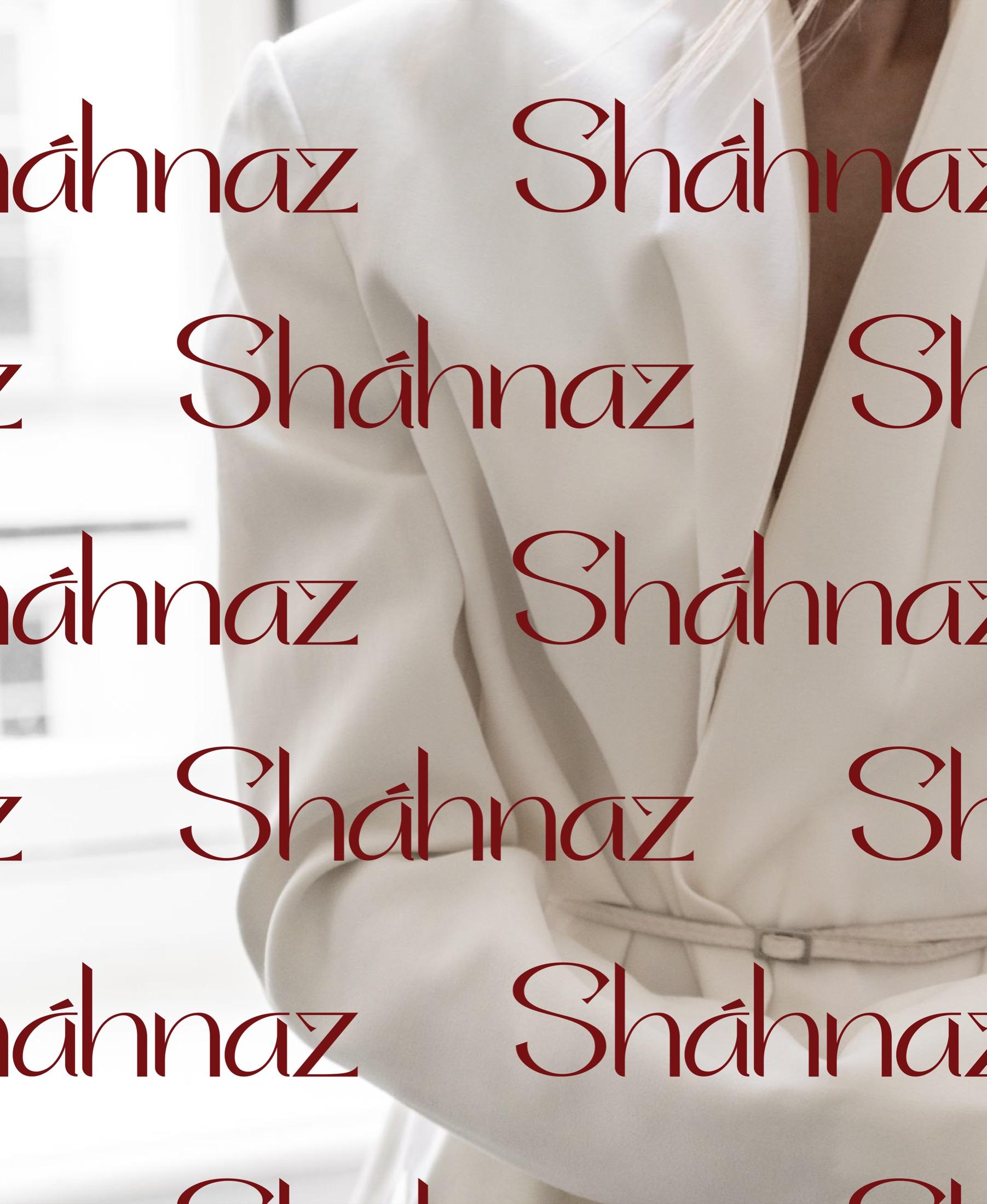
Dark red adds depth, restraint, and confidence. On a light ground the mark stays clear and expressive on carriers and packaging.
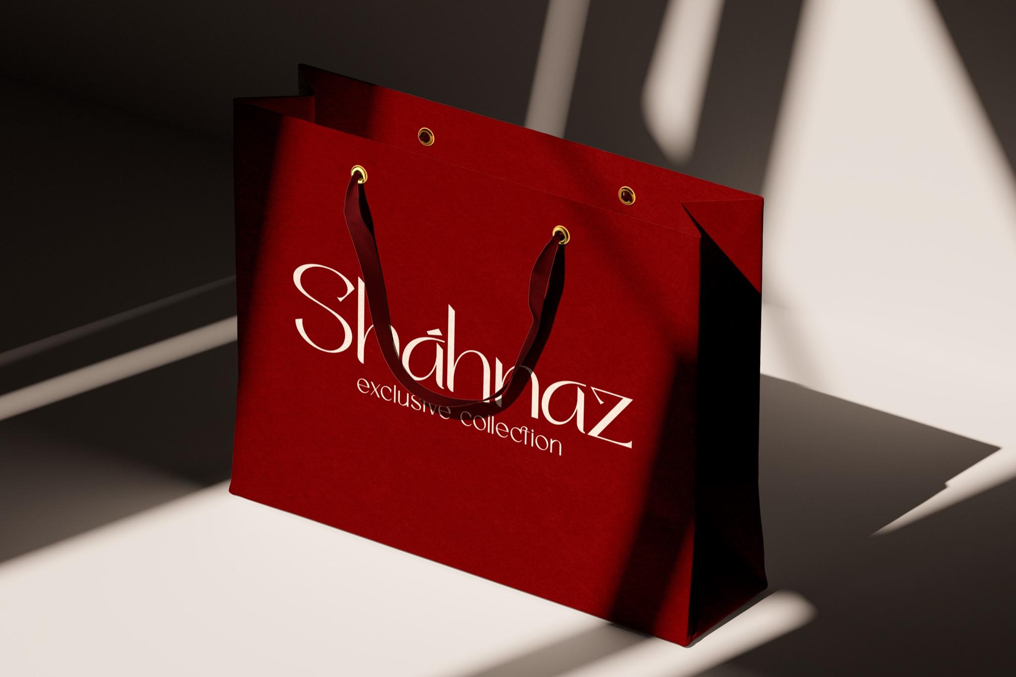
The line exclusive collection complements the name and clarifies the brand direction.
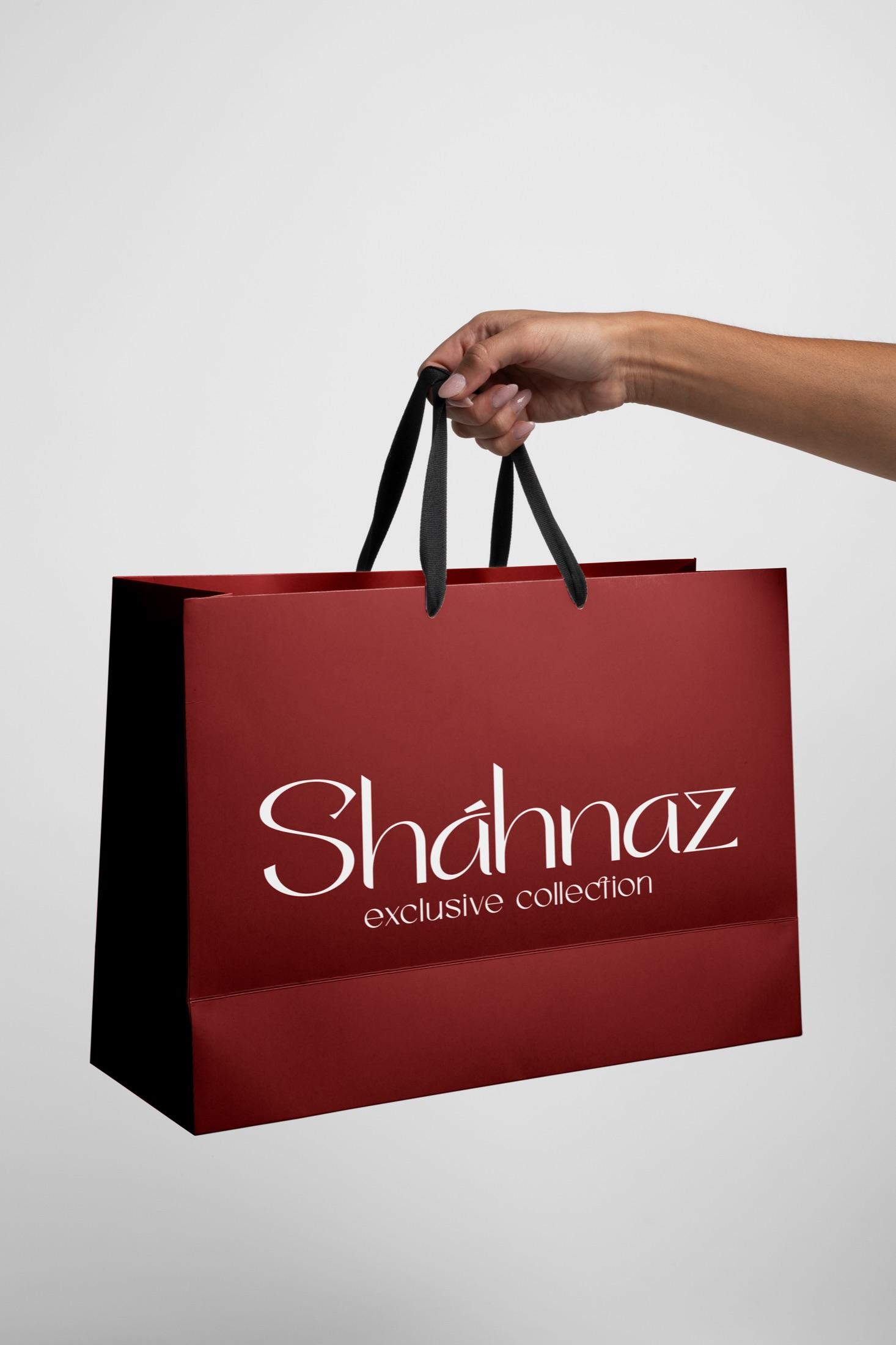
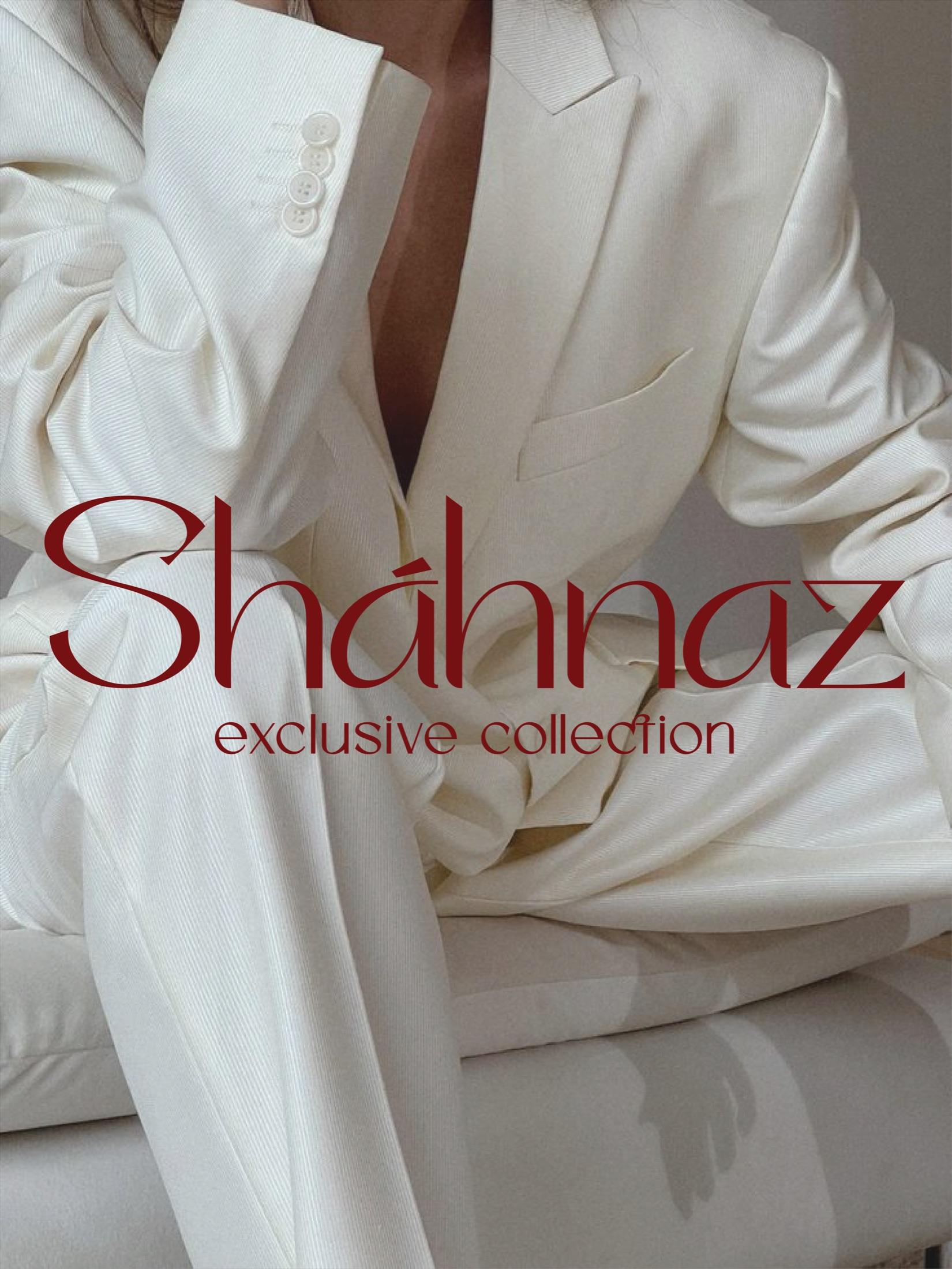
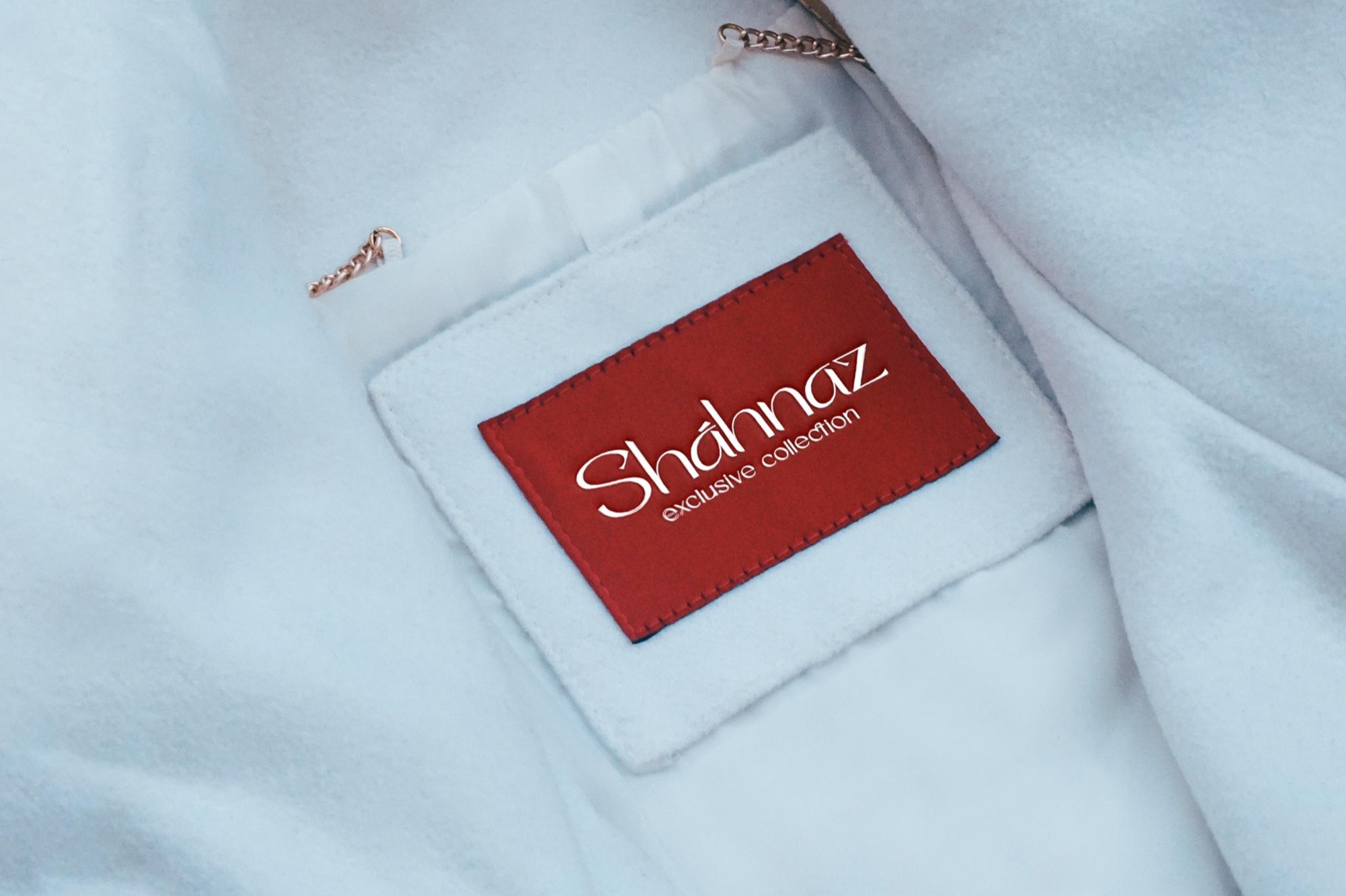
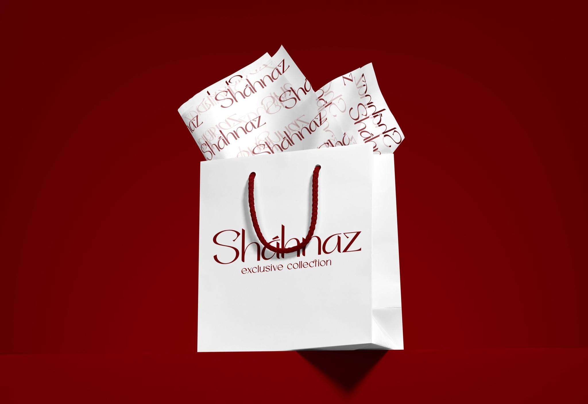
The result is a restrained, memorable mark that unites delicate aesthetics with a strong character.