A mark built on status and taste
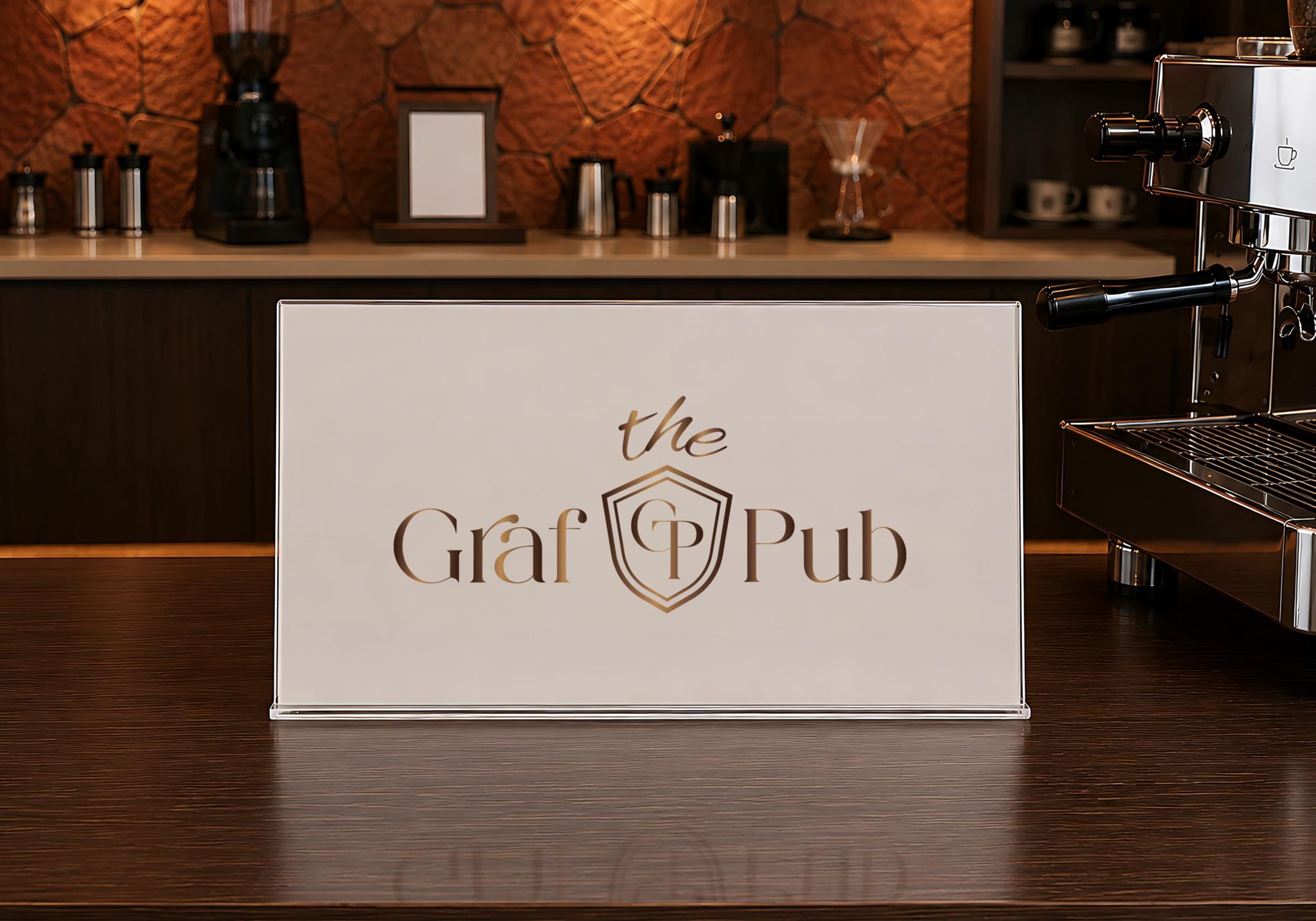
For The Graf Pub, the mark had to suit a premium bar—classic in tone and memorable. It needed to convey an atmosphere built on quality and style.
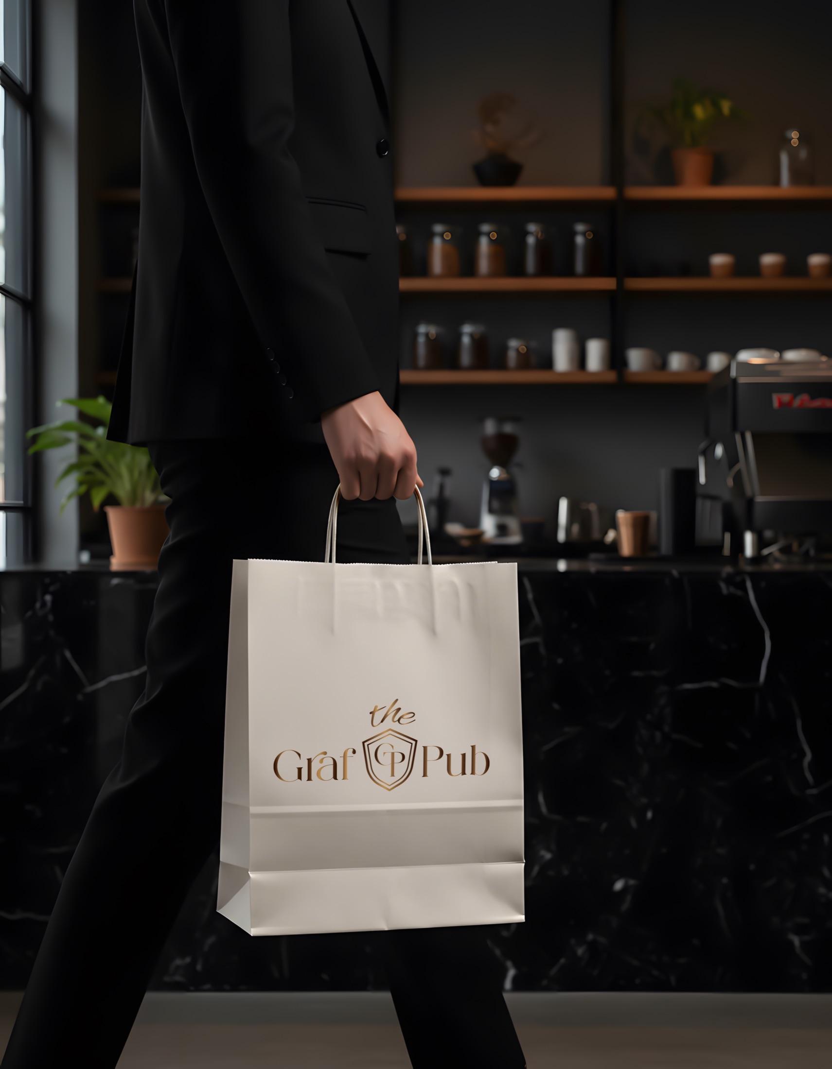
The goal was a mark with its own character—not a generic one. We built the composition as a monogram: letters from the name combined into a compact emblem.
The structure echoes a classic emblem. It adds weight and reinforces The Graf Pub’s composed, status-driven image.

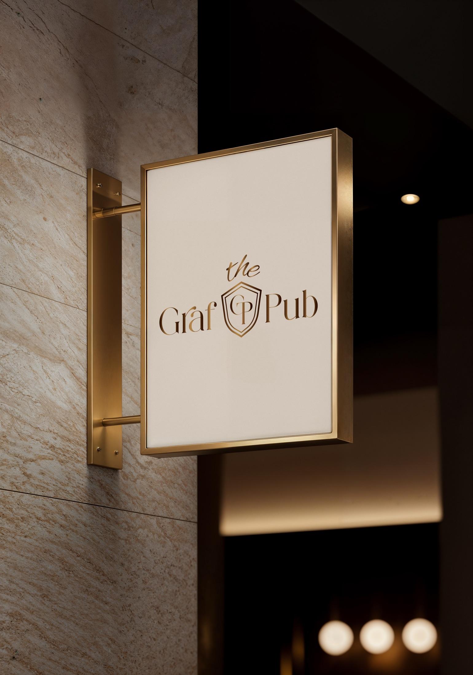
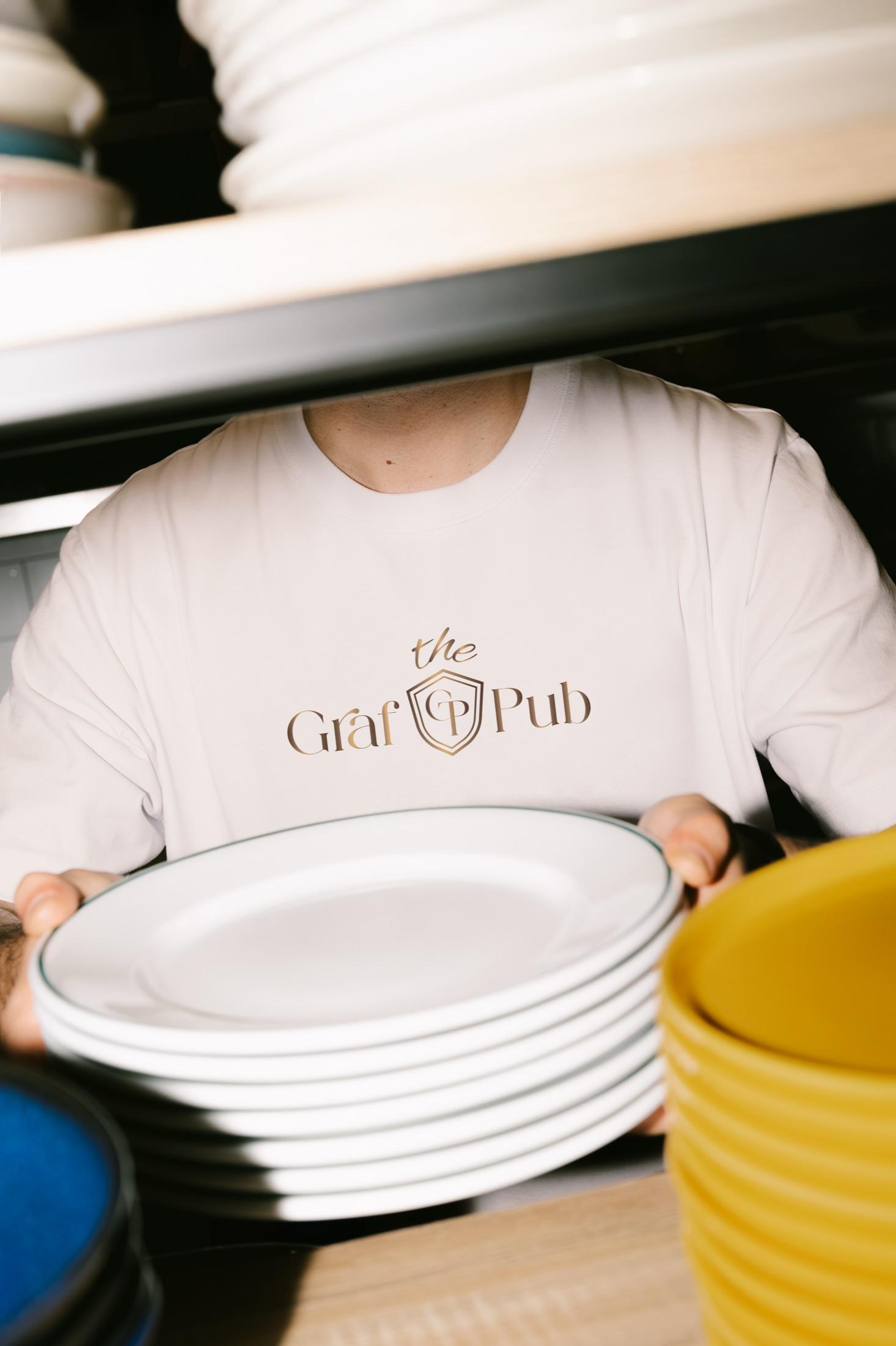
Typography keeps the same mood. The primary name brings elegance; the upper line lightens the mark and balances the rhythm of the composition.
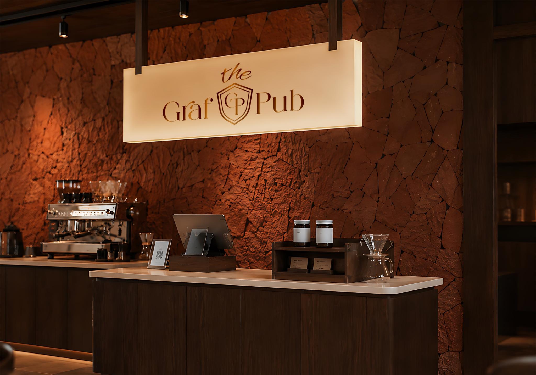
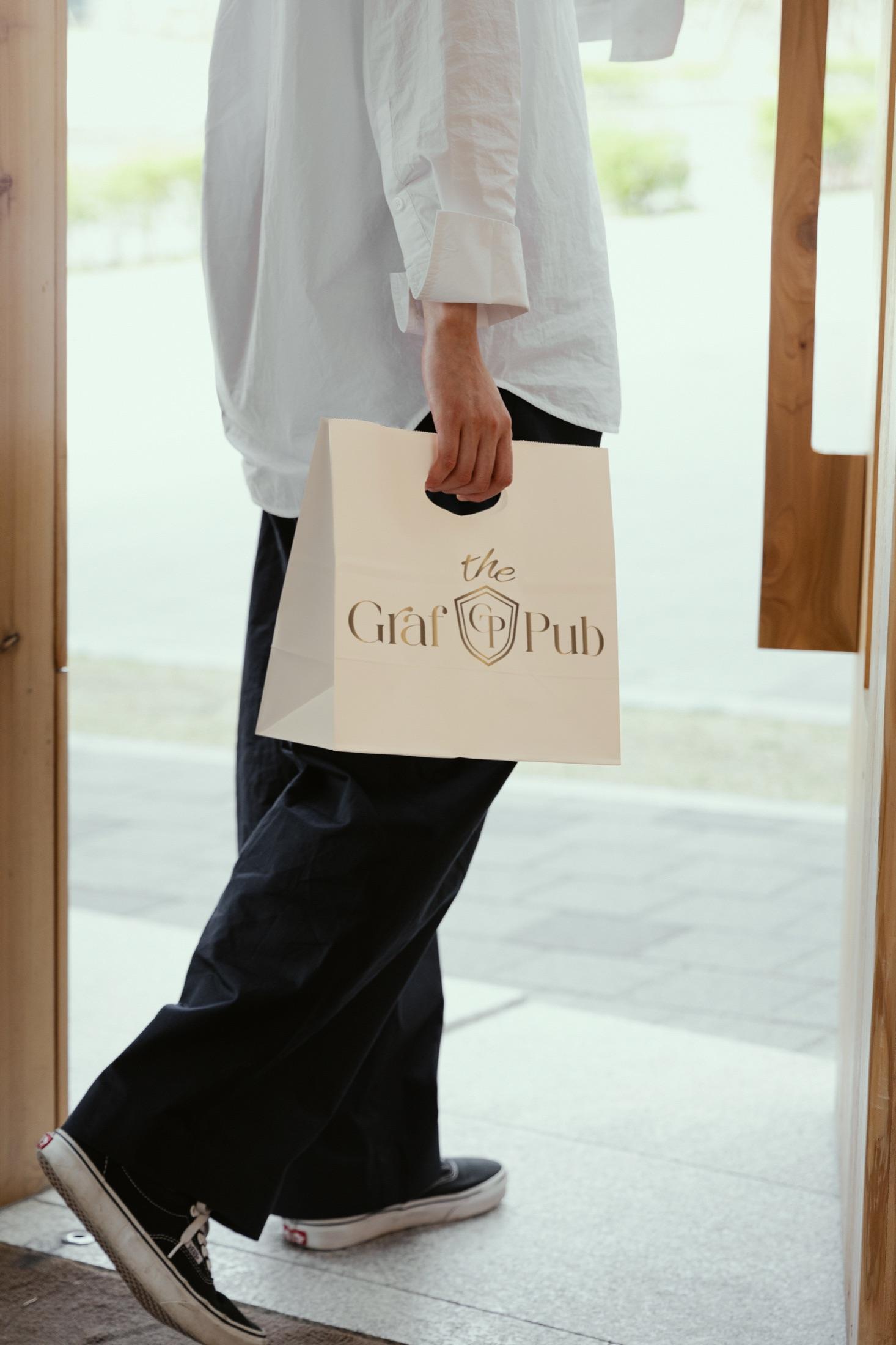
The result is a mark for The Graf Pub that isn’t overcomplicated yet carries its own weight and character. What matters here is style, status, and memorability working together in one composition.