
All projects
A warm mark with a national nuance
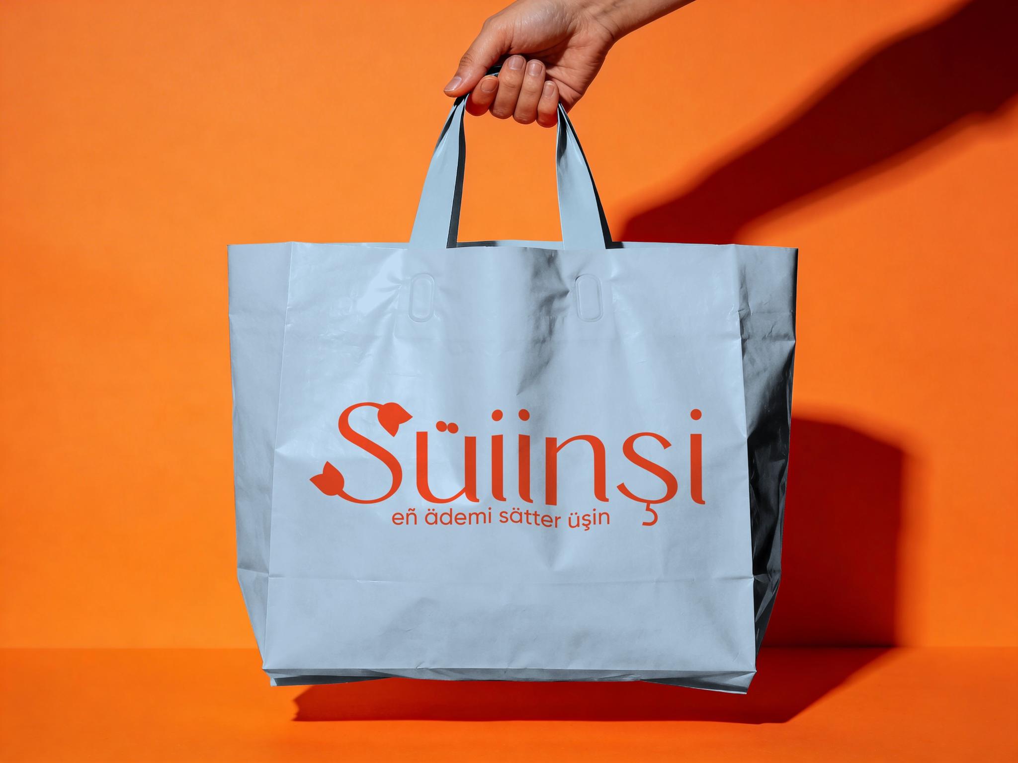
SÜIINŞI is a gift shop with a national-style direction. The goal was to keep minimalism while shaping a warm, distinctive mark with its own character.
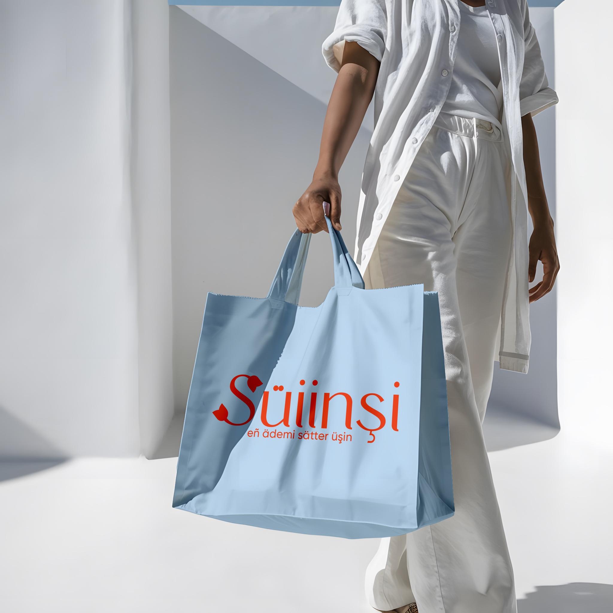
We needed something delicate, not visually empty. The base is clean typography, with the main accent carried by a single detail.
We integrated a floral element into the letter S. That small mark adds softness and memorability and naturally supports the brand’s gift-oriented, national mood.
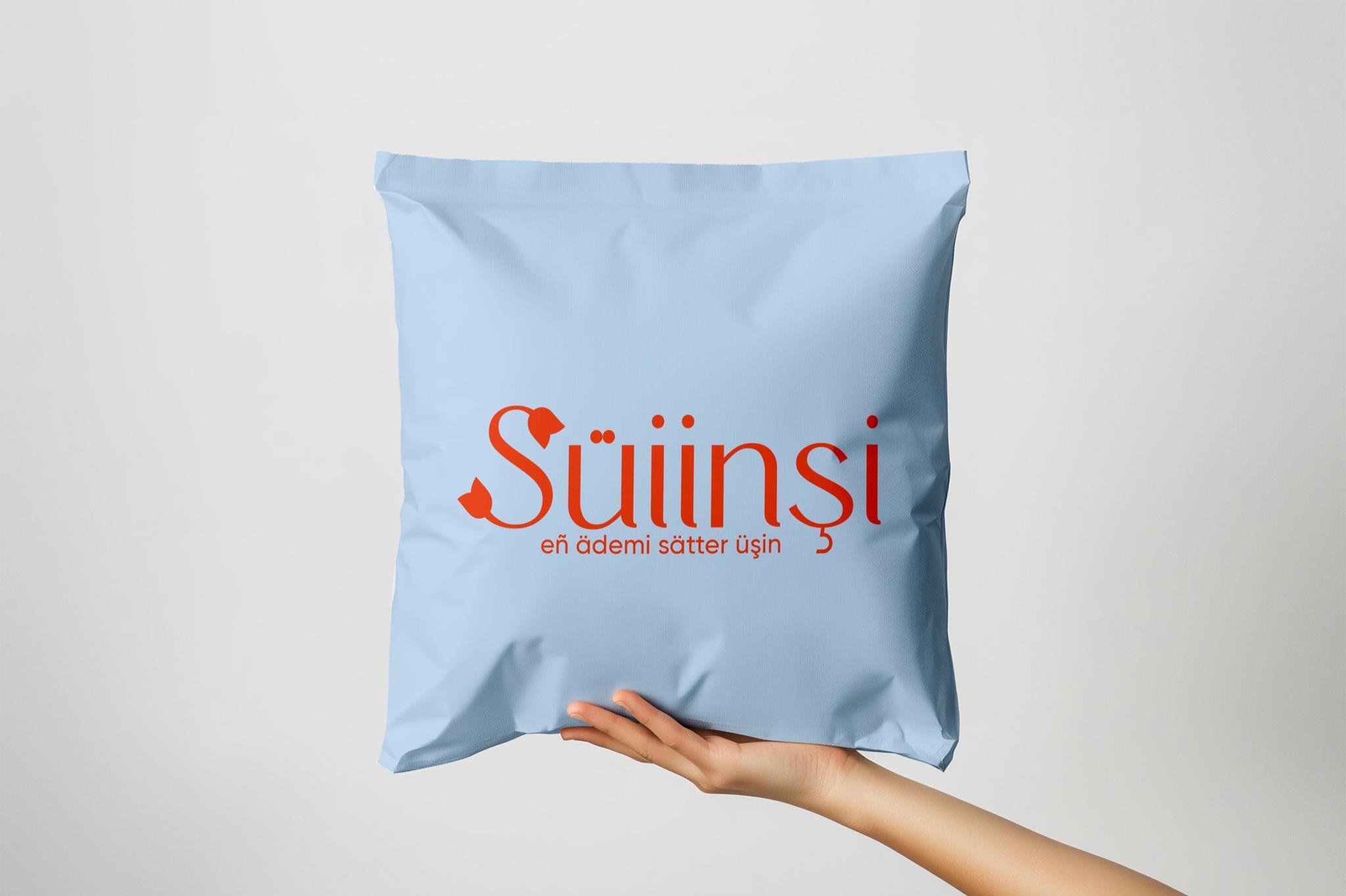
Color stays simple—a light ground and a clear accent—so the mark feels contemporary without losing warmth.
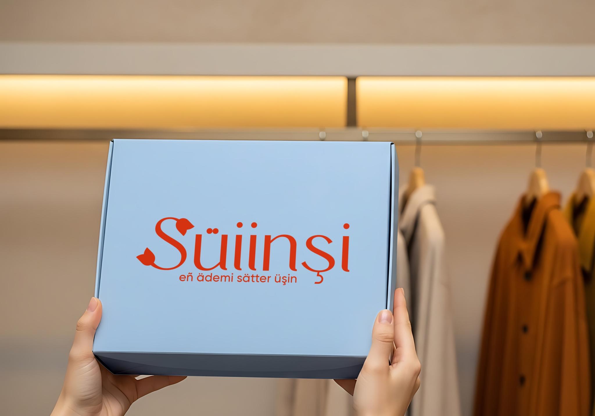
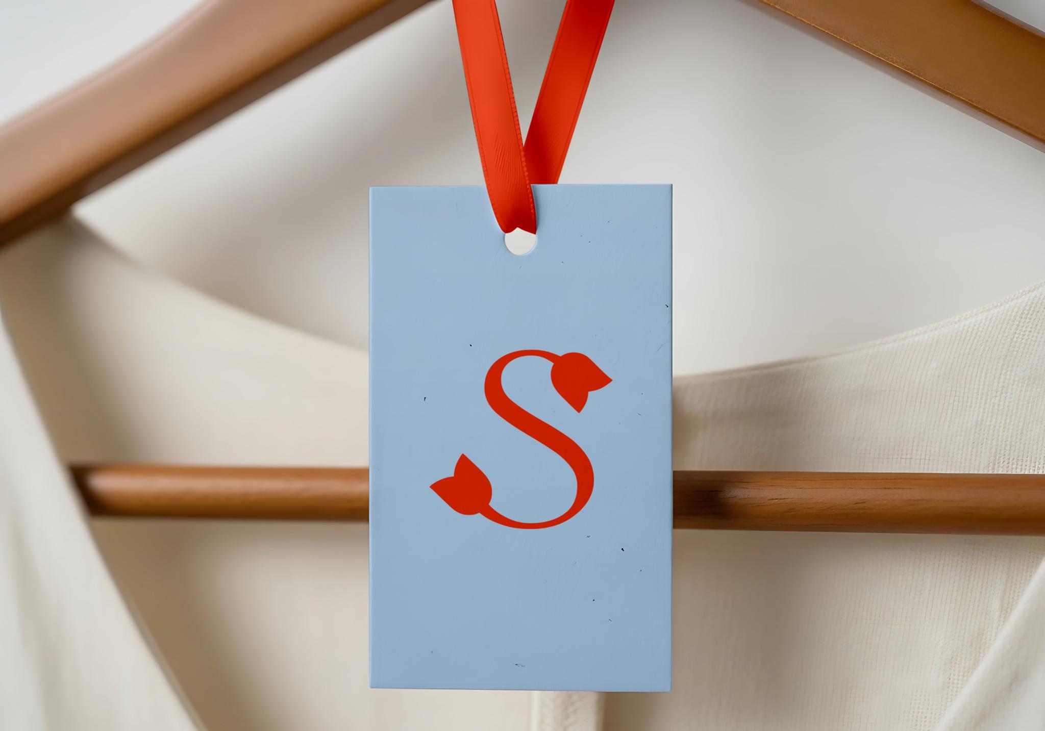
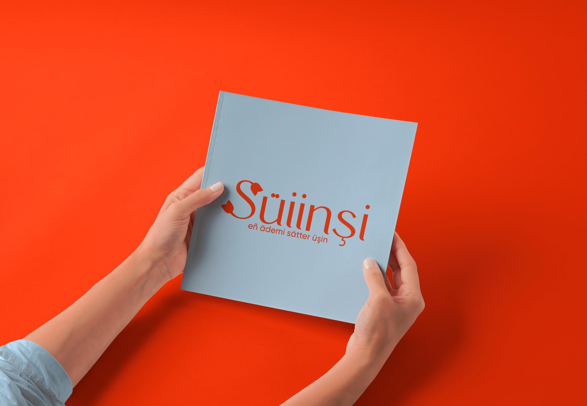
The result is an easy-to-read mark with character, aligned with a gift-shop aesthetic. What we value here is holding national nuance and warmth inside a simple form.