Bold design, bright character
CRUST BAKERY is a contemporary bakery brand. The client wanted a bold, modern identity closer to Western design—away from conventional bakery looks.
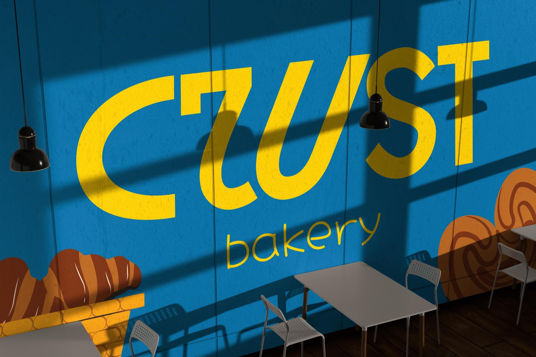
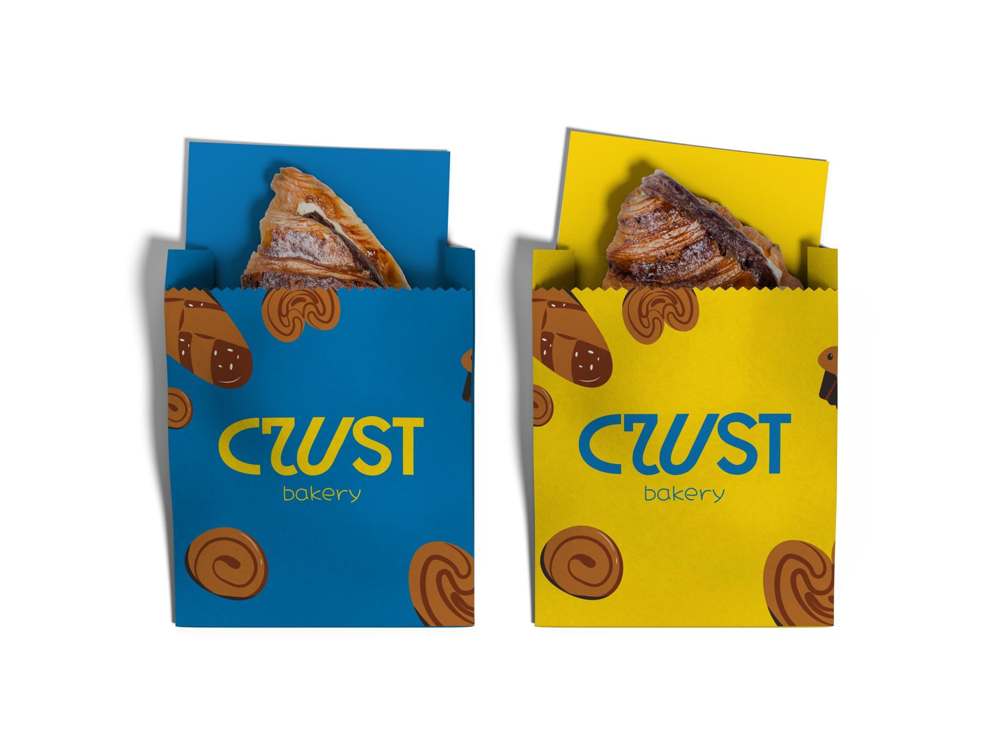
We deliberately avoided brown and beige palettes and classic bakery symbols. Saturated yellow and blue give the brand a bright, youthful character.
The logo is driven by distinctive typography. Letterform shape and arrangement turn the wordmark into the primary brand sign.
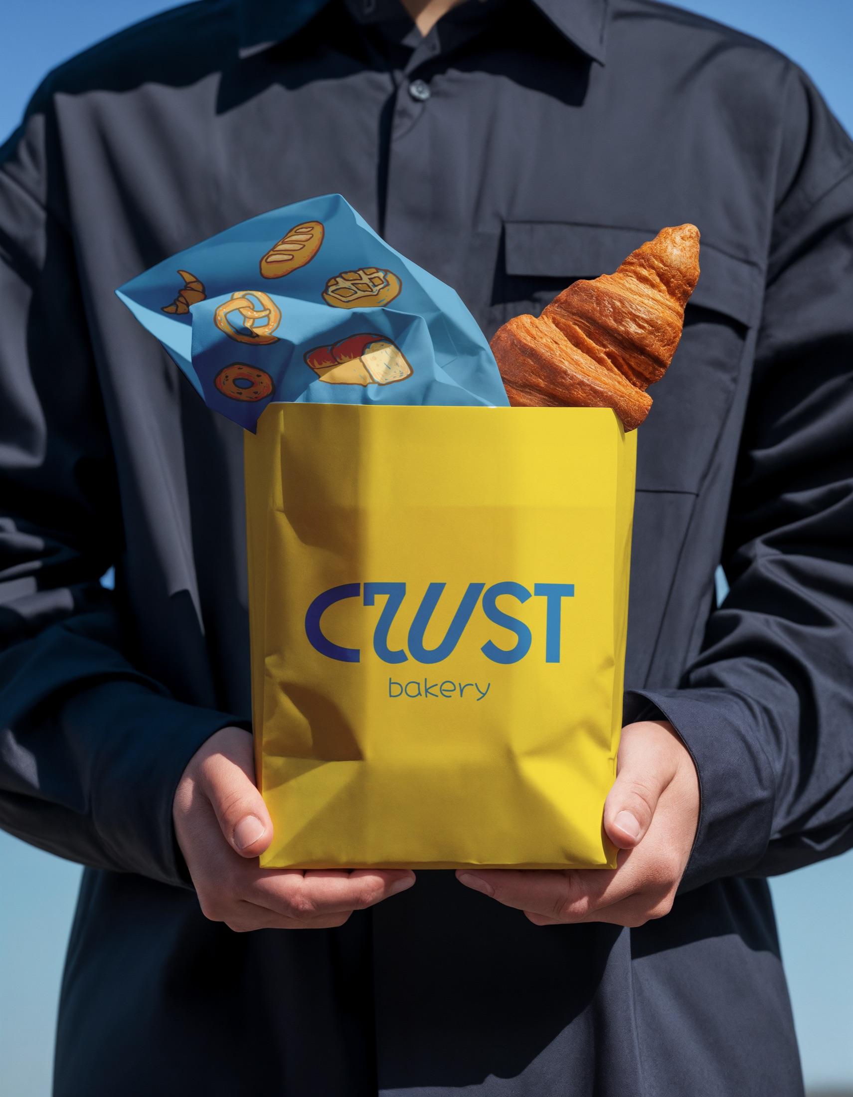
That typographic tone continues in packaging—bright yellow bags, blue graphics, and bread illustrations work as one system and carry CRUST’s free, upbeat mood.
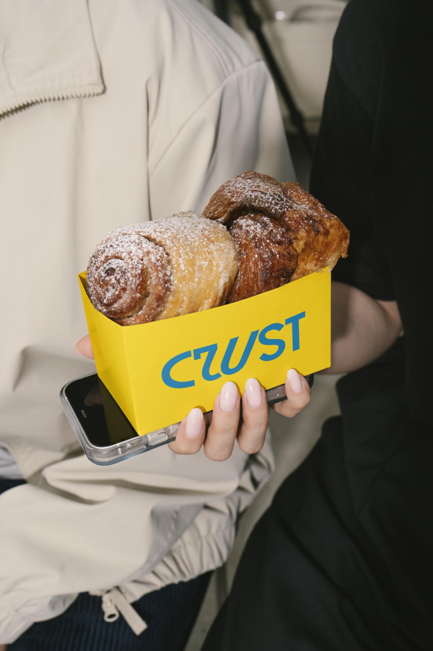
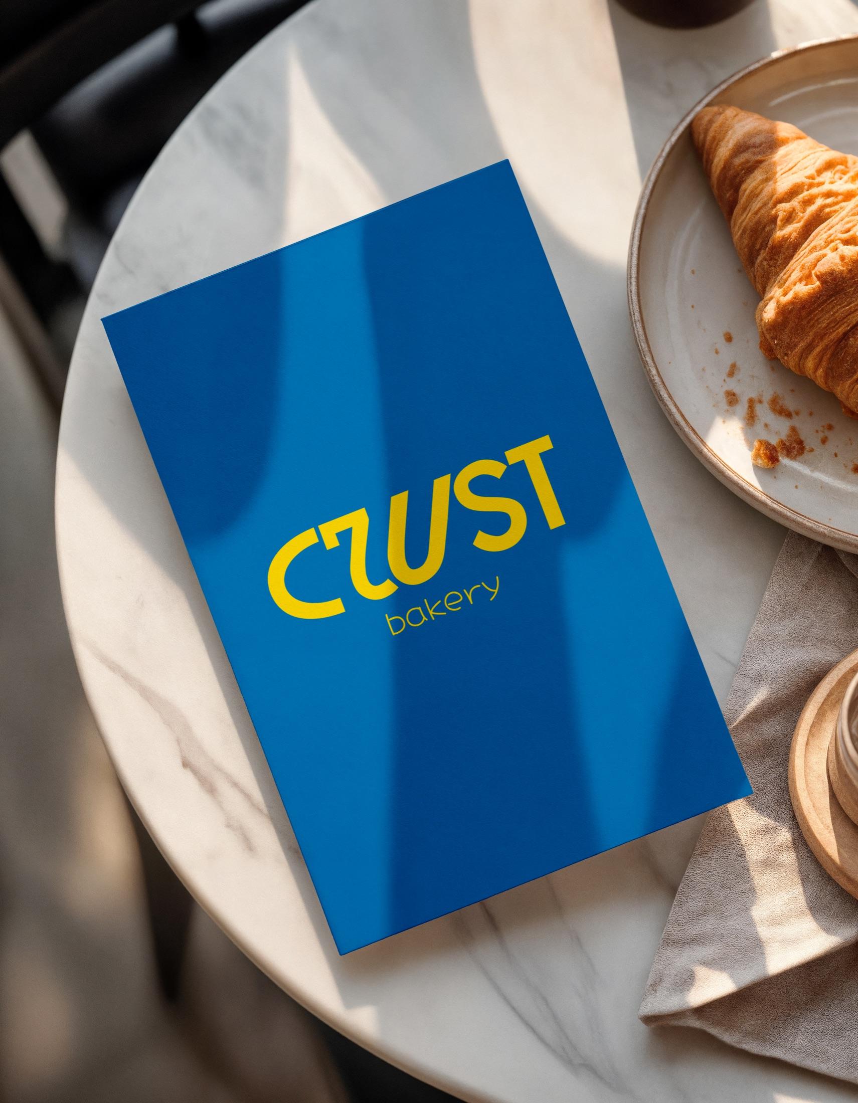
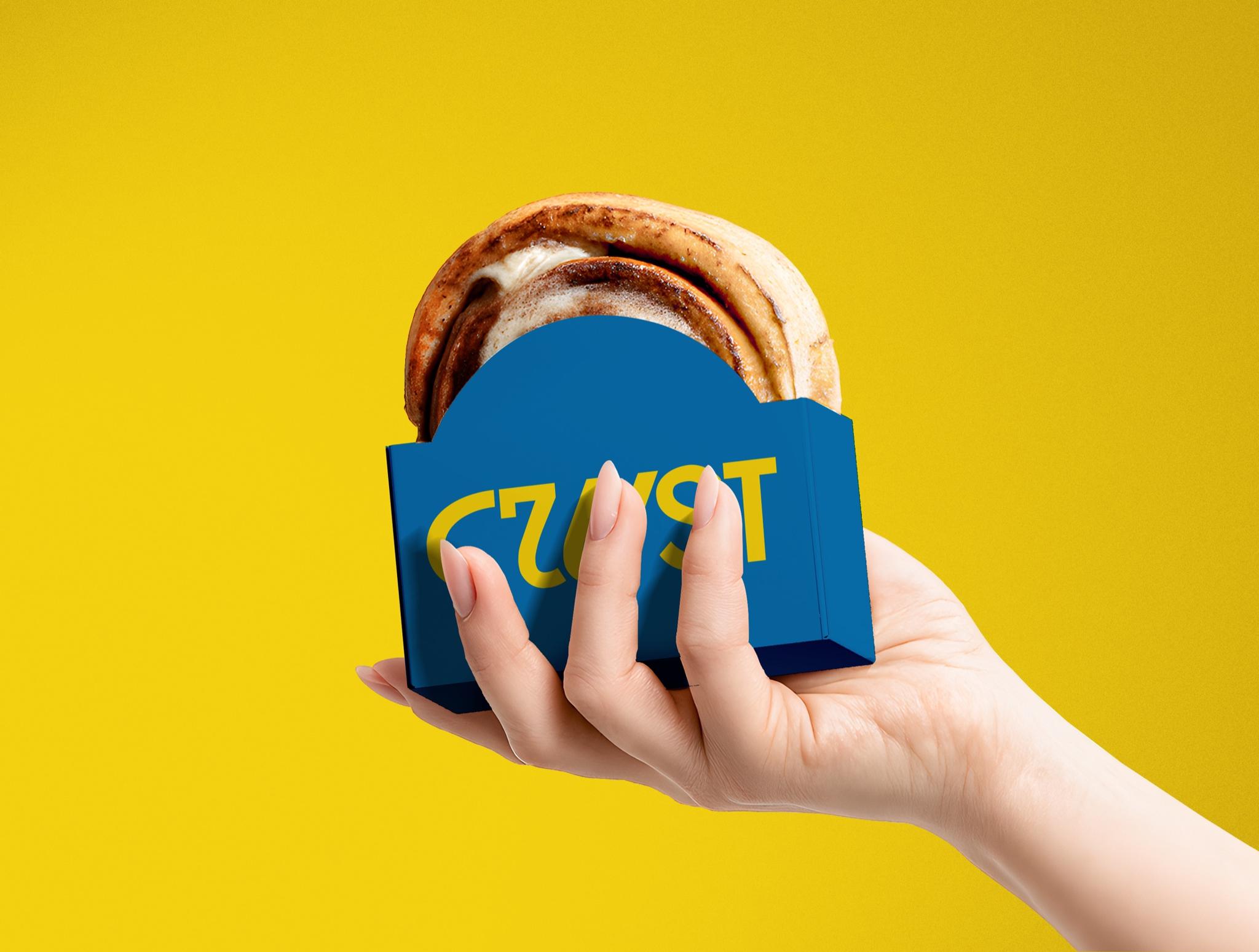
The mark had to hold up beyond a screen or a single layout—clear on signage, packaging, and everyday brand materials.
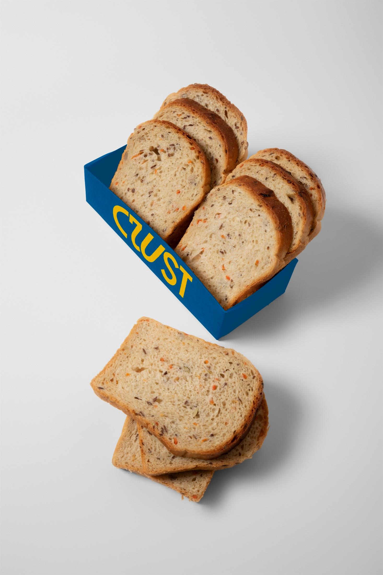
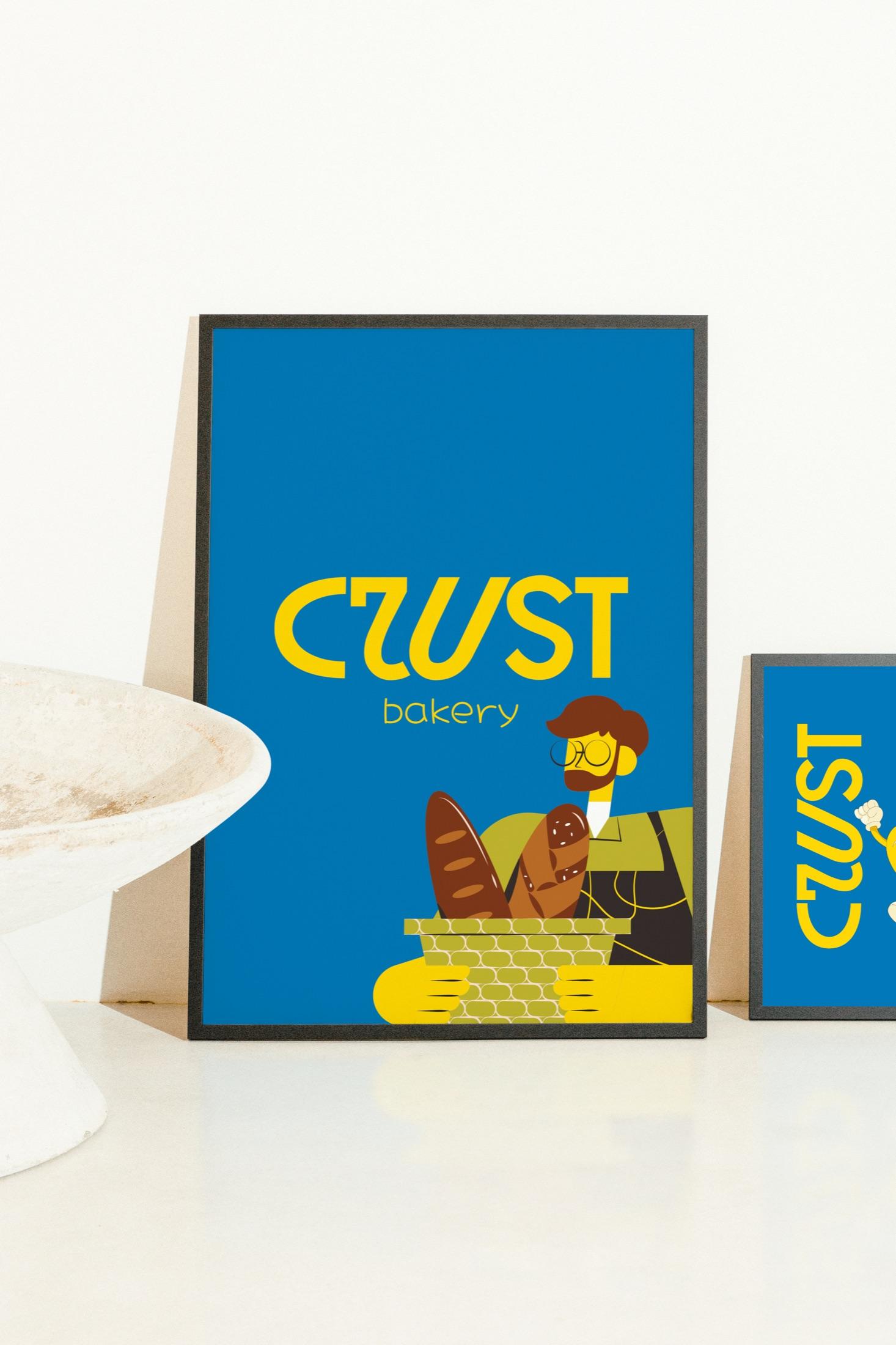
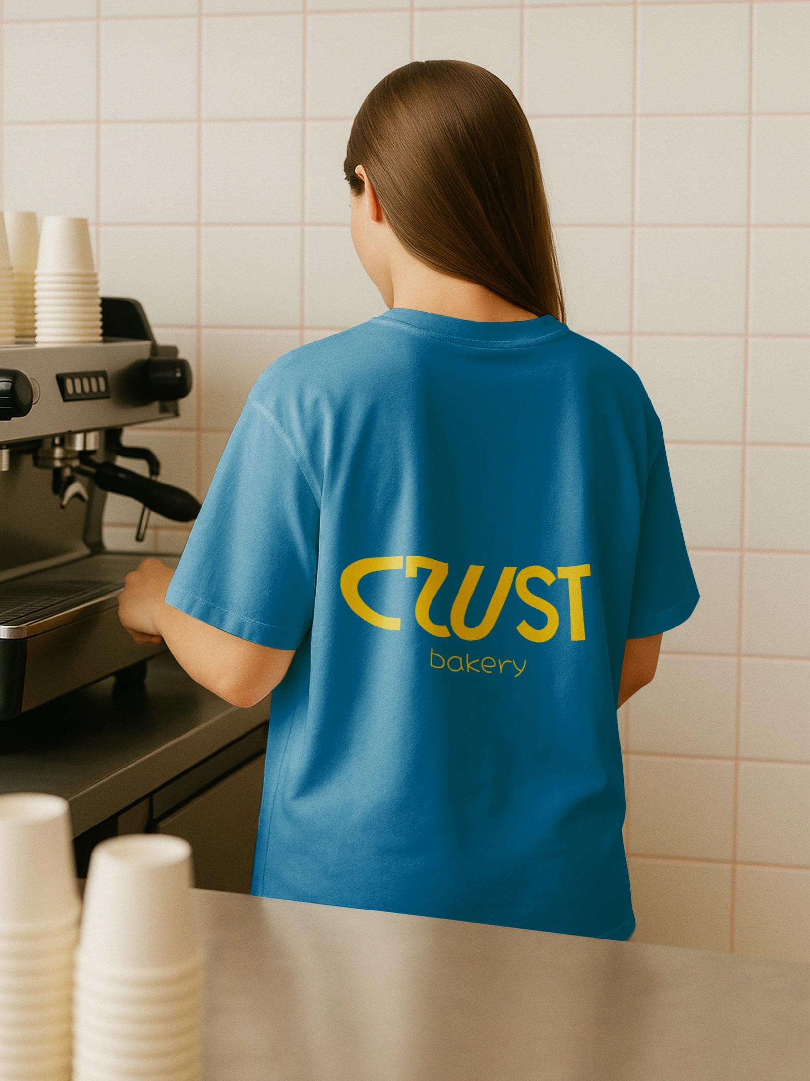
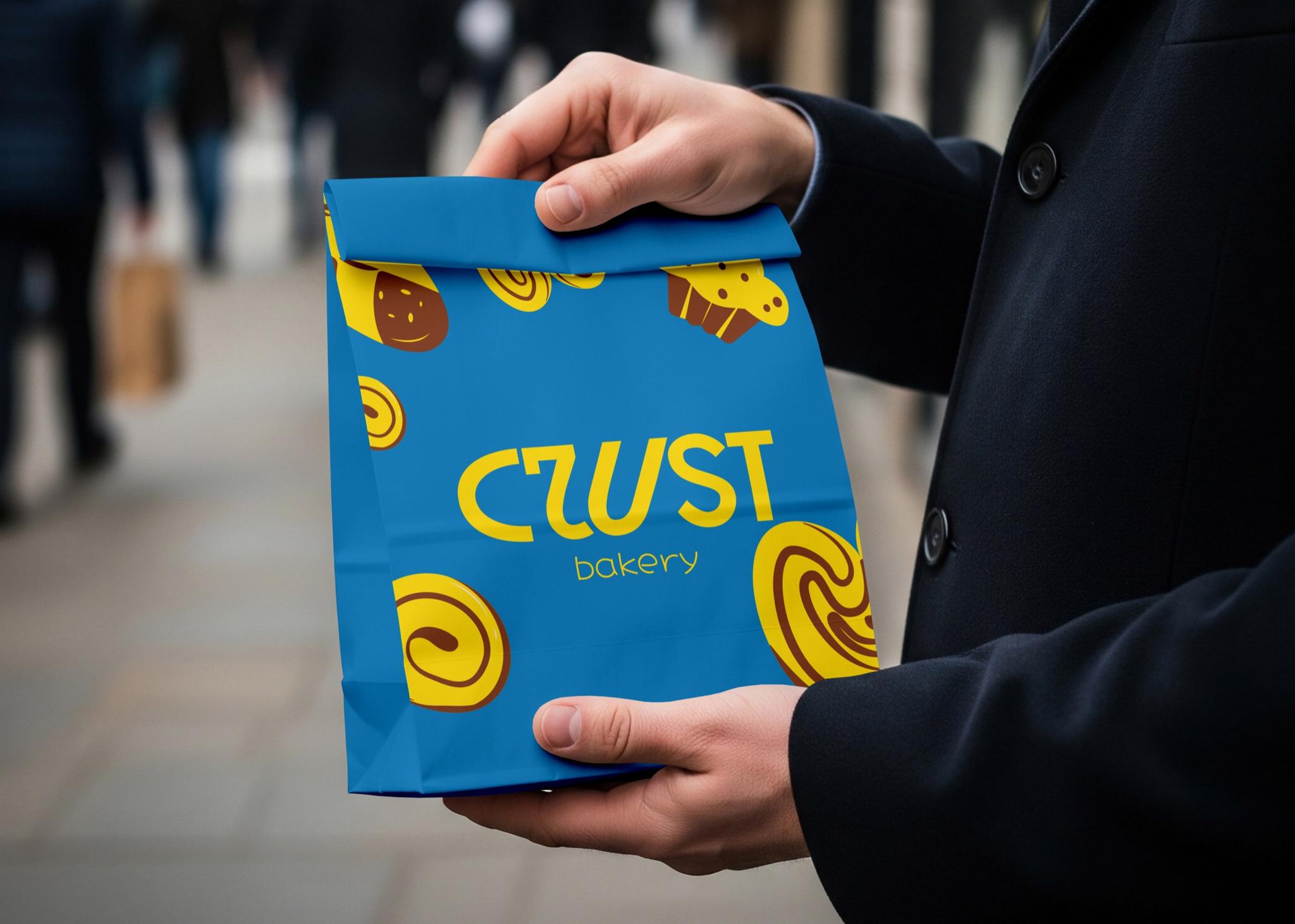
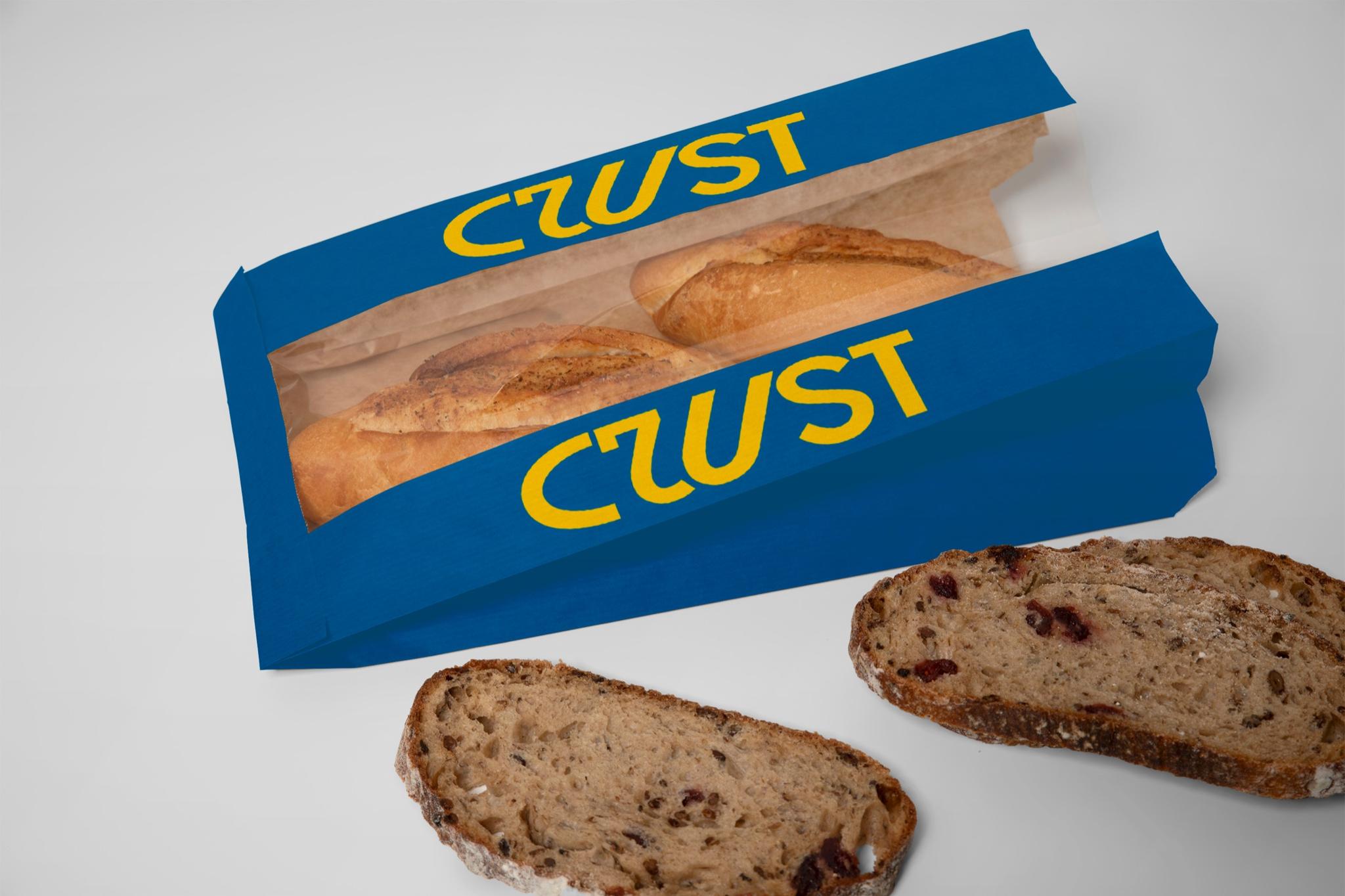
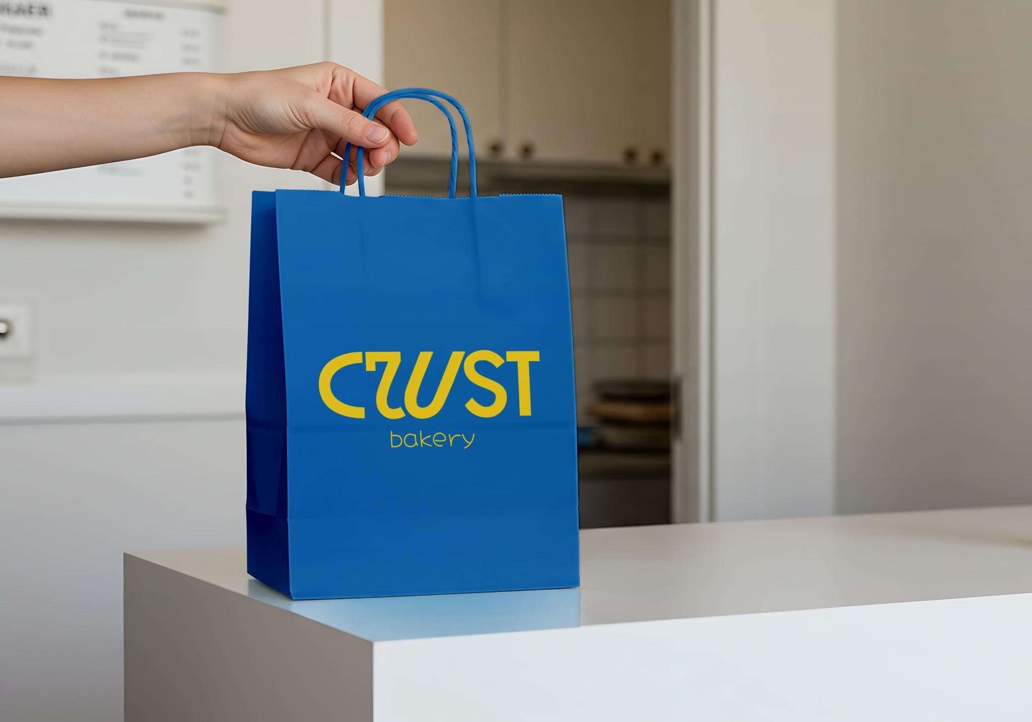
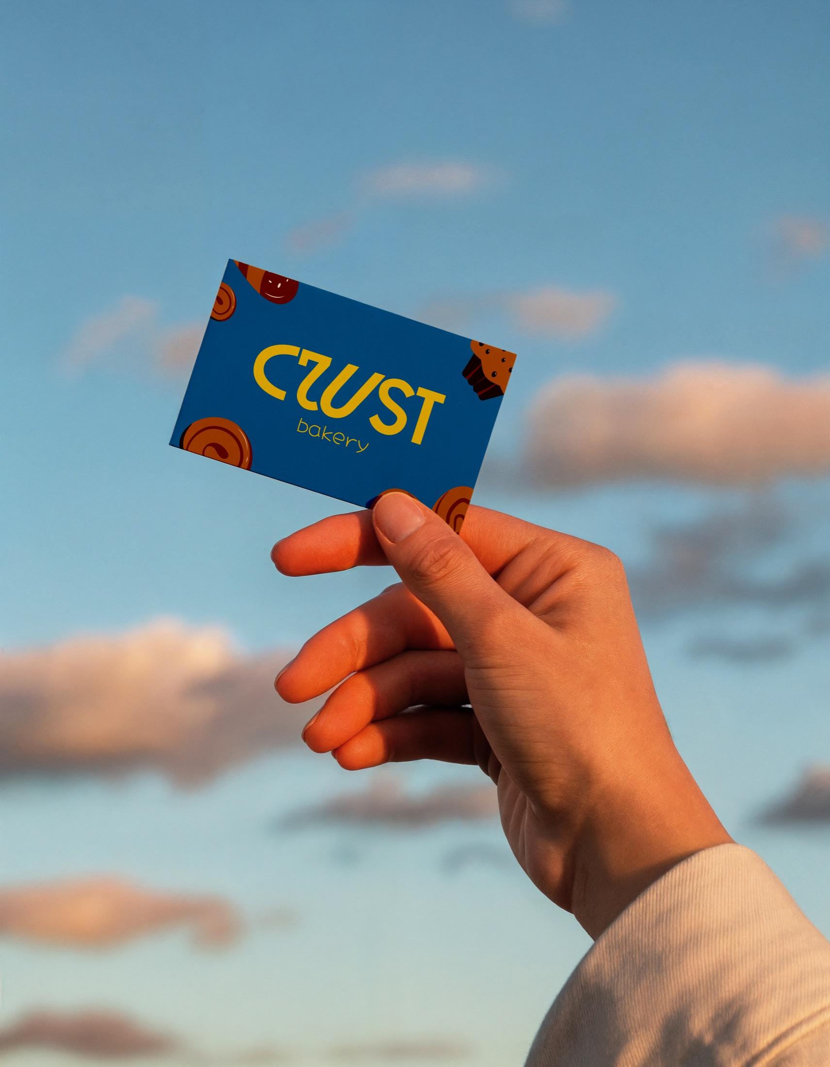
The result unites bold typography, contrasting color, and illustration. The strength of the project is that each element keeps the brand character on its own and within the whole.