
A warm mark born from two names
Saya Medi is a children's clothing brand named after the founder's daughters, Saya and Medina. What mattered was keeping the family warmth behind the brand—not just making a bright kids' logo.
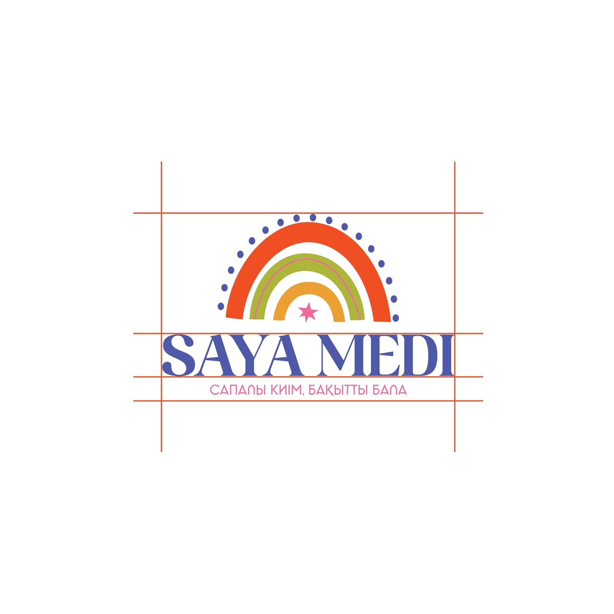
The client wanted a mark that's easy to remember, close to children, and reassuring for parents. We aimed for a simple, clear visual language that carries the joy of childhood.
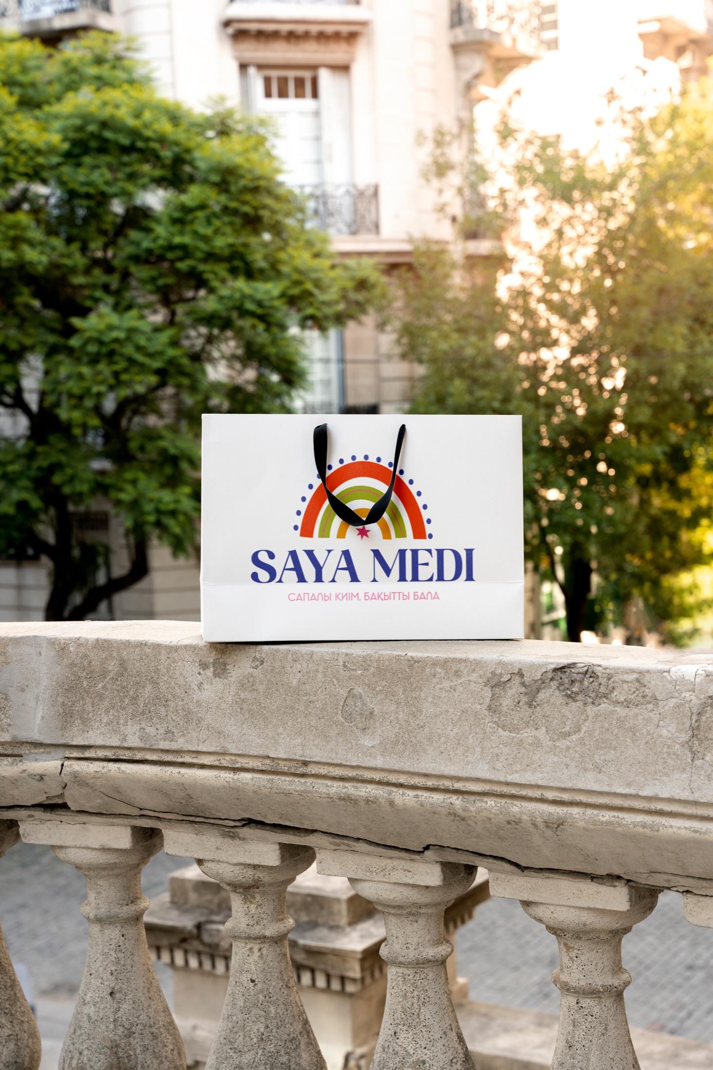
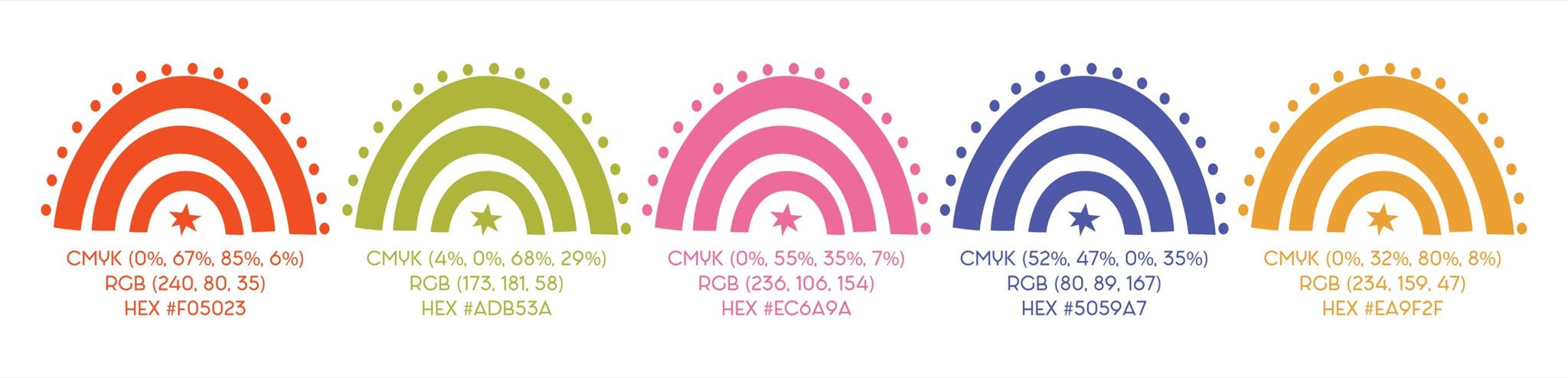
The mark is built from multicolor arcs like a rainbow. A star at the center and dots around it add playfulness and open up the brand's cheerful character.
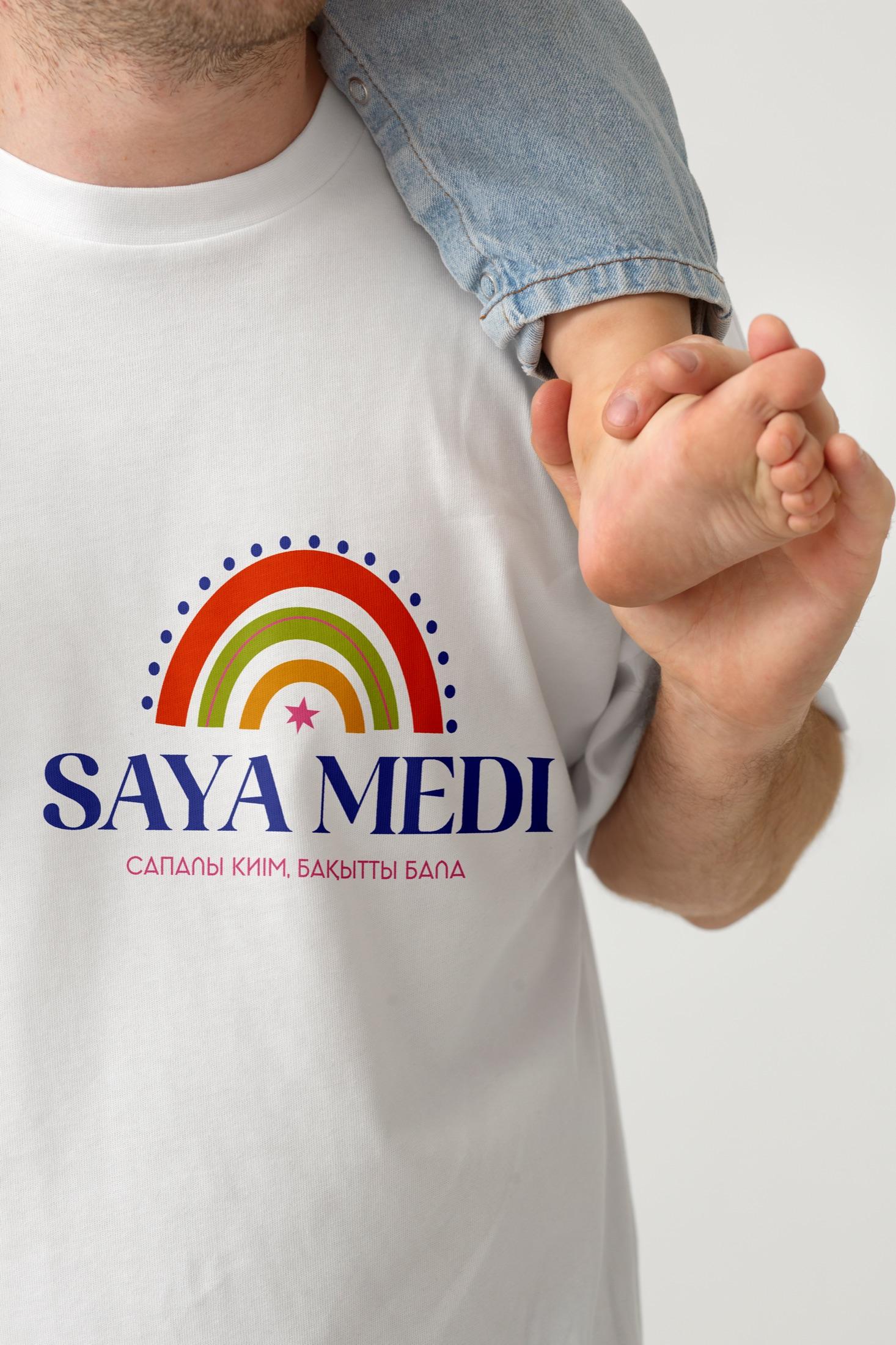
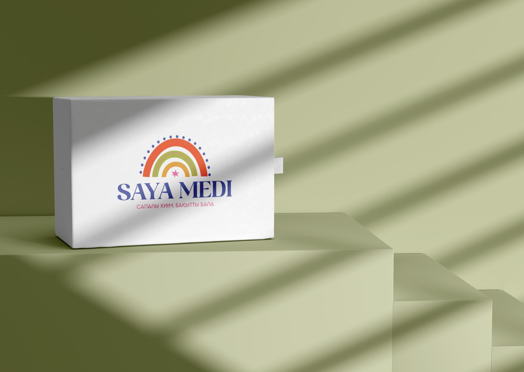
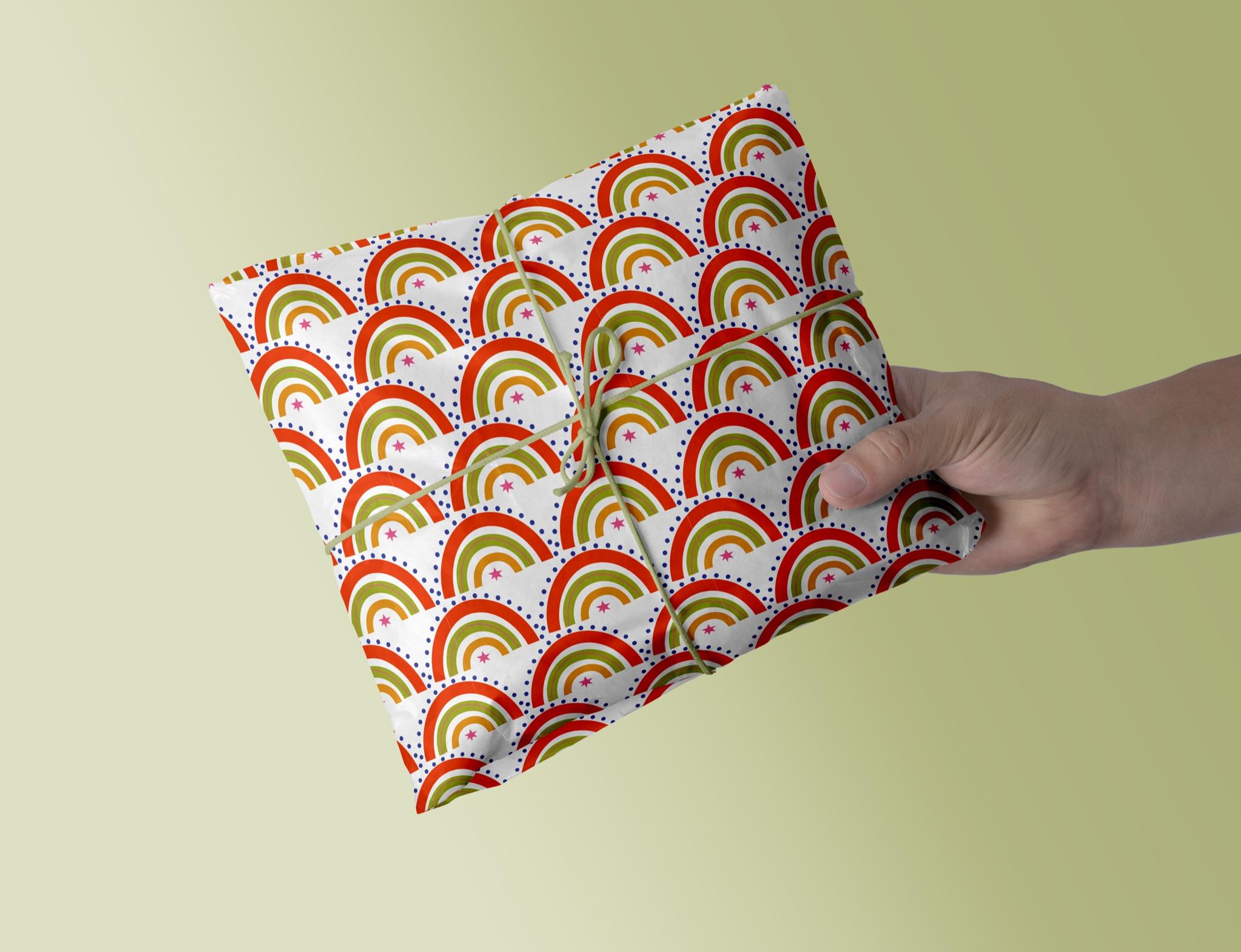
The mark needed to stay recognizable on every carrier and keep the brand's warmth. We built the system to adapt easily to packaging, labels, and everyday brand materials.

Saturated color and clear typography strengthen the effect and naturally tie the mark to children's clothing.
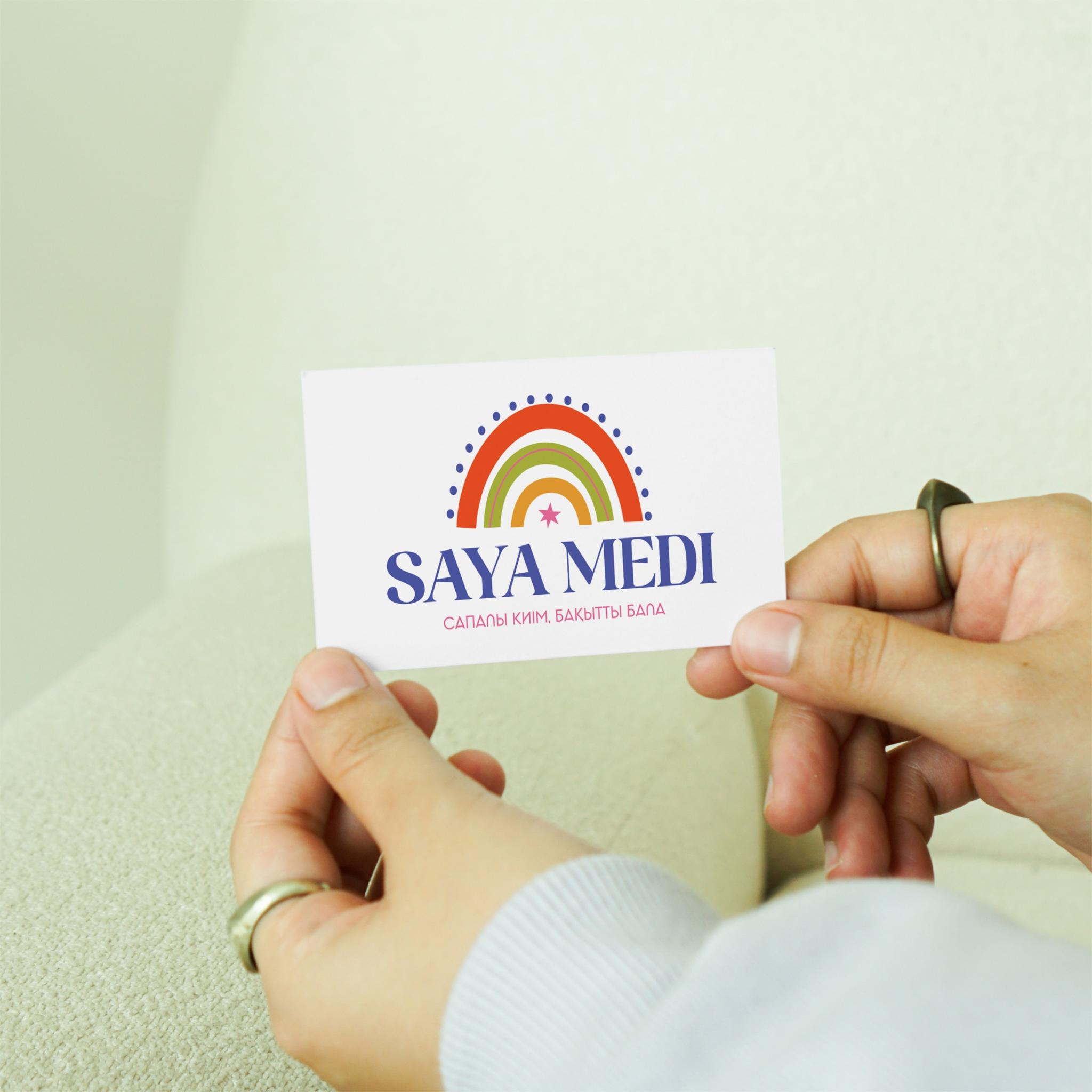
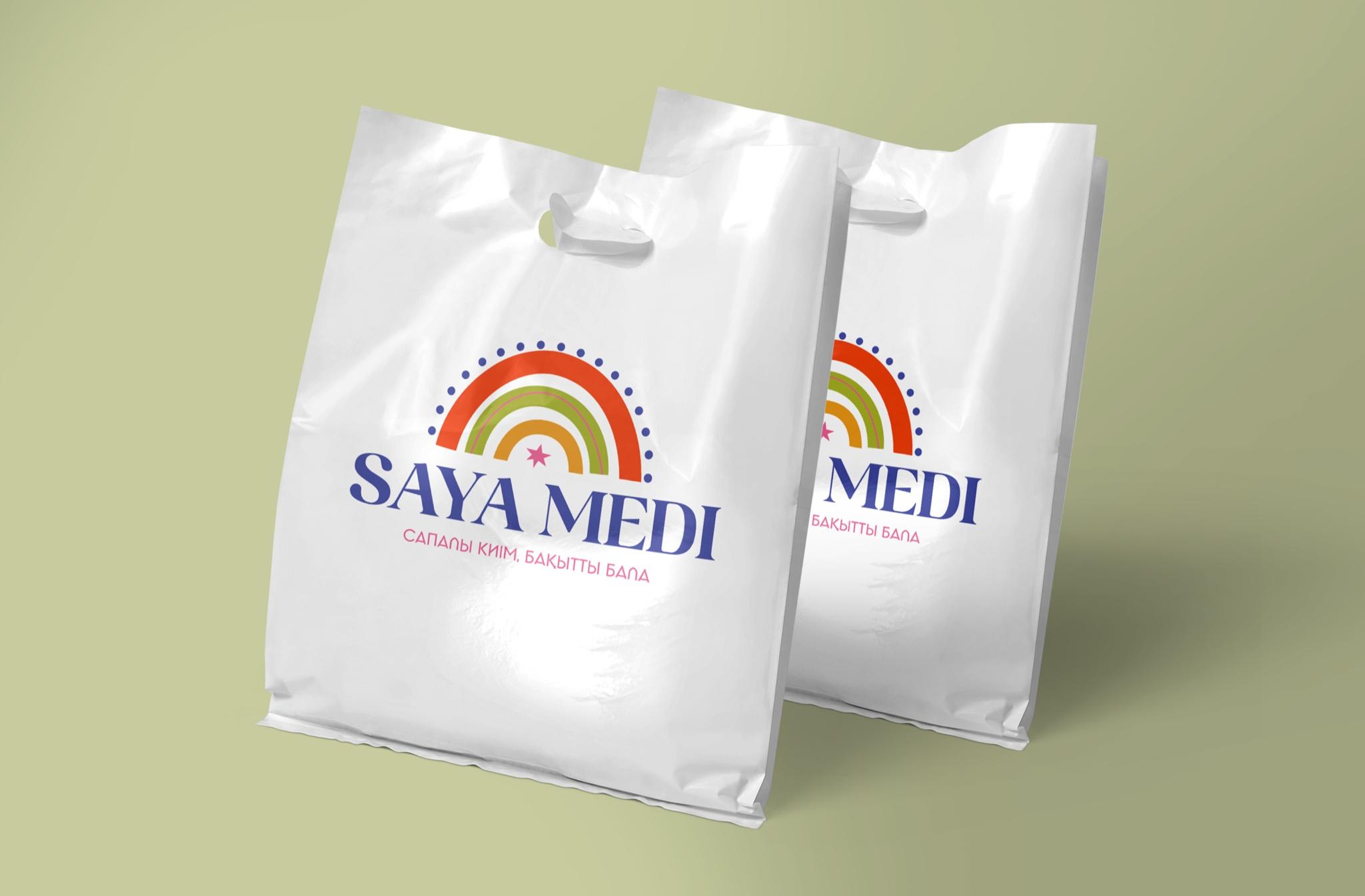
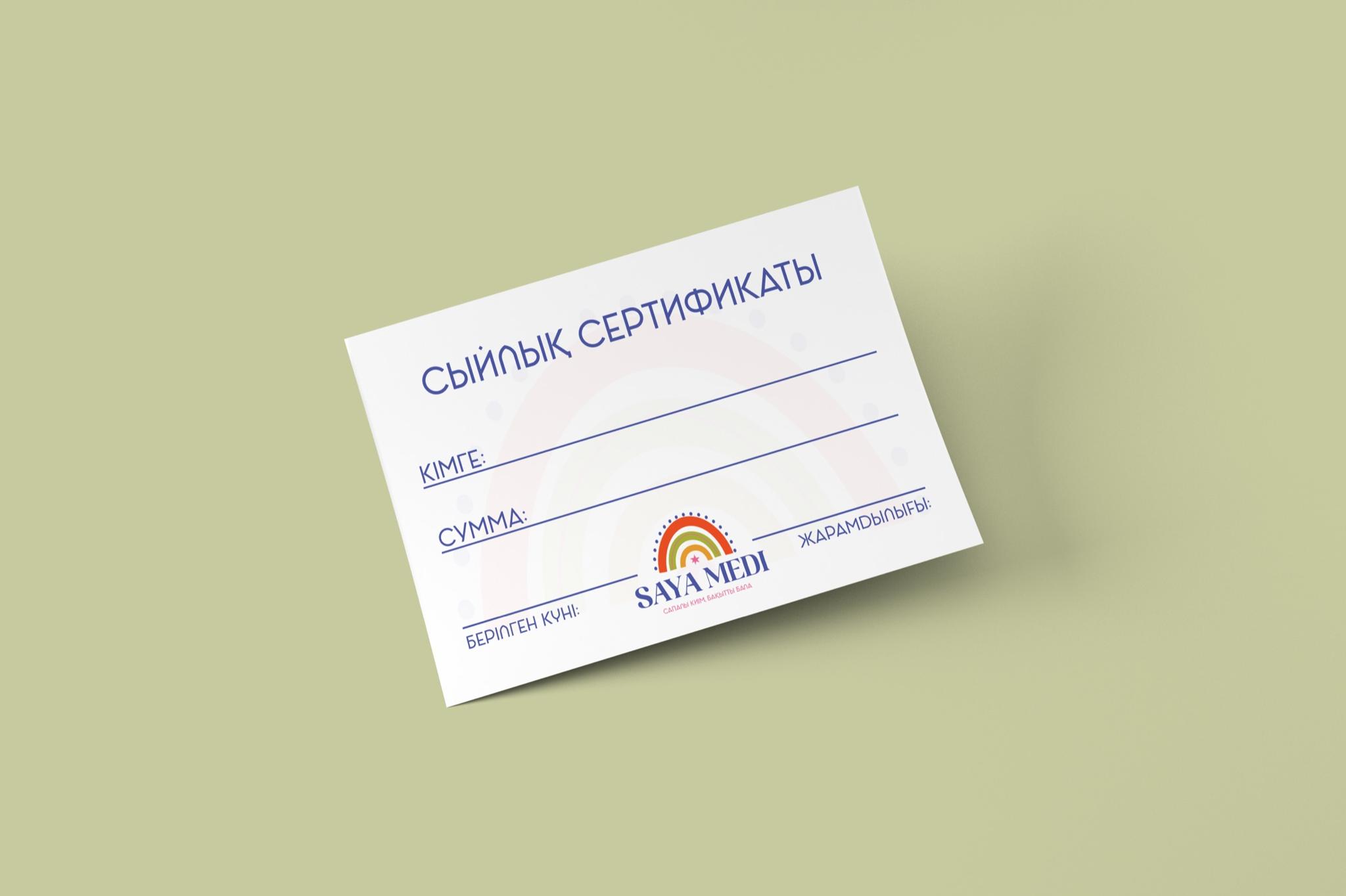
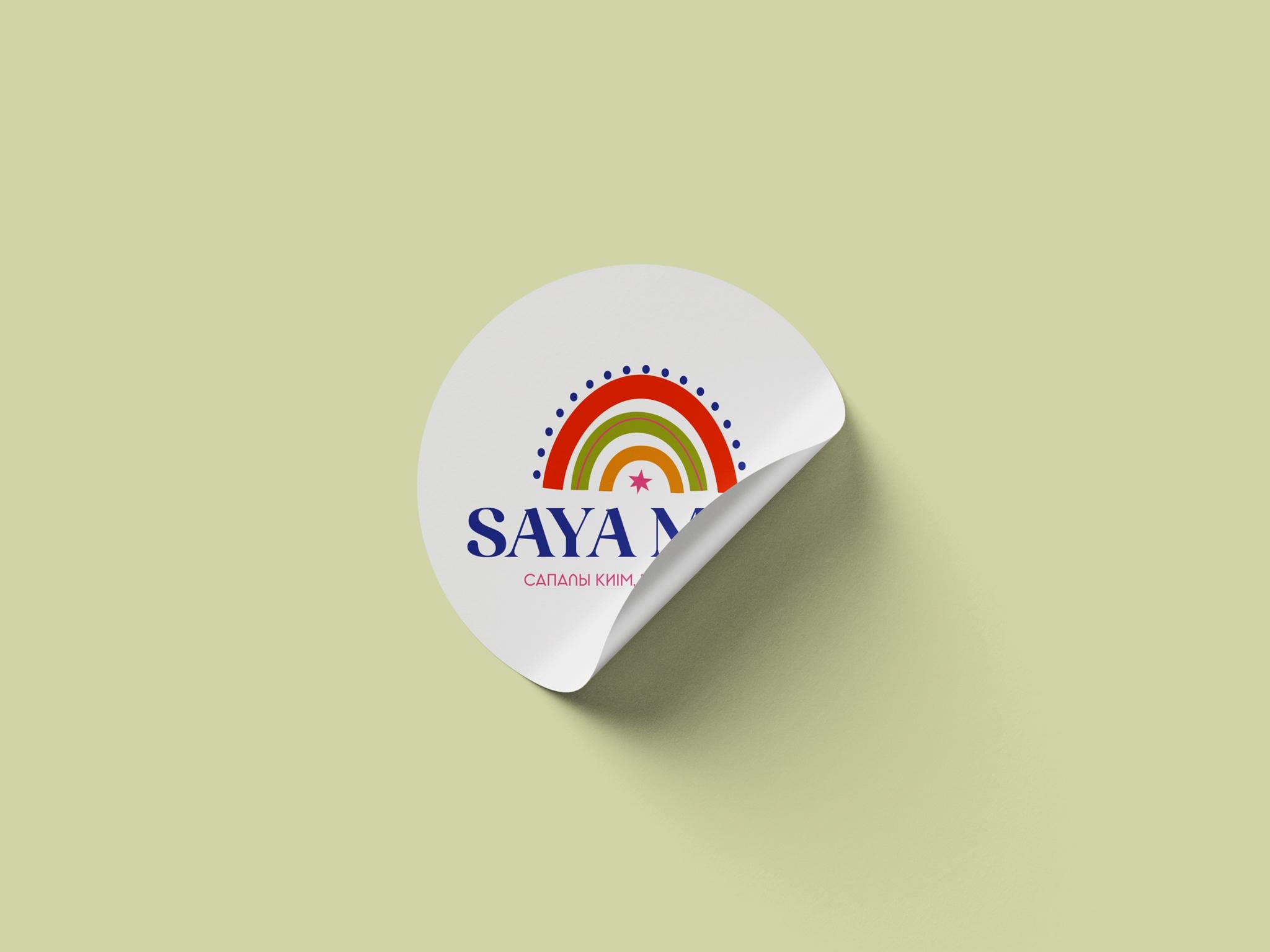
Colors, arcs, and small graphic details flow from one visual to the next and set a cohesive brand rhythm—each carrier distinct, but part of one world.
«Quality clothes. A happy child»
The line completes the idea: what matters is not only clothing, but a child's mood and the care around them.
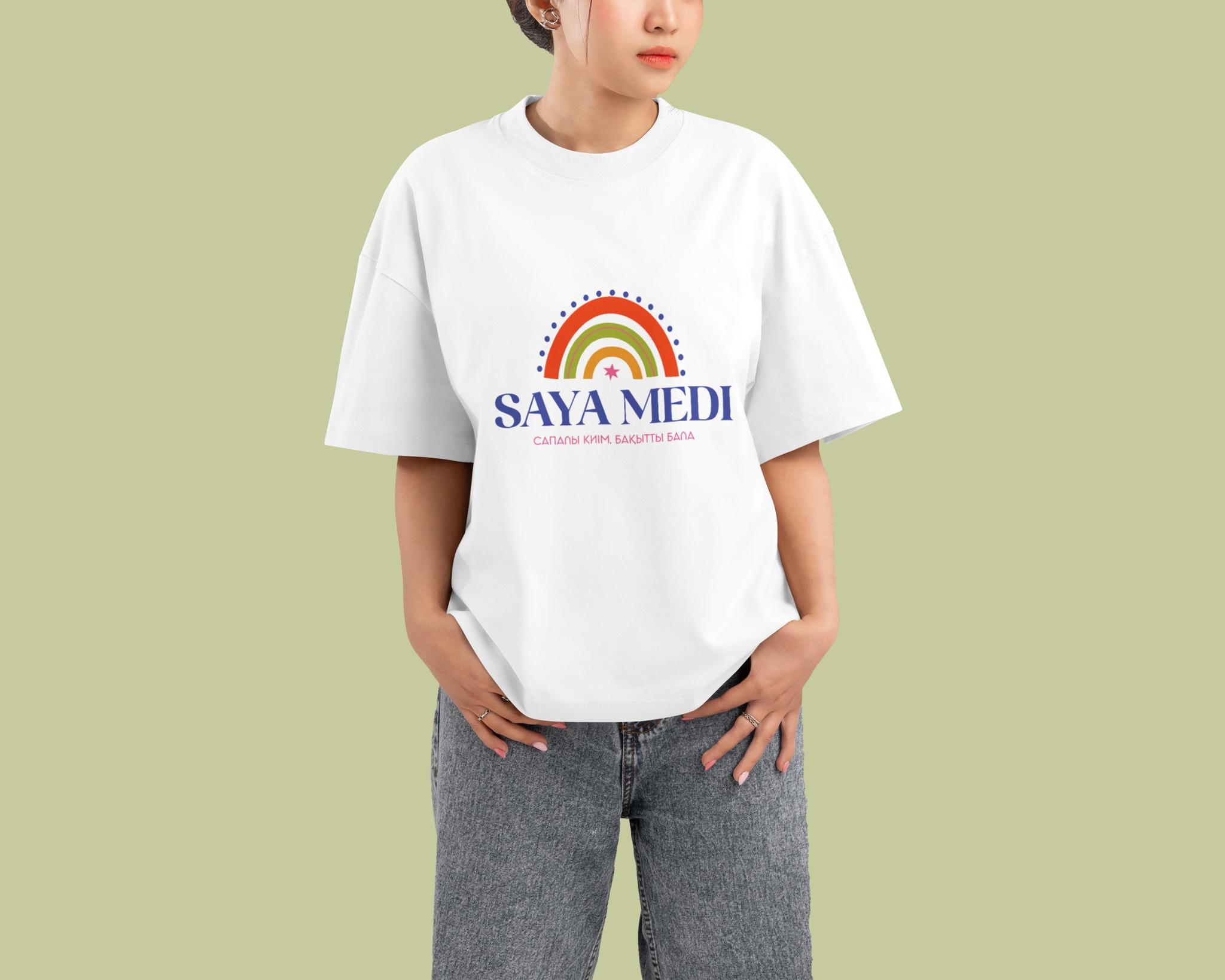
For Saya Medi, the result is a warm, recognizable mark with a personal story. What we value is how a small family story—starting with two daughters' names—became the brand's whole visual character.