Where coffee meets connection
Wi Cup is a coffee shop for working, meeting, and spending time—not just drinking coffee. The brand idea brings together comfort, quality coffee, and reliable Wi-Fi in one space.
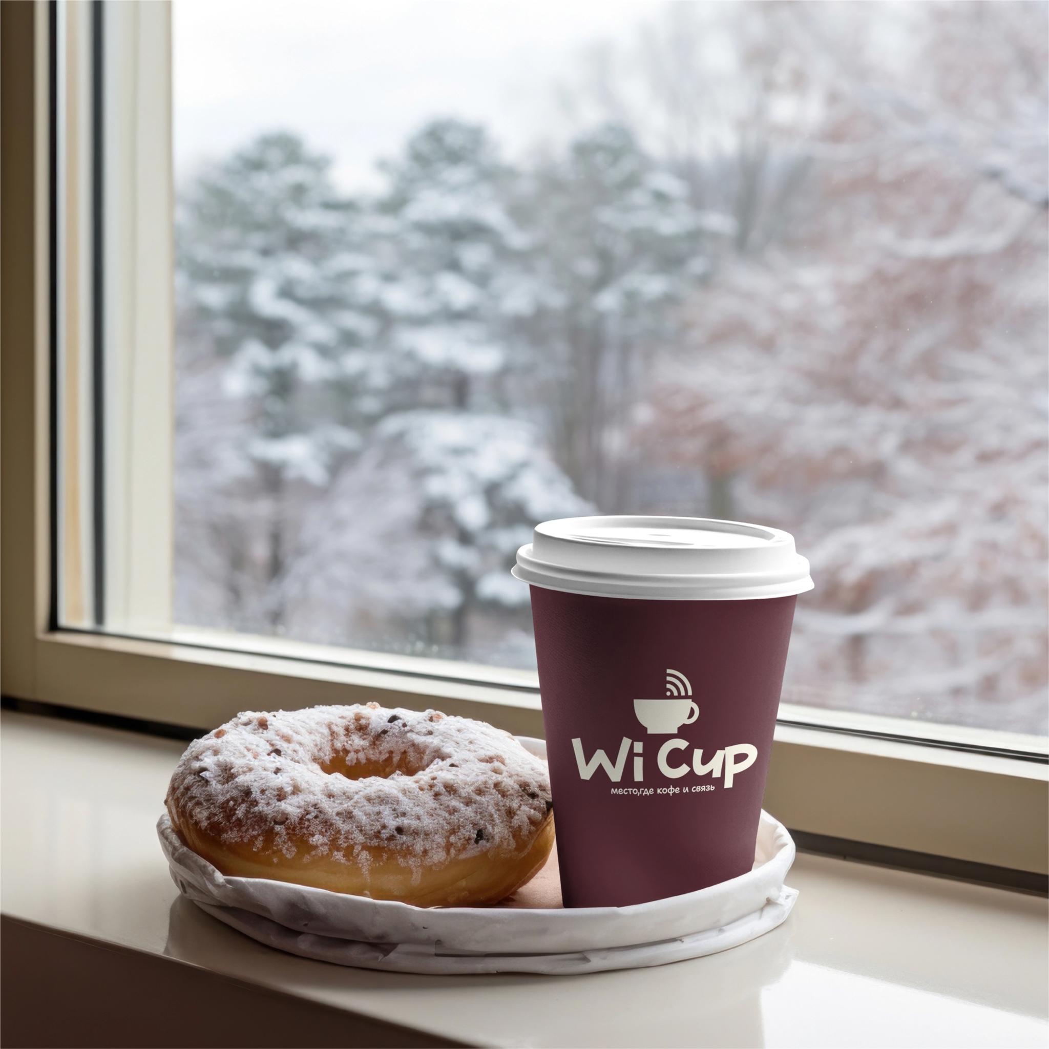
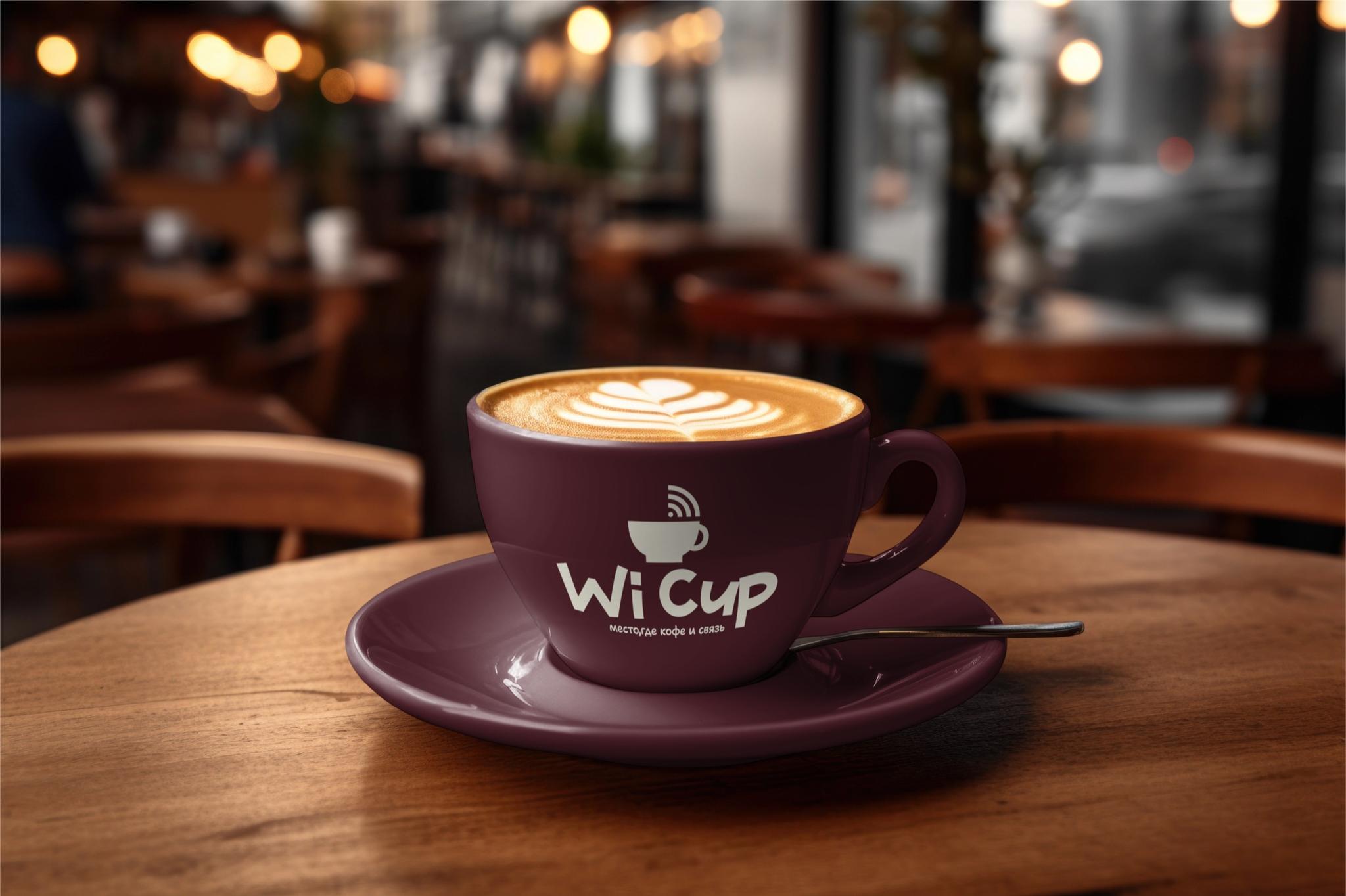
We built the logo around that idea—Wi-Fi combined with a coffee cup—a simple symbol that communicates the concept at a glance.
Connection here isn’t only about the internet—it’s about people meeting, sharing ideas, and spending time together.

Typography uses freer, slightly playful letterforms—open and friendly, not overly formal.
Dark burgundy with light cream supports the warmth and comfort you expect from a coffee shop.
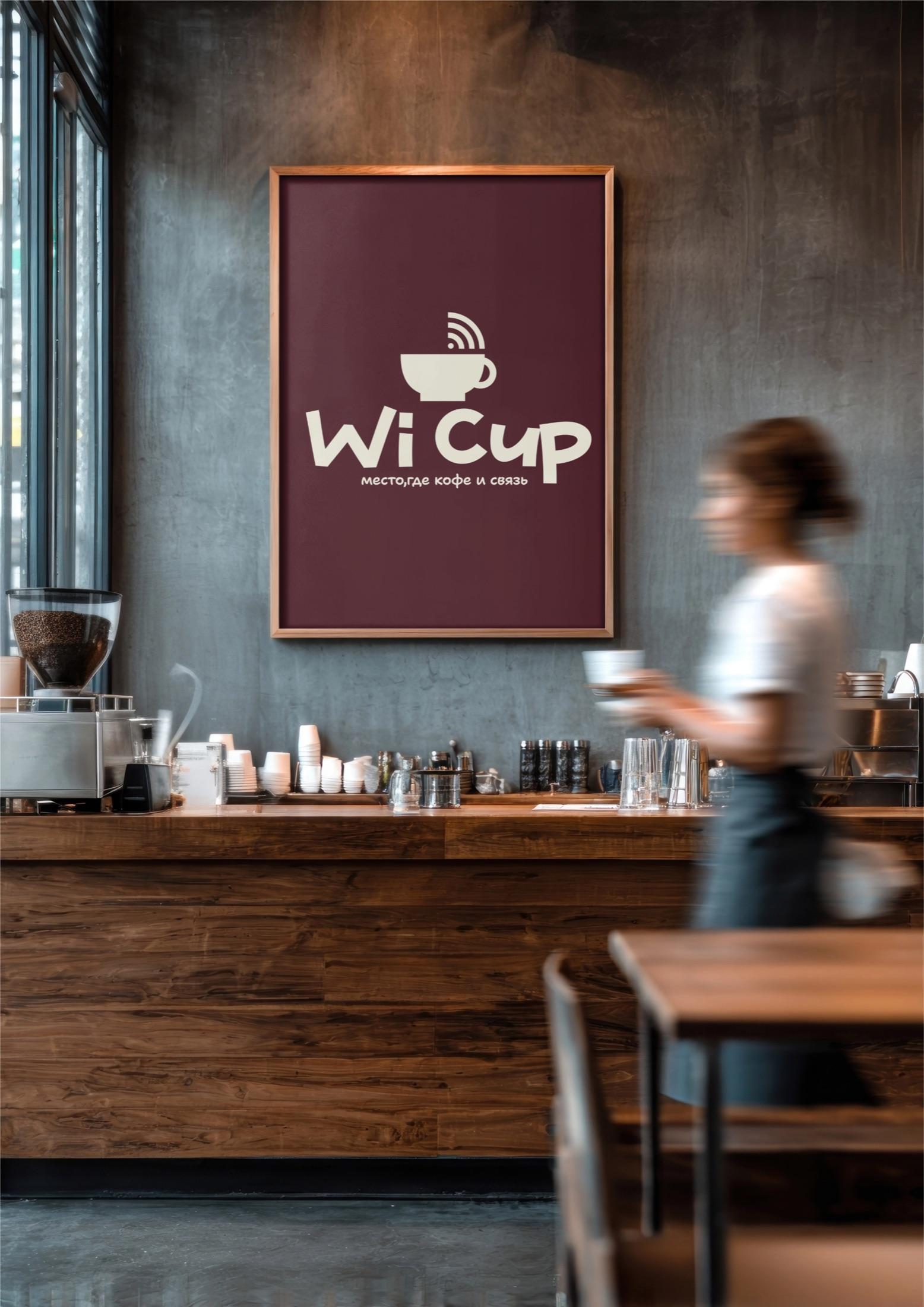
The result unites coffee culture with a contemporary work rhythm. What we value here is two simple signs becoming one clear idea: coffee and Wi-Fi.