A mark built on trust and care
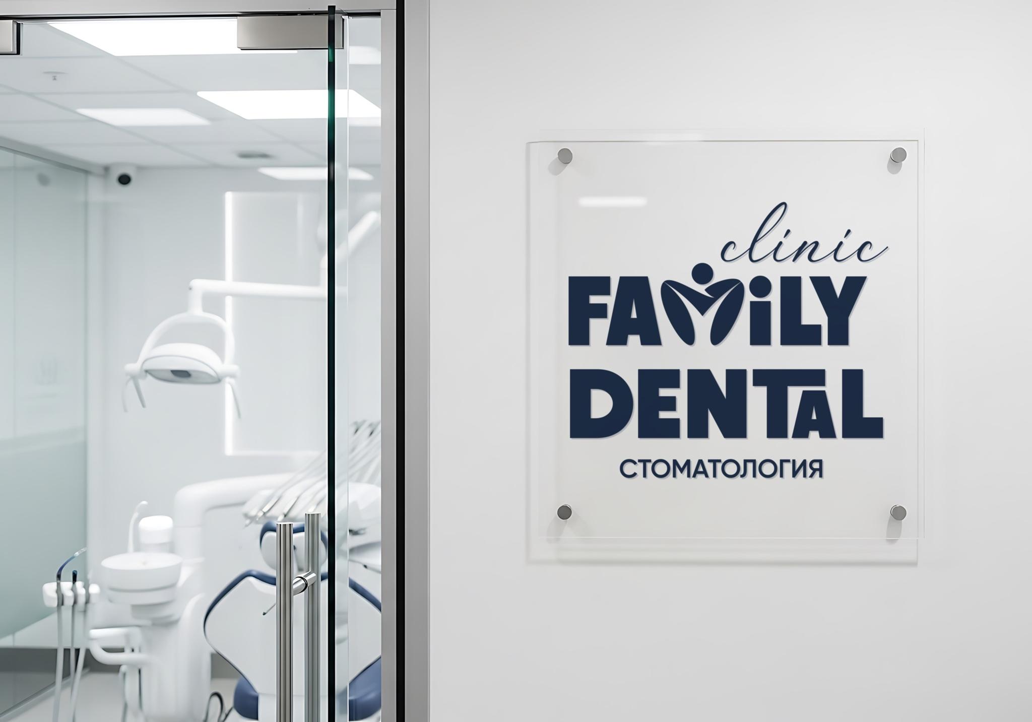
Family Dental is a dental clinic for every member of the family. The goal was a visual system that feels trustworthy, caring, and professional—without copying generic dental clichés.
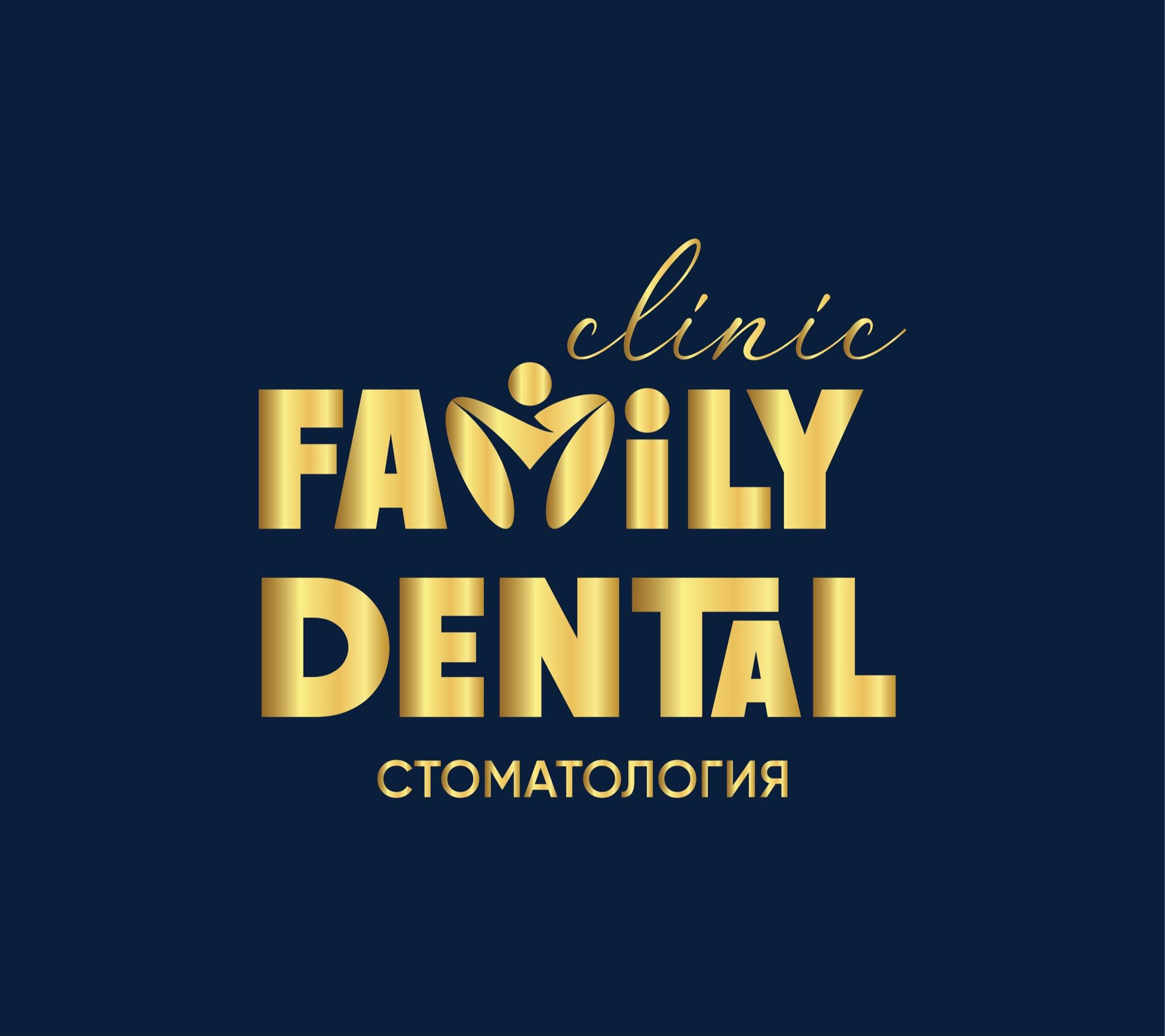
The core idea came from the name itself. We didn’t treat “Family” as plain text—we focused on the letter M within it.
The shape of the M forms a mark that recalls a human figure—a simple graphic way to express the clinic’s family orientation.

The composition uses bold, highly readable typography for stability and trust; the lighter line above softens the mark and eases the cold formality often seen in medical branding.
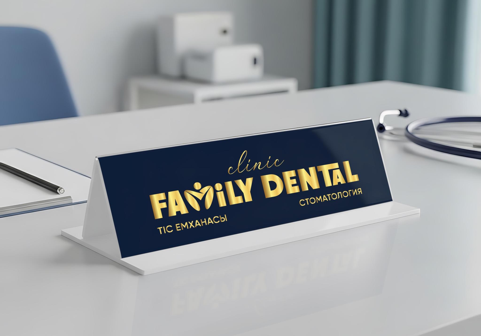
Dark blue supports cleanliness, trust, and a professional tone across the system.
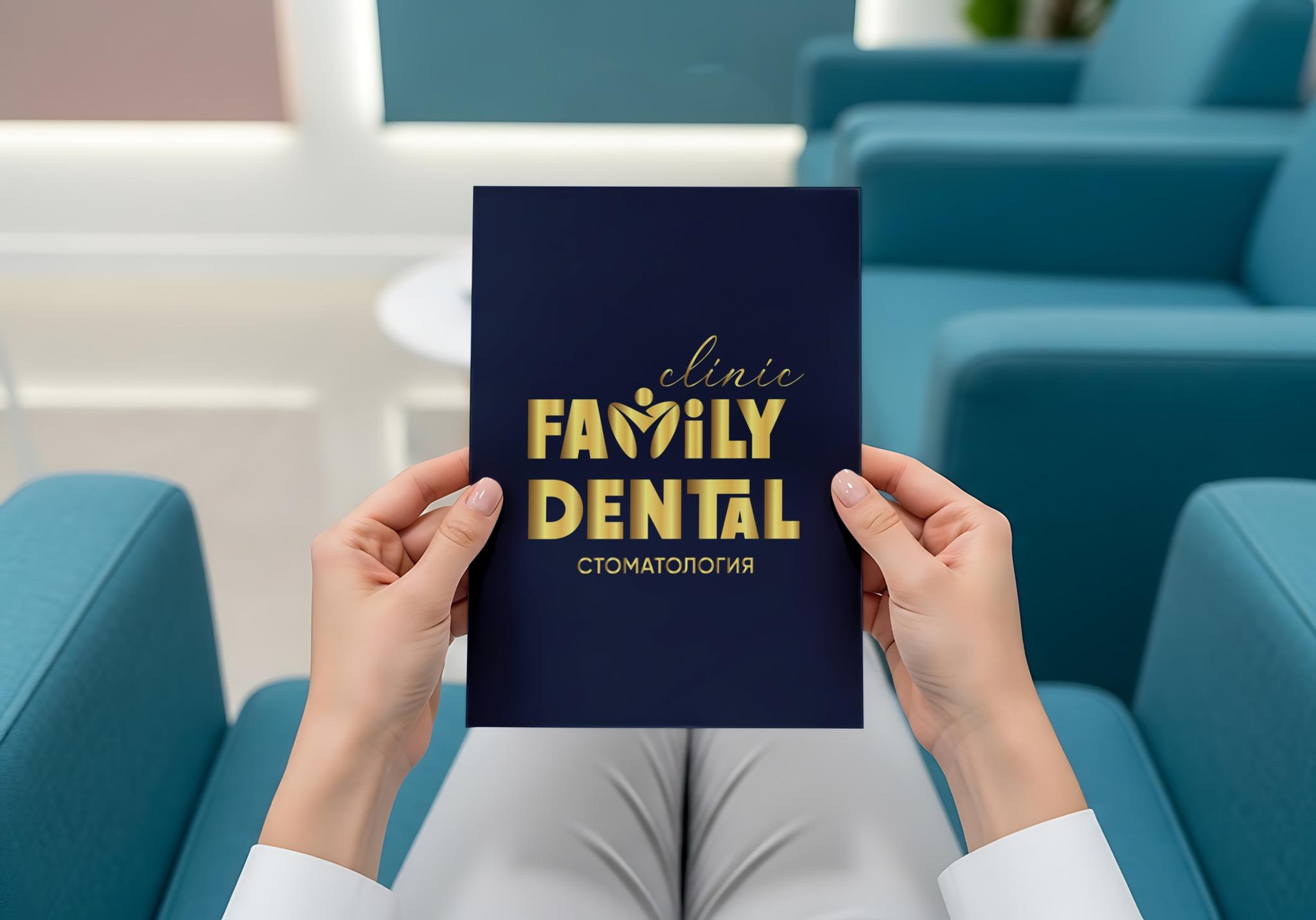
What mattered here was clear meaning inside simple typography—the mark reads at a glance yet carries the brand’s family idea within it.
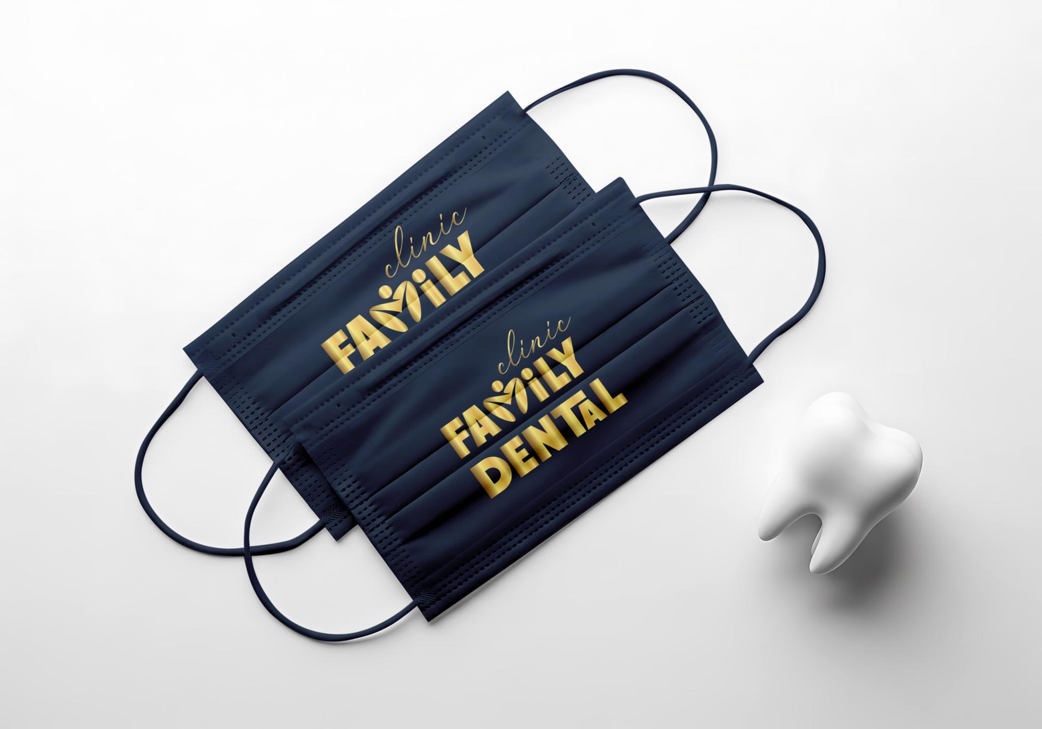
The result is a memorable mark for Family Dental that delivers family warmth and clinical trust together.