All projects
A style that needs no excess
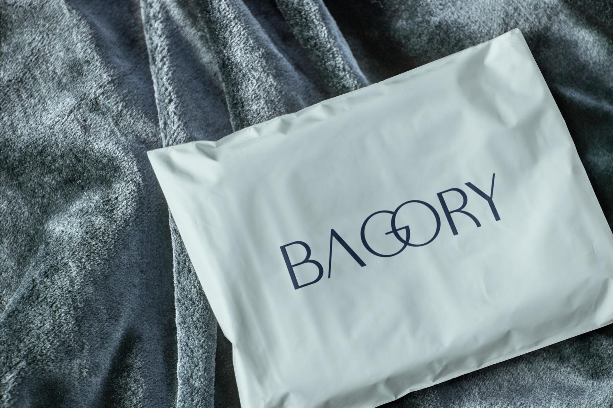
BAGORY is a bag brand built on minimalism and restrained aesthetics. The goal was a mark that doesn’t shout—one that communicates taste through simplicity.
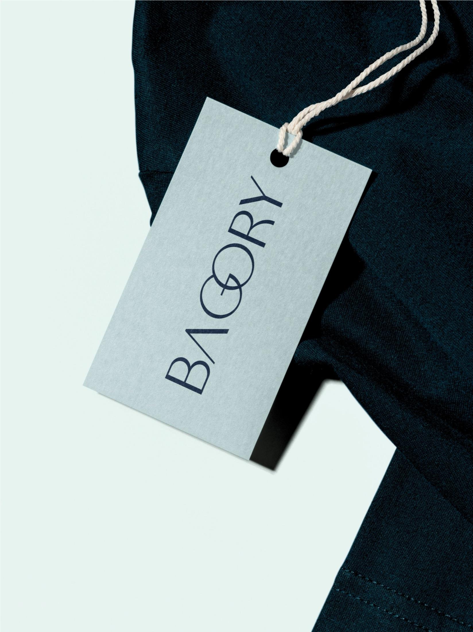
The focus is typography—thin, geometric letterforms for lightness, with intersecting shapes as a distinctive signature.
No extra symbols or decoration—the name itself is the mark, and character comes through the structure of the letters.
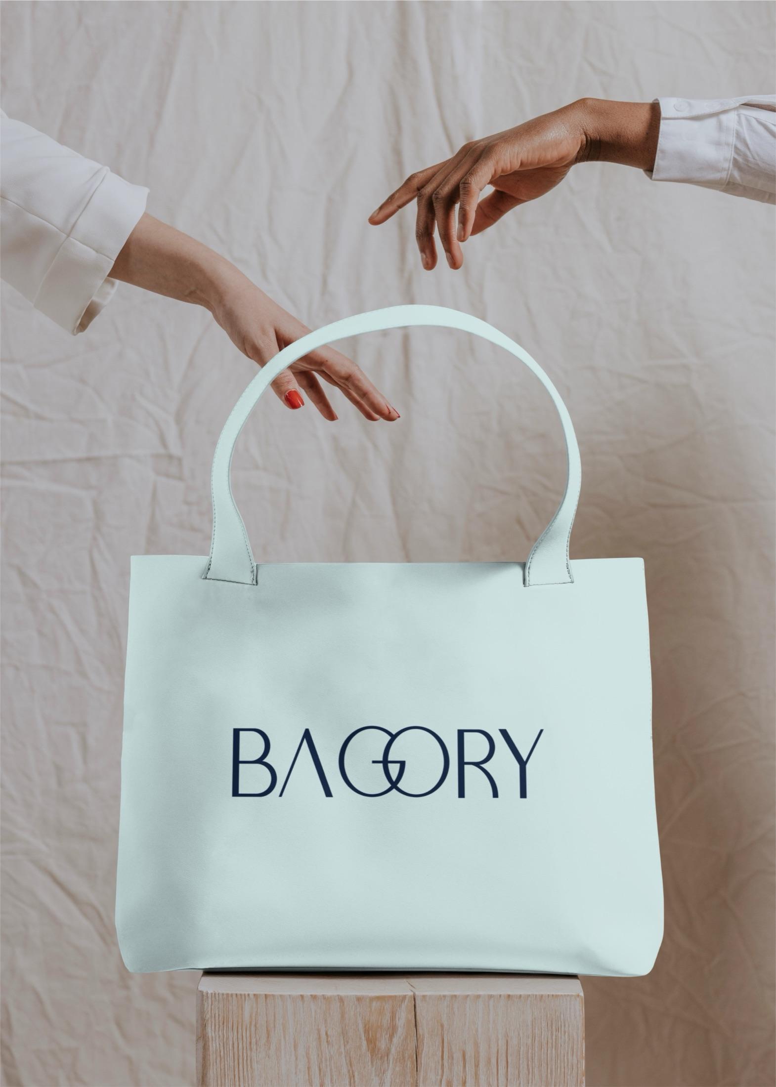
Color follows the same line—a cool gray-blue with dark blue lettering for a calm, refined image.
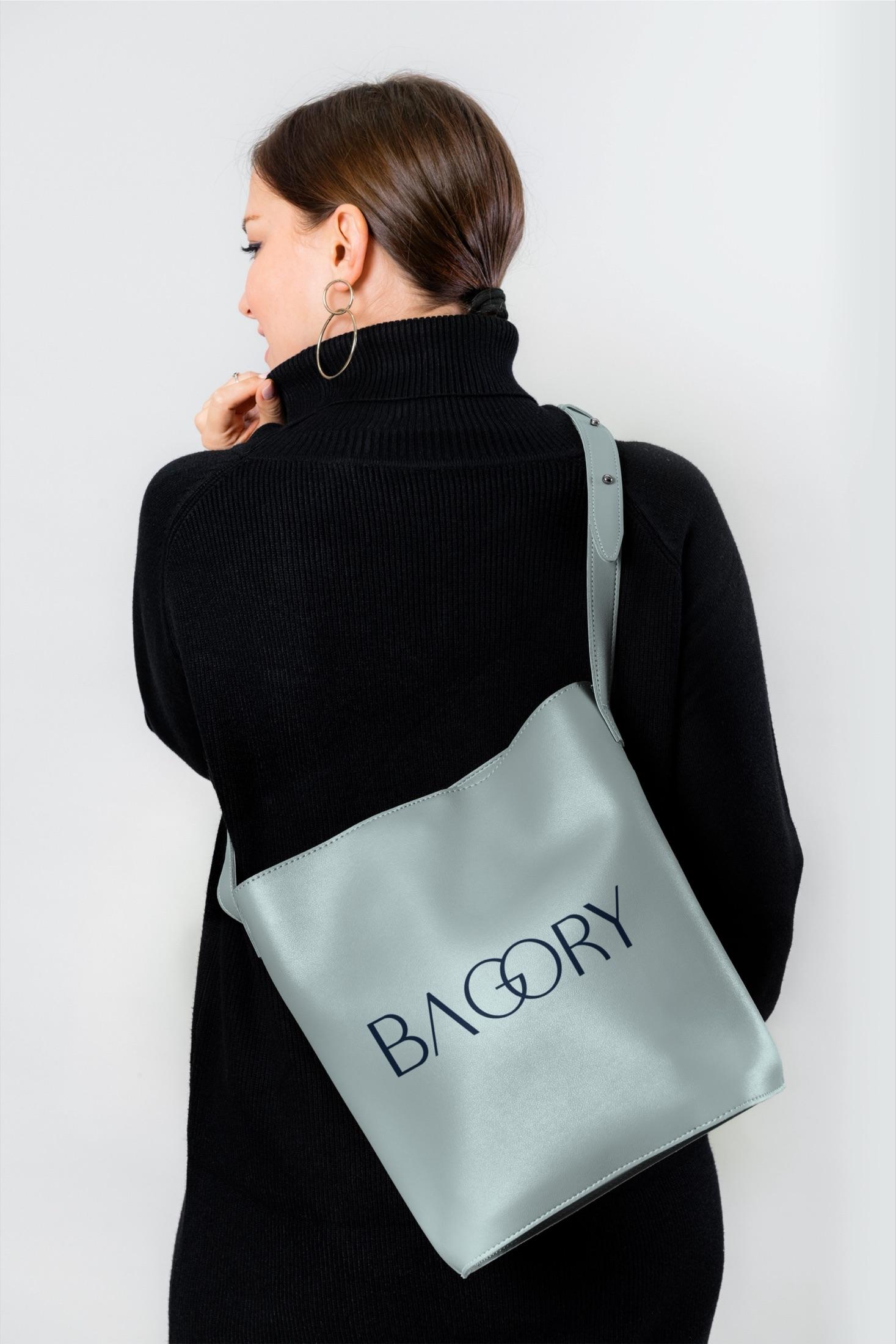
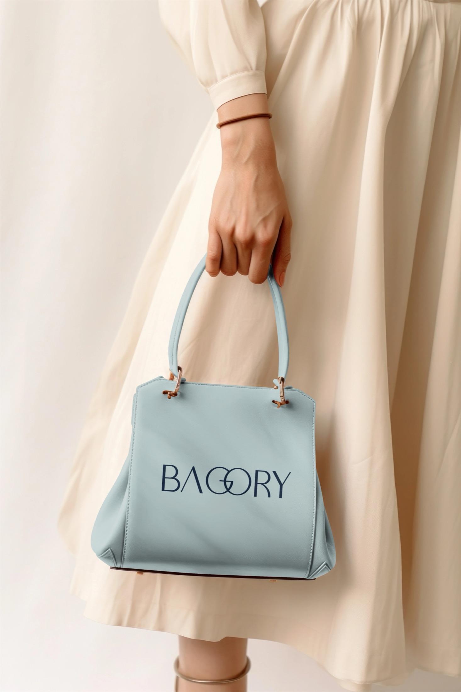
What mattered here was keeping things simple without losing the brand’s individuality.
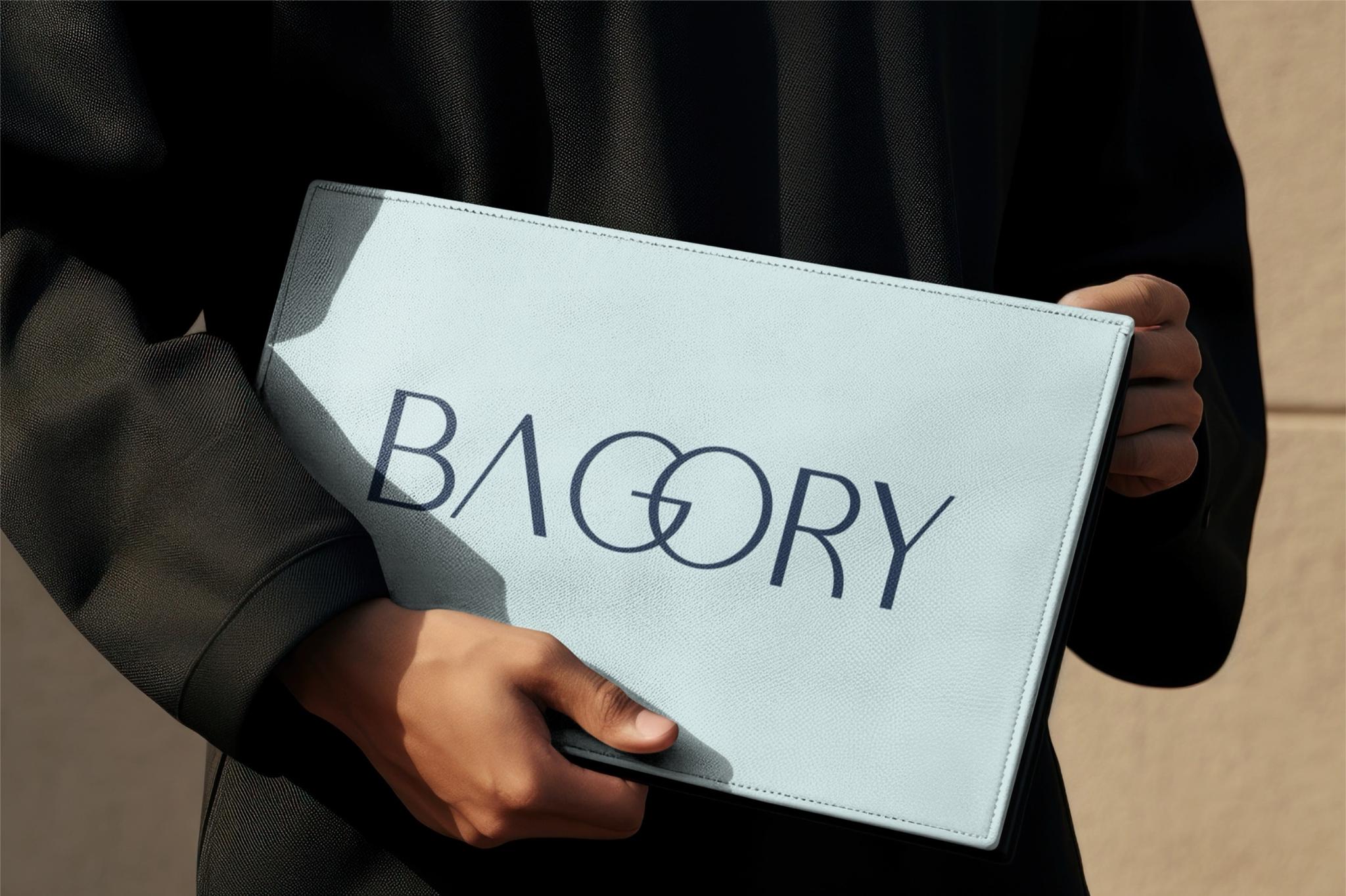
The result is a restrained, clear mark for a bag brand confident in its style—without trying to prove itself through excess.