
Distinct in taste and character
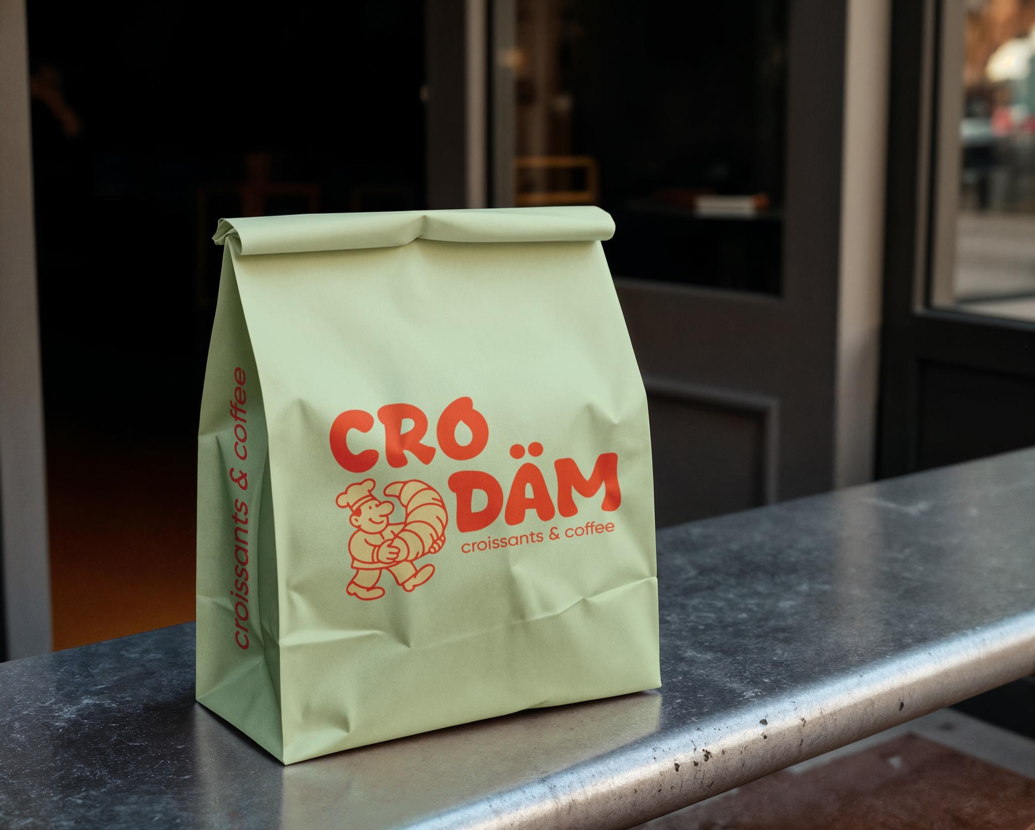
CRO DÄM is a modern bakery focused on croissants and coffee. The client wanted a trend-aware, colorful identity that stands apart from typical bakery looks.
A key requirement was an original brand character—so we centered the idea on a cheerful baker holding a large croissant.
The mascot did not begin as a finished character. Early sketches explored its silhouette, movement, and relationship with the croissant.
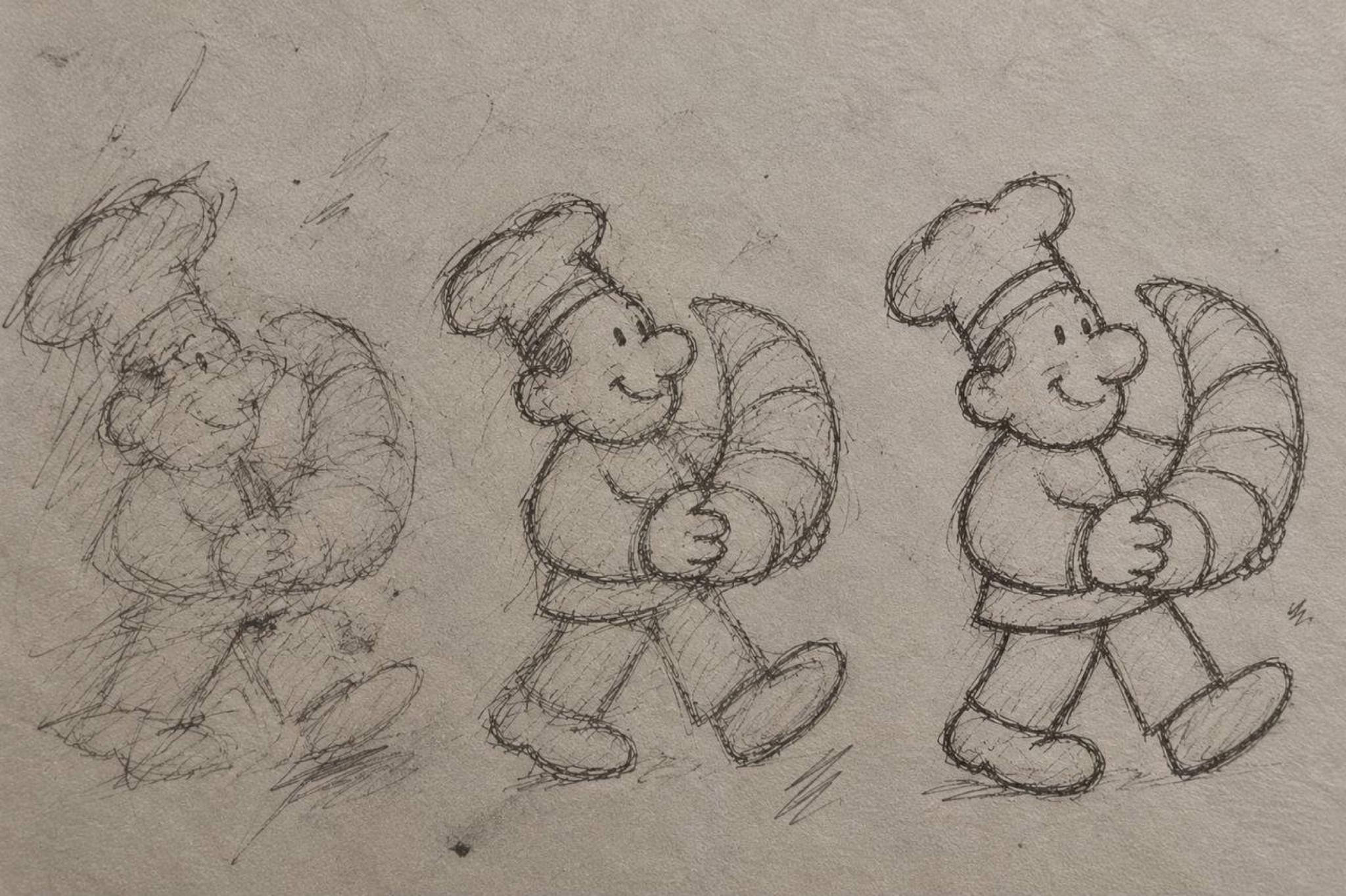
The mascot was drawn specifically for CRO DÄM—simple lines and a friendly face keep the brand approachable, and the croissant signals the core product instantly.
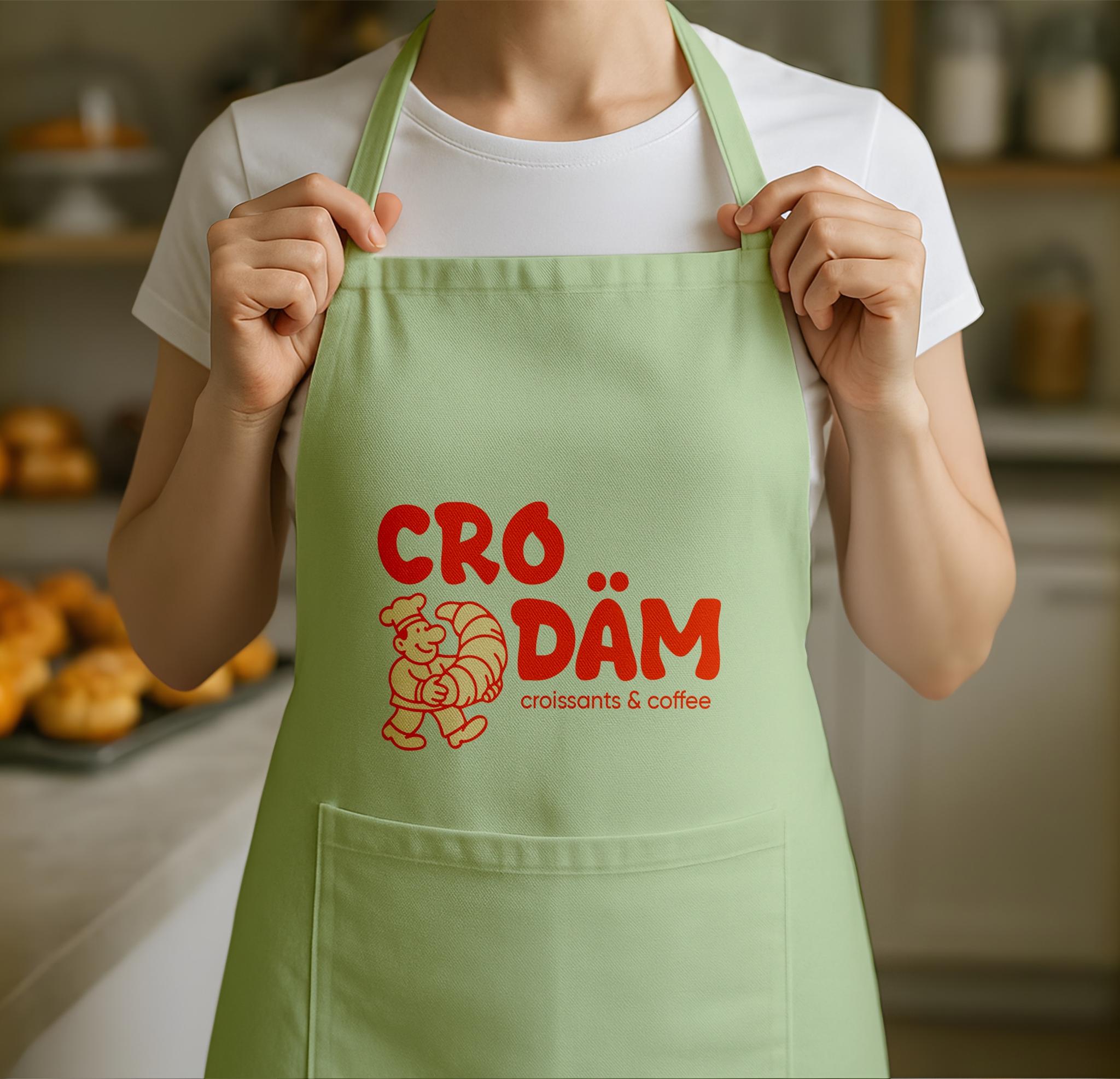
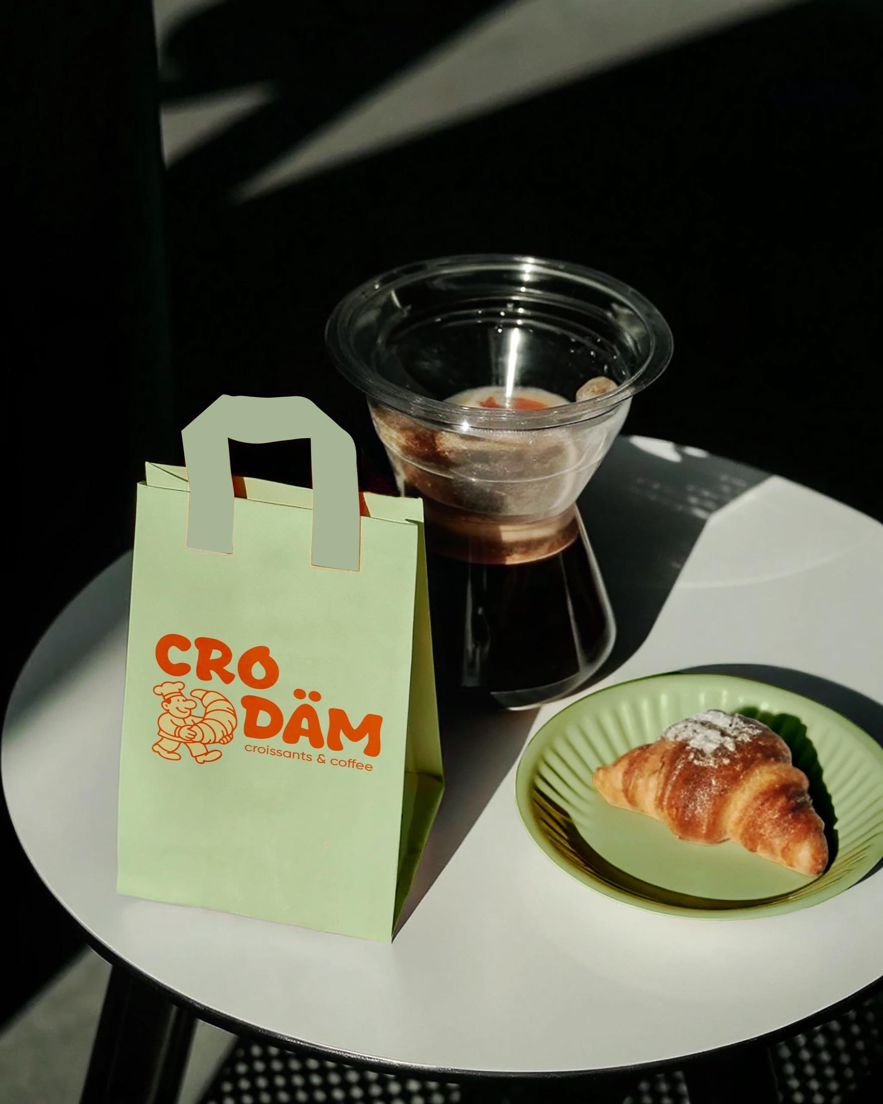
Typography follows the same mood—large, rounded, free letterforms that pair with the mascot in one memorable composition.
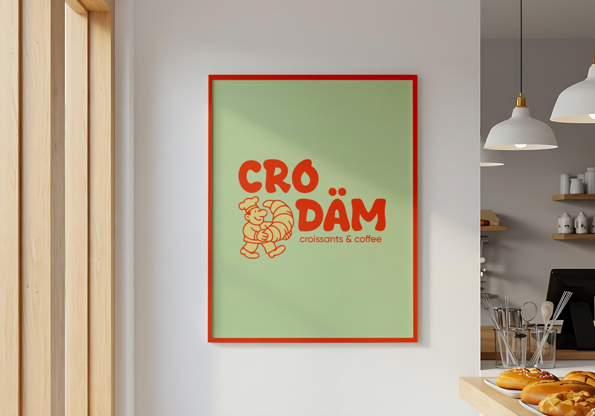
The palette pairs light green with a saturated red-orange—fresh, contemporary, and eye-catching.
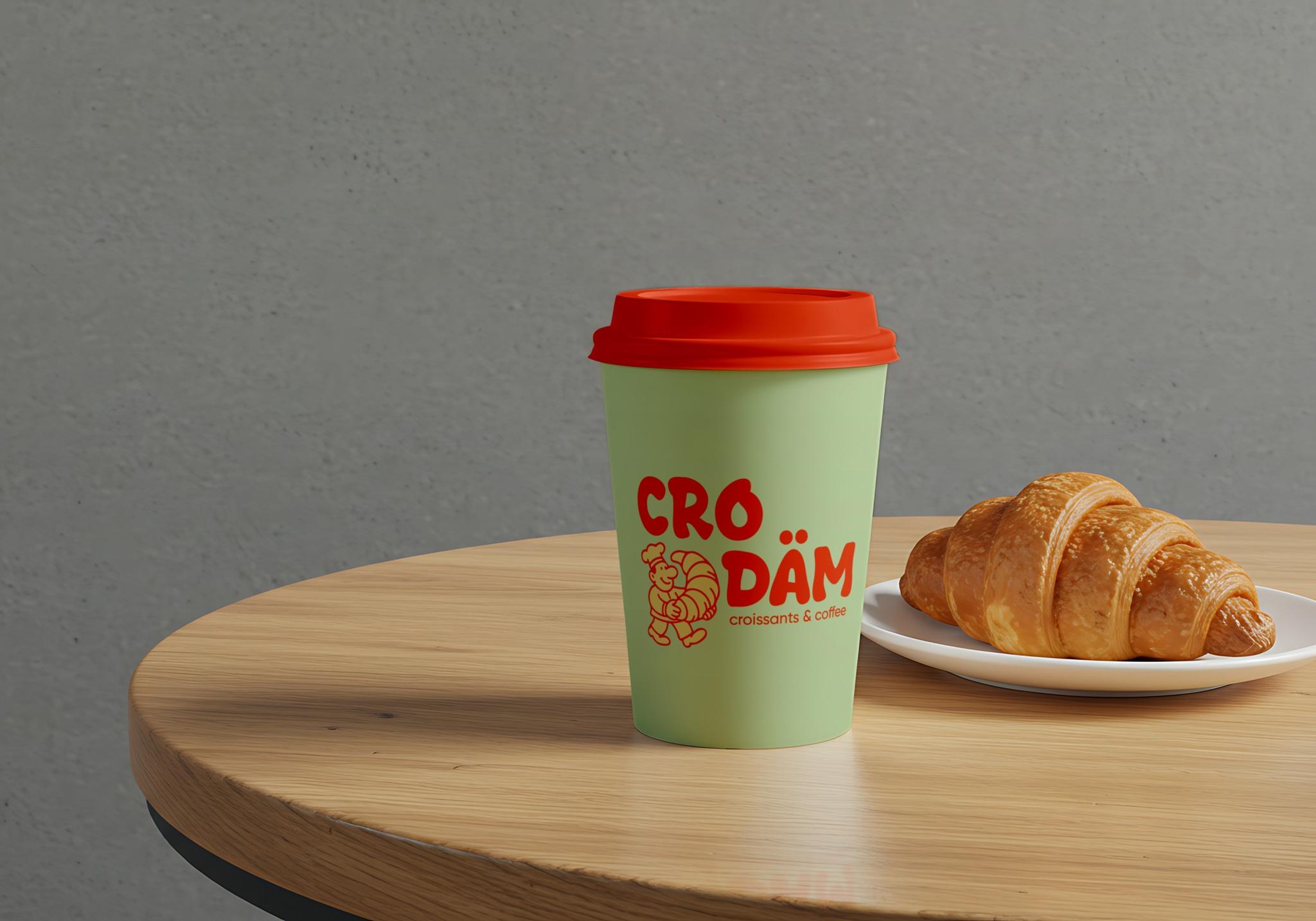
The interesting part was giving the mascot its own personality—not a side element, but part of the brand.
That’s why the character works as the main recognizer on packaging and advertising.
The result for CRO DÄM is a distinct mascot, bold color, free typography, and packaging—bright and simple, setting the mood at a glance.