
A burger brand with a lighter mood
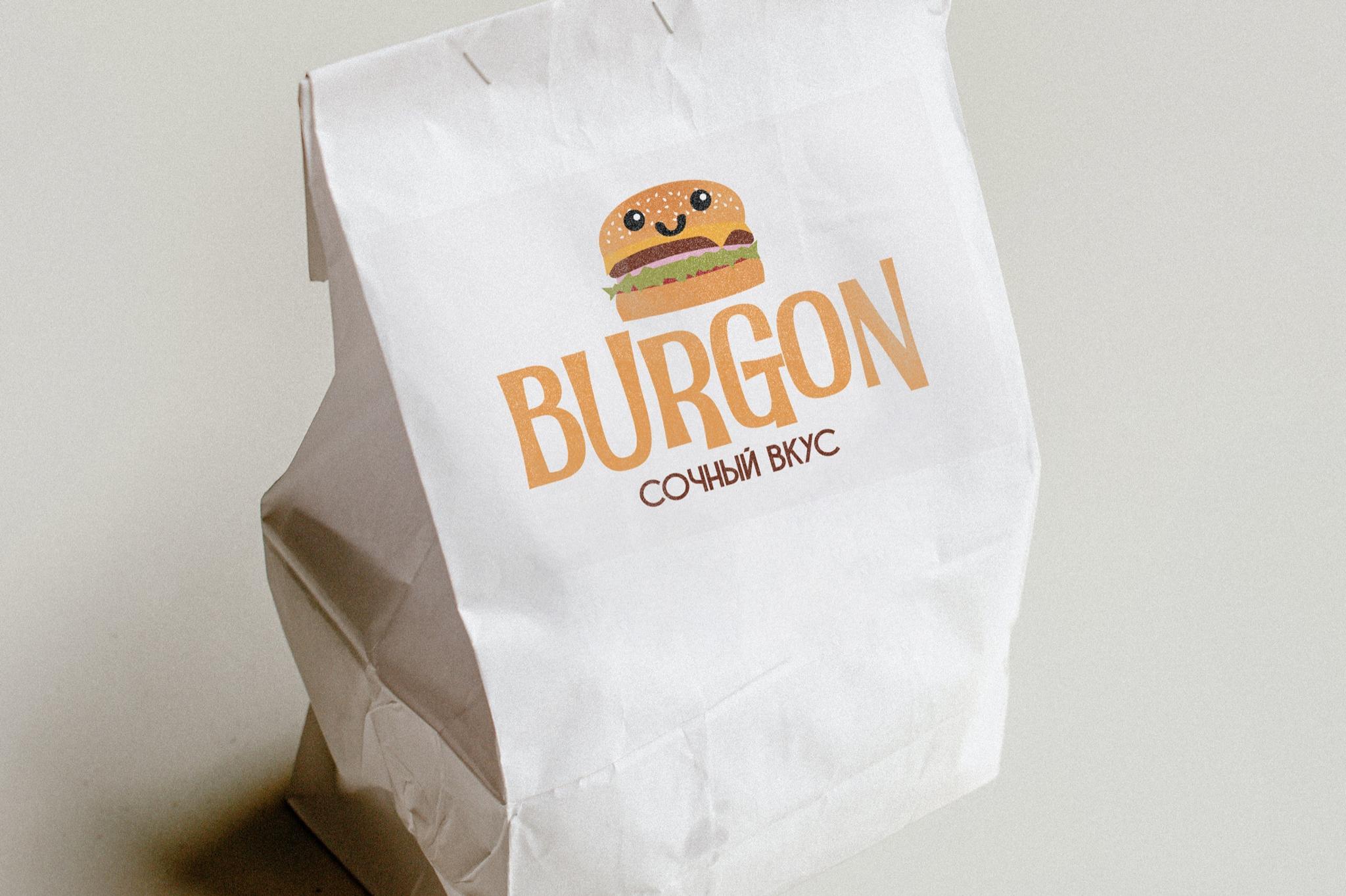
For BURGON, the goal was an identity that presents burgers with a lighter, friendlier mood—not heavy fast-food aggression.
Illustration mattered to the client—so we chose a small, friendly burger character as the logo’s lead figure.
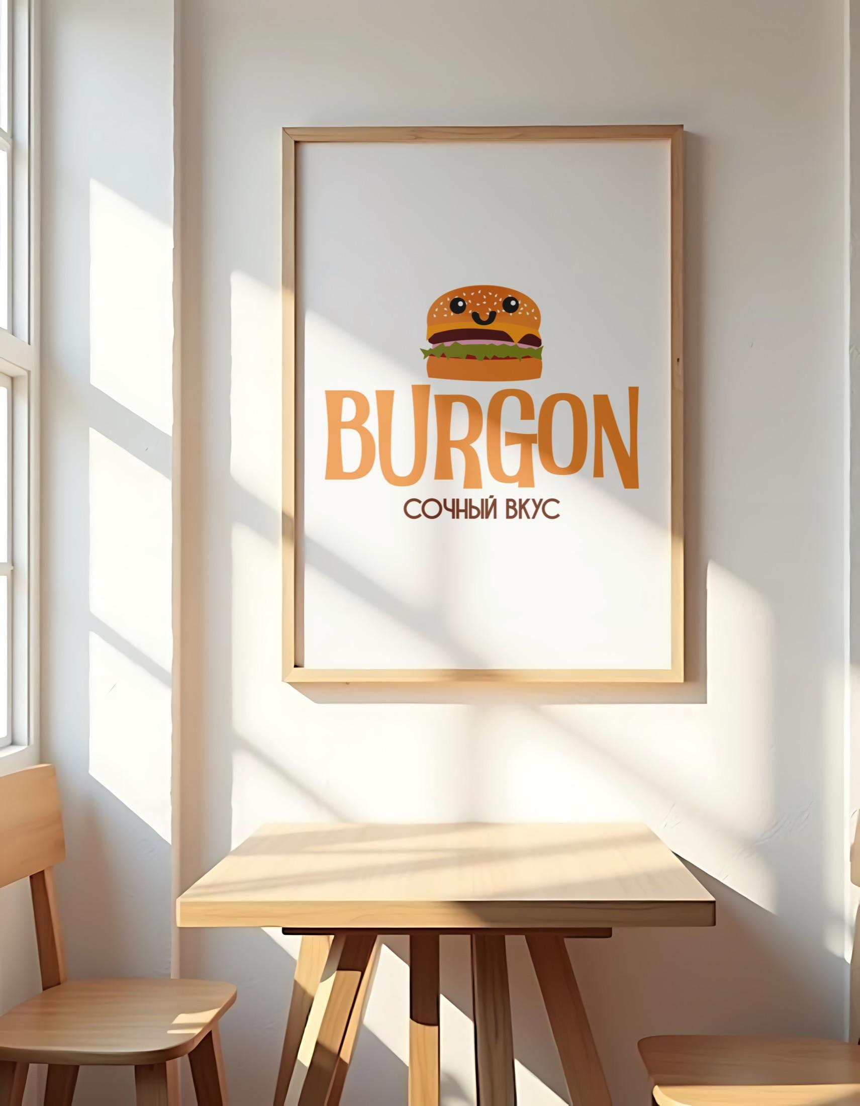
The drawing isn’t decoration—it defines the brand’s personality. A cheerful, kind burger brings the product closer and keeps it light and appealing, not heavy or aggressive.
Typography keeps the same mood—large, clear letterforms add energy and read easily alongside the illustration, without competing.
Color stays minimal—white, warm orange, and dark brown accents echo bun, meat, warmth, and flavor.
What mattered was illustration, lettering, and color pulling in one direction.
The result for BURGON is appetizing, memorable, and friendly—taste and mood read at a glance.